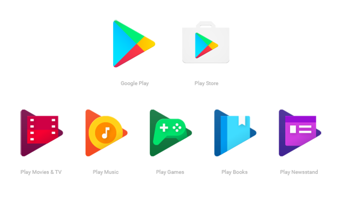
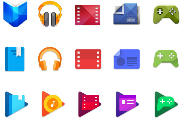
Google is kicking off the week by revamping the look of its "Play" family of app icons. That includes the Play Store, Play Music, and anything else that starts with "Play." The look is much more consistent, but I imagine the redesign will be rather divisive. I mean, isn't everything?
You'll probably see the Play Store icon most, and it's changed the least. It's brighter, and the little folded handle is flat now. The others use the play arrow with a unique icon on top. Google hasn't announced any other changes to the Play apps, just new icons.
The blog post says the new icons will come to all apps in the next few weeks. That probably means new APKs will show up soon as part of a slow rollout. We'll have the APKs when that happens, of course.
Source: Android Blog


