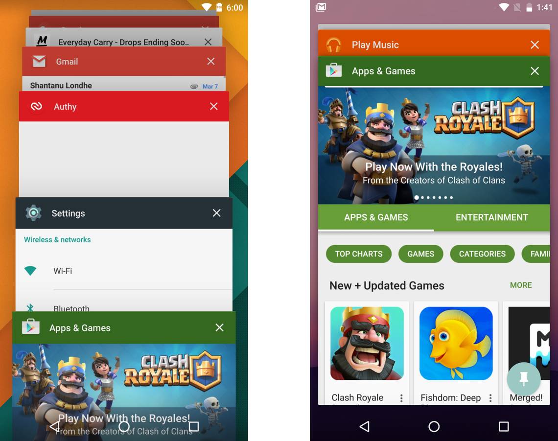
We already know the headlining changes in Android N, but as usual there are a lot of little things to talk about. For example, have you seen that new recent app UI? Those cards are so big. See above for a comparison of Android 6.0 on the left and Android N on the right.
The cards now take up most of the screen, to show more of the app's UI. You might have to scroll a little more to reach an app deeper down in the stack, though. On Marshmallow you can reliably tap three cards (other than the current app) without scrolling. On the N preview there are two you can tap without scrolling, but that includes the current one.
Play Store was open, card drops to the bottom immediately
The recent app list does have a handy tweak when you're in an app and hit the overview button. The app that you're in will be the front card, but it drops down to the bottom, revealing whatever was the previous app. It's not as if you'd hit the overview button just to open the app you're already using, so this makes sense to me. It doesn't do this if you're on the home screen, of course.
Via: +FranciscoFranco1990