Some of you may think of Cerberus as a three-headed dog that guards the gates of Hell. Others may think of a service that can track down your phone and lock it as necessary. One of the two has decided to embrace material design.
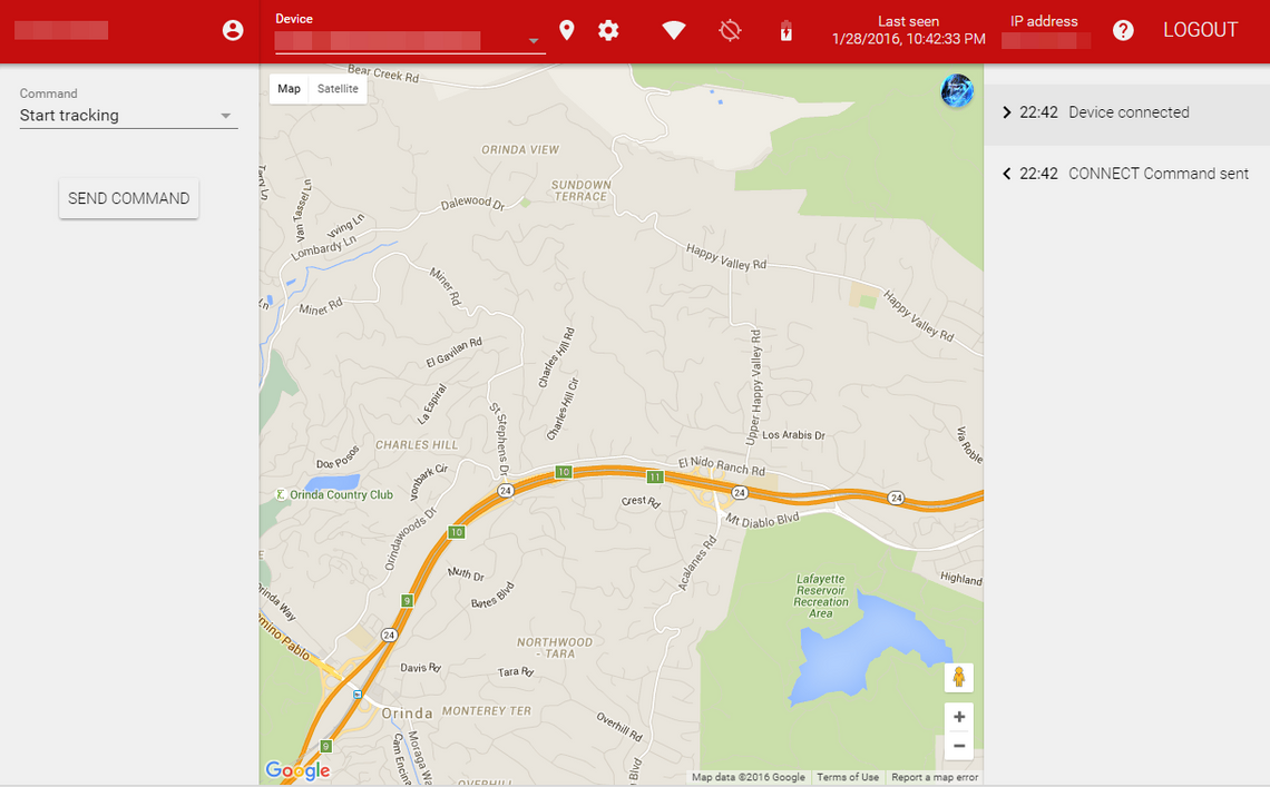
Non-Cerberus users can get a glimpse at the old site from our coverage over the summer. Folks signing into the site now are seeing something fundamentally different. A red action bar stretches across the top. White icons offer bold contrast. Pop-ups resemble what you would see on an Android device, and subtle animations are dotted throughout the experience.
There are elements that don't feel quite right. The toolbar is cluttered with icons. Dialogs contain an excess of raised buttons. But overall, these changes bring the website more in line with the Android app, which received a material design update a little more than a year ago.
You can see more samples of what to expect from the material update in the screenshots below.
[imgset]
[/imgset]
Thanks: cpvm