Quick Links
Coming across a genuinely new launcher interface and paradigm on Android is rare. Most third-party clients try to emulate the default Android launcher and add some customizations and improvements here and there. Not to undermine the power of something like Nova Launcher, but there's only so many times you can swipe left and right between homescreens or tap to open and close an app drawer before you wonder what that new launcher you installed does differently. If you seek the novelty of a new welcoming interface each time you unlock your phone, choices are somewhat more limited especially if you want a reliable and simple app, not one that has been built for the sake of difference more than usability.
HomeUX walks that thin line with aplomb. It's a bit unique in the way it organizes your homescreen, but it remains simple and usable over the long run. The app has been in development in closed beta for many months and has recently been released to the public as a version 1.0 beta. I've had it installed on my G4 since its earliest days and it has been on and off my default launcher, battling it out with Nova Launcher over homescreen supremacy.
Folders are in, homescreens and app drawers are out
Over the months, HomeUX has matured, moving from a decent concept that covered the basics to a complete offering that feels fresh but without sacrificing features. Icon packs? Widgets? Shortcuts? Grid sizes? Material Design? HomeUX has it all covered. You won't have to sacrifice any of these to use the launcher. What you will have to leave behind however, is your understanding of homescreens and app drawers. HomeUX blends both together, and focuses instead on differentiating between folders.
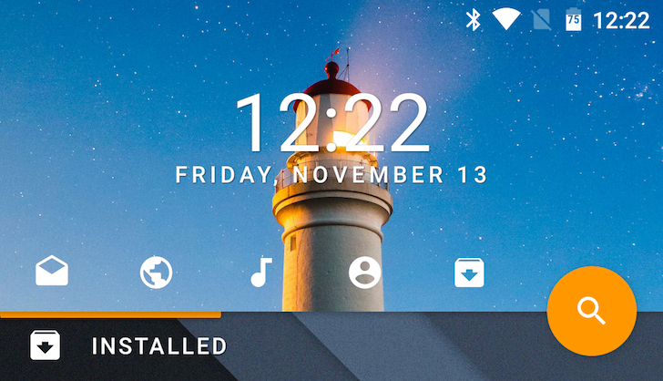
Your HomeUX screen is divided between two distinct areas: the top is the Action Panel and the bottom is whatever folder you happen to be browsing. Swiping vertically switches folders, which in turn changes the background image and accent color of the Action Panel. By default, you have one folder — All — which hosts all of your apps' icons. Below, you'll see that I've created two other folders — Less Used and Installed — which house their own apps (that I've chosen to remove from All in order not to overcrowd that).
Swiping horizontally can be done on both the top Action Panel and the bottom folder. Let's focus on the latter for now. This gesture allows you to have multiple pages inside the same folder. For example, my Installed folder houses two other screens for a few widgets as seen below. That keeps them accessible, but hides them away from my main layout so they don't ruin whatever simple design I was trying to achieve.
You may have noticed that the Action Panel is somewhat static throughout all of this swiping. Aside from changing backgrounds and colors, it keeps the same clock and date, the same shortcuts to my 5 most-used apps (QuickApps), and the same action button (floating QuickApp). That's because it's meant to be an easy way to reach your frequent apps. Think of it as a dock, except it's placed higher on the screen.
Swiping horizontally on this panel is independent from the folders below it. To the left, you actually reveal your list of folders where you can add new ones and edit those that you've already created. HomeUX focuses on gestures a lot and this is one of the first examples I'll mention. In order to edit a folder, you have to tap and hold it, then drag it to the Edit icon and release. That's what opens the options screen.
There you can add apps to the folder, change its name, icon, background image (which can be set to a photo or a solid color), and accent color (which changes the horizontal separating bar and action button).
Gestures are also part of the way you move and edit apps inside your folders. The same tap and hold on any icon shrinks the grid and reveals options to uninstall the app, view its information in Android's settings, edit it, and add it to another folder. Without letting go, you drag the icon to whatever option you choose and release to activate it.
Plenty of settings
The Action Panel's usability doesn't stop at folders. First, if you lose an app you're looking for, the colored Search floating QuickApp will let you quickly type and find it. But more importantly, you can access all of HomeUX' other settings by swiping right on the panel. That reveals a third screen with options to change the wallpaper, icon pack, and settings.
In the latter, you'll find a familiar territory of launcher settings with app grids, icon sizes, notification badges, transparencies, transitions, and more.
You'll also be able to change the floating QuickApp's behavior, target app, and icon, the clock's appearance, and the default home folder. HomeUX can also perform backups on your homescreen settings and restore from it, in case you're switching devices, resetting them, or if you just want to have a backup ready in case things go wrong.
Below you'll see some variants of my homescreens with the white app background turned on (left), and with a 50% transparent Action Panel, smaller clock, and bigger app icons (middle and right). Notice how the wallpaper peeks behind each folder's background, creating a nice blending effect.
Joys and frustrations
HomeUX looks fresh and stays that way as long as you use it. It's not a traditional launcher like the hundreds we've seen on Android, but it doesn't deviate too far from them. The unique approach isn't overwhelming and the overall feel remains familiar and easy to adapt to.
Swiping, scrolling, dragging, all of these interactions are combined with beautiful animations that add to the joy of using HomeUX. Both the play on accent colors and the distinction between wallpaper and top background add a touch of novelty each time you switch folders, letting you mix, match, and create unique atmospheres that are just a swipe away.
And despite a layout that seems a bit stiff with the persistent Action Panel and floating QuickApp, there are plenty of customization features. A stroll through the app's Google+ community will show you what other users have done with it, including plenty of unique setups that vary between the simple and the maddeningly complex.
However, HomeUX isn't free of frustrations. Choosing an icon for a folder or a QuickApp is a matter of scrolling through a never-ending list of small black icons, most of which are useless. There isn't even a lower or upper case G for a Google folder. There's no logic and no order to the way the icons are listed, so you'll have to just go through them one by one and hope to find something that fits.
And over the months, bugs have been squashed but others have emerged. Sometimes apps don't disappear from the All folder when they're added to another one, despite choosing that option in the settings. And I get that it's still technically a "beta," but the app force closes at least once a day on my G4 and a lot more often on my Nexus 5X, mostly when trying to reorganize things.
Stability has actually been a bit of a hit-and-miss on the Nexus 5X. When it works, HomeUX is fluid and enjoyable on the phone. But when it doesn't, it's the white-knuckle level of annoying. Tapping and holding on apps and widgets to edit them works one out of three times at best. Moving an app from a folder (that isn't All) to another causes a crash every single time. Folder icon alignment is often wonky if I try adding more than 4 folders. Adding apps to the QuickApps panel required at least two tries for each one, because the icon choosing panel wouldn't open. Those bugs are either non-existent or not as frequent on my G4. I guess either the app isn't yet completely stable on Marshmallow or it isn't playing nice with my Nexus 5X.
But even with these issues, HomeUX is worth trying, if only for its unique approach and design. You might find it has easily dethroned your favorite launcher or you might go back to whatever you were using before. But there's no harm in giving it a chance since it's free for all but a few features. The pro key unlocks notification badges, different transitions, app icon resizing, and clock font customization. Those features are superfluous to me, but I did buy it to support the developer. Original work like this deserves recognition.