Hi. I'm Michael. I look at a lot of Google Play Store listings, and Artem and I usually pick out more than a hundred apps and games every month to be featured in our weekly roundups here at Android Police. After doing this week in and week out for a couple of years, there are some observations I'd like to share with developers on how to make your game stand out of the crowd. With us, as with consumers in general, you might only get a few seconds to grab the attention of potential players before they move on - it's important to make the most of them.
This guide is specifically for game developers, but app devs can probably glean a few useful hints as well. Note that following this guide to the letter won't guarantee your new game a featured spot on this site - we're not giving it all away here - but implementing some of the suggestions certainly couldn't hurt.
A solid Play Store listing includes three elements: the text description, the screenshots, and a video.
App Description
As in all informative text, it's best to get to the point quickly and simply when you're writing out your game's description. Assume that people will only read the first paragraph, because a lot of them will (trust me on this - I've seen people comment on Android Police stories before they finish reading the headline). A couple of sentences describing the basic gist of your game are what you should shoot for, particularly including anything that's unique or novel about the game's mechanics or structure.
There are also a few things you should avoid, at least in the introduction. I know you've spent tortured weeks laying out the narrative structure of your game's world and your character's fascinating backstories. That's nice, it really is, but don't give Google Play Store users a narrative dump right away - they need to know what kind of game it is before they can be bothered to care about the story. If a player is looking for a light action-adventure but you've made a deep tactical RPG, it's not going to help him or her to know the framework of the story.
Keeping with our short and sweet theme, don't clog up the introduction with quotes or review scores (even from Android Police). The description can be as long as you want - you can include all of your self-congratulatory stuff at the end. Game update information should also be avoided in the description - that first paragraph is for informing new players and hopefully earning a download, not for sending information to the players you already have. There's a changelog section of the Play Store for a reason.
Good example: 99 Bricks Wizard Academy
Note the efficient use of space in 99 Bricks' description: the first two sentences lay out the purpose and central goal of the game, and the next few sections progressively flesh out some of the more subtle aspects of the strategy. Media reviews and social links are at the bottom of the description, and all updated information is separated into the changelog. Well done.
Bad example: Crossy Road
This isn't even the whole thing, I couldn't fit it all on my monitor for a screenshot.
The description of Crossy Road starts with information for the latest update, a note about Android TV compatibility, and a full instruction on how to set up Google Play Games, information that new players don't need. It follows with quotes from the media, then four rhetorical questions. It isn't until 18 lines, three quotes, five bullet points, and six separate sections of text that potential players get to a description of the actual game.
Screenshots
There's a simple rule to follow with screenshots: make sure that they're screenshots of your actual game. All too often we see developers completely cover their game's screenshots with gigantic images of characters, huge swaths of text (text goes in the description!), and nonsensical formatting that makes it nearly impossible to actually see what the game looks like.

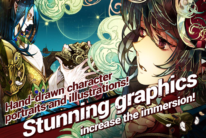
This is a Play Store screenshot for Exos Saga. It would make a sweet poster, but it doesn't tell us anything about the gameplay.
Take good, solid screenshots that show off your game's primary interface. Put as much of your game on display as possible. Take varied shots of different levels and environments. Don't include the intro screen - no one puts a title card on a movie poster - and if your game needs some kind of intensive menu system to drive the action forward, that should probably be the first thing on the cutting room floor. If you've updated your game with a notable new feature, try to take at least a couple of new screenshots and post them along with the update.
Take lots of screenshots. Lots. For Android Police, we like to have six for a good story or a roundup listing... and screenshots that are just the title or are mostly photos of characters with a tiny game screen in the corner are the first to get cut. (Most games only give us about four decent, usable screenshots that show the actual gameplay.) Oh, and one last thing: don't be lazy and re-use iOS screenshots on the Play Store. It's obvious to people who play a lot of these games, and those are your best potential customers, because they'll spread the word about a good game.
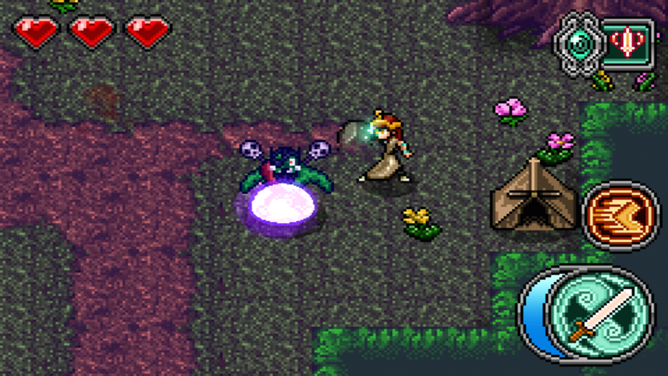
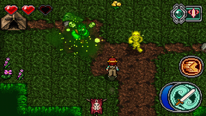
Good example: Mage Gauntlet


Mage Gauntlet's listing includes nine screenshots of various portions of the game world, the overworld, and the inventory. They also aren't afraid to demonstrate the on-screen controls, clearly showing to any experienced gamer that this is an action-RPG, as opposed to something turn-based. Prospective players get an instant feel for what the game is like.
Bad example: CSR Racing


The first screenshot in the Play Store listing for CSR Racing tells you that it has 125 million downloads, on top of a generic picture of two cars. That isn't useful at all. The second slide shows four cars, with a mention of how many licensed vehicles the game has. Fine, but how do you actually play it? Is it a conventional racer or a lane-based runner or what? The third screenshot is another generic shot (though at least it's for a new feature), and the fourth shot shows an in-game menu. We still have no idea what the gameplay is like. Finally, at the fifth and final screenshot, we can see that it's a drag-racing game with no steering and only the barest user interaction. Congratulations, developer, you've just wasted your prospective player's time and effort.
Bonus bad example: Zenonia 5


Between the anime characters and the odd layering of the actual screenshots themselves, like a kindergartener trying to make a collage, it's difficult to tell what's actually going on in any of these images. There's never a good reason to cram three or four screenshots into a single image - Google Play lets you post dozens of photos, and it would be much better for your actual players if you simply posted them in sequence.
Video Trailer
The most important thing about having a video trailer for your game is, well, having one. Far, far too many games omit a video from the Play Store, sometimes when the developer has already posted one to YouTube (why?). Paradoxically, it seems that the larger the publisher, the more likely they are to skip a video. Despite nearly infinite resources, EA only posts videos for about half of its Android games, and NVIDIA's highly-touted Android ports almost never include one.
You don't have to be a wizard with Adobe Premiere to make a decent video. Just record a few sessions, pick out some nice-looking sequences, and paste them together - you don't even need to modify the audio. Odds are pretty good that your computer already includes a basic video editor that can get the job done. As with screenshots, try to record video that does a good job of demonstrating what your game is about and what makes it unique. Make sure not to obfuscate the game itself; have you noticed how all the high-priced commercials for titles like Game of War include almost no video of the actual gameplay? That's because these are crappy IAP time-sinks, and showing off the actual game wouldn't result in downloads or sales.
Keep it short and sweet. Ideally, the trailer should be like a good movie trailer, somewhere between one and two minutes. Again, it isn't the complexity or the quality of the video that matters, so much that it's there. Unless you really know what you're doing, it might be a good idea to omit any voice-over or complex editing. Like screenshots, don't try to inject any unnecessary static images on top of the video - players want to see gameplay first and foremost.
All that being said, if you actually do have some video editing experience, feel free to apply it. A good example is the trailer for Leviathan: Warships above, which adds a hilarious voice-over and text, but doesn't skimp on the gameplay.
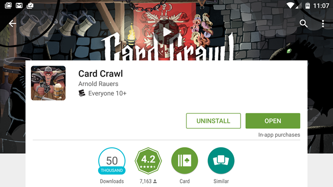
Good example: Card Crawl
This one-minute trailer spends nearly the entire run time showing players the core plus-and-minus gameplay mechanic, with a few peeks at deck-building and some animation re-used from the game itself. There's no time wasted on flashy extras, no unnecessary voice-over or text, just a quick look at what playing the game is actually like.
Bad example: Clash of Clans
This one-minute TV spot probably cost Supercell hundreds of thousands of dollars to produce thanks to the inclusion of Liam Neeson (not to mention a reported million to air during the Super Bowl). But between his menacing monologue and the over-produced animated scenes, we get no idea of what the game is actually like to play. Is it a medieval action brawler? An online RPG? We can't tell, because there's not a single second of in-game video. (It's a crappy IAP-riddled "strategy" game, in case you were wondering, where the only strategy is to out-spend your opponents.)
Keep in mind, I'm not a marketer, I'm a player - the tips outlined above show what we at Android Police like to see in a good app profile, not necessarily what sells. But if you follow this guide, you're much more likely to catch our attention when you submit your game to our tip line.