
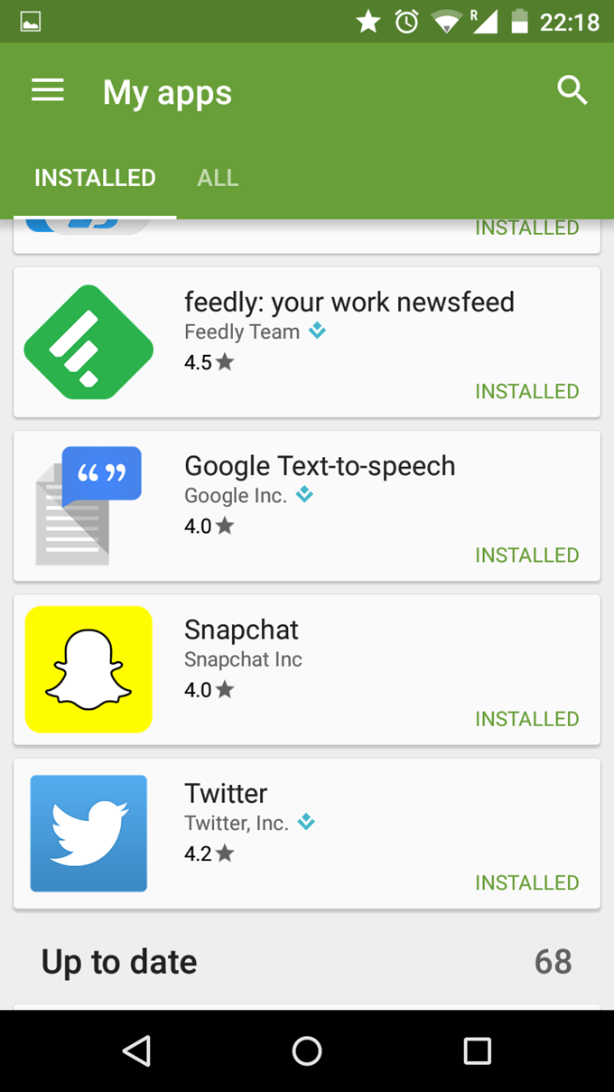
Google often experiments with small interface changes without mentioning them in blog posts or update notes, and that seems to be the case with the latest aesthetic change in the Play Store. Multiple Google+ users and Android Police readers have noticed a new and more compact display of the five-star rating system for app and game listings on the home page and in searches, replacing the full five-star graphic with a single icon and a numerical value. Observe the difference below, standard on the left, updated on the right:


There's no indication that this is happening for a wide range of users, and there has been no mention of a visual change from an official source. That being the case, this is probably some limited A-B testing from Google's Play Store development team, just looking to see whether this small change to search results improves usability. It may do just that: with a numerical readout you can see a more precise rating for each app, which isn't normally visible without going into the listing and scrolling down. The default view only allows for full- and half-star scores, which are a bit hard to see on smaller screens.


The numerical display makes a definite improvement to readability, especially considering the grey-on-grey-on-grey color scheme. There doesn't appear to be any particular Play Store APK version or Android version combo that triggers this change, so it seems to be a server-side adjustment. We'll be keeping an eye out for more widespread changes.
Thanks: Christopher Neumann Ruud