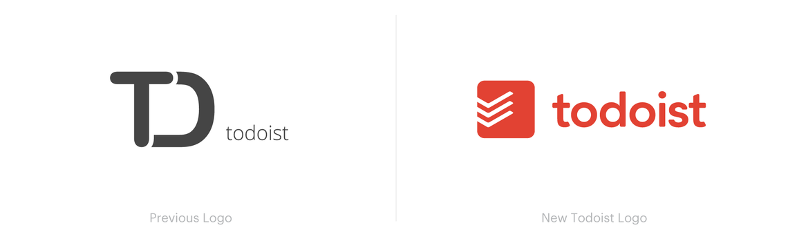
Todoist gave its Android app a complete material makeover early this summer, providing users with the most changes they've seen in years. But it seems the company left one thing off the list at the time, and today it's rectifying that. The to-do list and note syncing service has come out with a new brand identity, one that does away with its old TD logo.
The new icon utilizes a stack of check marks. Here's a before and after comparison.
The icon is hardly the only change. The company has switched from the Open Sans font to Graphik. The bright red has been given more prominence on the website, though you can change the color of the interface if you'd like or revert back to the original all-white theme. And if you're logging into the site via mobile rather than the app, expect a more optimized experience. Todoist says Google's material design guidelines served as inspiration for the new looks it introduced on the web and in its Mac app.
The updated app is already live in the Play Store. Grab it below, and hit up the source link for a more complete look at all the changes Todoist has made to the online interface.
What's New:
A new Todoist…
Last year, we embarked on a creative journey to bring our entire brand identity in line with our mission: To build a tool that can help anyone achieve more every day. This redesign brings:
- A brand new Todoist logo to all of our platforms
- An entirely redesigned Todoist website & blog
- A complete update of our Web, plugin and desktop apps with fresh interfaces & powerful new features
Learn more about the new Todoist on our blog at http://j.mp/new_td.
Source: Todoist