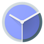
Hmm. I dunno. Does the darker blue on the right look more "neutral" to you? I kinda preferred the sky blue/hot pink color scheme rather than a more conventional red/blue that's been added in the latest incremental update to the official Google Clock app, 4.0.2. But then I'm a man with plastic spaceships on my desk. (And my fridge. And my bookshelf.) Maybe I'm in no position to judge aesthetics. (Oh, also there are spaceships on my TV stand.)
Left: old and blusted. Right: new blueness.
Other changes included a fix for both a duplicate provider issue and a timer button problem. Google says that the Play Store version of the app may not install on its own - if it doesn't, disable the app on your phone and try again. Or you can mozey on over to APK Mirror and download the app manually, especially if you're having rollout issues. That's about it - oh wait, there are also some plastic spaceships in the standing lamp in my living room.