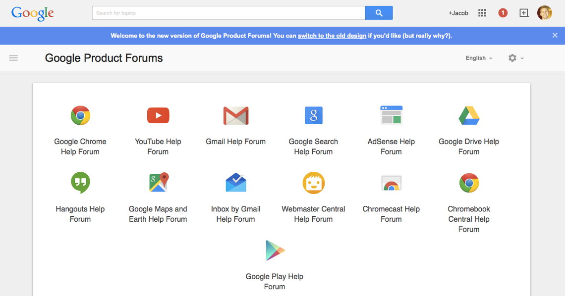
Google's product forums have been a design nightmare for some time now, but today they rolled out a Material Design update for them. It is every bit as good as you might have hoped for, though you still have the option to switch to the old style. This extends to all of Google's products' support forums, but not Google Groups, which are technically separate despite the fact they shared a very similar UI before today. And, sadly, the mobile site still has its ancient, burn-your-eyes look.
While we will rightly hope for Google to get things going on mobile devices, let's take a moment and enjoy all the goodness in desktop browsers. The thread browsing view very clearly separates pinned posts from the rest of the content, while unread threads get highlighted.
Viewing a single thread looks very sharp, with the original post very clearly separated from the rest of the content. Individual replies each lie on their own card. The sidebar is a little half-baked, but it still slides in, which is nice. A particularly nice detail is the floating slider, which comes in handy when browsing long threads extended over several months or years.
[imgset]
[/imgset]
Check out the new goods here.
Source: Moritz Tolxdorff