Google updated its design spec recently. The material spec, which Google says is a living document (as evidenced by its ongoing updates), gained further guidance on floating action buttons, dialogs, updates on typography, and a lot more.
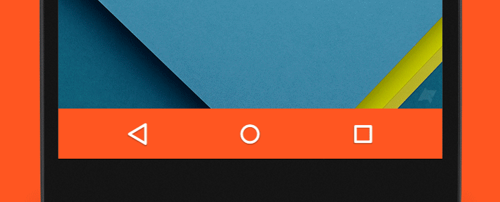
One less-advertised update was a change to the section in "Structure" concerning the navigation bar in Android. The "color variants" text is still identical to that from the "status bar" subsection, but an image showing nav bars themed to match your device's hardware was removed. Here's the image in question:
Theming according to device color is - as far as this writer knows - not possible on Android at the moment, and neither is theming the nav bar to its "light style" variant also shown in the guidelines, where the nav bar is white and the buttons become gray.
But those two discrepancies aside, the change brought a question back to the top of my mind that's been rolling around for a while now - if Google's guidelines had "usage" advice for nav bar theming, what would it say? When is it appropriate to theme the navigation bar, and when isn't it? How does the navigation bar relate to the status bar, and how do both of them relate to the actual app you're using?
I thought it might be fun to explore these questions in writing (and pictures), so let's get started.
Mixed signals
Part of the confusion when it comes to theming Android's system bars, I think, comes from the fact that Google seems to send mixed signals on the subject. The material spec is sparse on guidance, but demonstrates dark, light, translucent, and transparent variations, and - until recently - colored variants. Meanwhile Google's developer documentation makes no bones about when to theme:
When you customize the navigation and status bars, either make them both transparent or modify only the status bar. The navigation bar should remain black in all other cases.
It's hard to immediately see which is correct, but it's easy to see what's possible. After all, developers can set navigationBarColor to whatever they want, and as I explained in Your Brand Can Survive A Material Redesign using colors in an interface can be important to maintaining harmony between your brand and the interface itself. So knowing that, why not theme?
It seems there are two possibilities that could explain the mixed signals: one, that the material design spec actually reflects an attitude or philosophy toward nav bar theming that has yet to be completely cleaned up or two, that the developer documentation is the source that's incorrect, and Google plans to provide official guidance or examples of theming in the future.
Either way, to get to the root of the issue it's necessary to take a look at the philosophy behind theming the system bars.
System bars and apps - another plane
The system bars are not material, and don't behave according to the same rules - they exist on another plane outside the interface. The only element in either of the system bars that actually impacts the app you're currently using - in terms of interaction - is the back button, so it's easy to see the separation between system bars and apps. The system bars are more critical to the device in general than they are to the app in specific.
But even within this separate plane, there's further distinction between the two bars.
While both bars are independent of the app itself, one is much closer than the other. Consider the position of both system bars. The status bar is almost always adjacent to an app's toolbar, where the app's primary color is established. The navigation bar, meanwhile, lives all the way across the display past all the app's content, at the very bottom of the screen. So consider the visual impact of coloring each bar according to the app's primaryDark color.
On one hand, the status bar is right next to the clearly established primary color and nothing else. On the other hand, the navigation bar is its own color block living next to whatever content comes its way.
Of course the obvious hole in this description would lie in scrolling away the toolbar when the user scrolls through a vertical set of content. See the Play suite of apps for example.
I would argue that this use of the status bar is mainly a function of continuity. Negotiating a transformation from themed to dark or from themed to translucent would result in greater visual friction than simply maintaining the color until the toolbar is scrolled back into view (as soon as the user scrolls up a few pixels). The obvious outlier to this trend is Newsstand. Ever the design rebel, Newsstand doesn't theme the status bar at all.
To theme or not to theme
Accepting the logic above means establishing that theming the status bar can (and arguably should) be implemented often, while theming the nav bar should ideally be implemented less often. So when is it appropriate to alter the nav bar? There are a few cases that come to mind, which I've illustrated for this post.
The first case is one already mentioned by Google's spec - the translucent nav bar. This variant of the nav bar should be used when you want users to be able to peek at oncoming content, but the content is a complex image or set of images.
Google's image is of a black bar at about 20% opacity, but I think the translucent bar is actually one of the better opportunities for theming with the app's darker primary color at 40% opacity. See an example in the image below. The effect is subtle but feels harmonious with the status bar without becoming too involved in the actual interface.
A second example Google gives is the transparent bar, with the explanation that it should be used over an even-toned image. The design spec isn't clear on what should be going on with the status bar, and while the dev doc is clear, for the sake of this exercise let's see an example with and without a transparent status bar. This is kind of a rare use. After all, having a piece of visual content with an even enough tone to not disturb the navigation buttons isn't very common. And the design spec isn't calling for the gradient-laden approach taken by apps like Google Search - it shows a completely transparent nav area.
So, does this use break the above reasoning by bringing the nav buttons just a little too close to the interface? Personally, I think in most contexts it does, but if there isn't complex content (like complicated images or text) flowing behind the nav, this might actually be okay. The nav bar is deemphasized, but as long as it isn't subject to the whims of the app's content, it won't get too tangled up in the interface.
Of course accomplishing this in an app that isn't just a full-screen photo would be difficult. In the recipe app example below, the actual "recipe" and "comments" tabs would probably have to cheat the window frame by cutting off content before it got to the nav bar.
Photo: Cristian Bortes under CC BY-SA 2.0 Recipe: Saveur
Outside of those two variants and the standard black nav bar, the only other variant shown in the design spec is a "light" style nav bar - a white bar with gray buttons. This implementation hasn't appeared anywhere yet unless you've got color inversion switched on, and since - as far as I'm aware - it isn't possible for a normal app to color the actual navbar icons, we'll ignore that style for now.
So what other possibilities are there? The answer isn't clear-cut, as the following examples are highly dependent on the needs and nature of the individual app.
One outlying example is the Google Now screen inside Google Now Launcher. When the Google app is accessed from another launcher, the system bars are both black, but when accessed from Google's launcher, both have gradient background protection.
As with the colored status bar in the Play suite, I would say this theming choice is made for continuity - the launcher uses gradients to protect the status bar and nav bar so opening the Google app, which actually lives "in" the launcher itself, should continue that visual style.
Another case might be a media player that shows cover art or other visual media at full frame. If you want the app to keep system bars visible during playback, translucent bars could be employed, but fully colored bars could work too. This is definitely a non-standard approach, but one that could help to deemphasize the system bars without making them harder to see.
Photo: Cristian Bortes under CC BY-SA 2.0 Recipe: Saveur
Final thoughts
In the end, whether - and how - the bars should be themed will depend on the specific context and content of an individual app. That said, there are a few cases where theming the bars will always be appropriate, if you choose to theme. Hopefully the examples above have illustrated some of those in a way that makes sense. Outside of that, as long as the decision is considered carefully, taking into account the roles of both bars and their relationship to the app itself, everything should turn out well.