If you've been paying attention the last several months, you're probably aware that since we posted our early look at Google's revamped launcher icons, users have been yearning for the "materialized" versions of their favorite apps' icons. This new design direction even spurred custom icon packs to replicate the look and feel of the rumored Google goodies. For developers and designers on Android, it's easy to see the attention the new icons are getting and start thinking about redesigning your own app's launcher icon.
The only problem is that Google hasn't updated their launcher icon spec, and launcher icons have nary a mention in the Material Design spec.
In lieu of an official spec, I thought I might be helpful to post a quick guide to the new style, compiled from observations on all the icons I've seen so far. The rules for Google's icons are few but nuanced, so it's worth taking a close look at what makes a stylistically consistent launcher icon that will fit in with the others in Android's new design direction. Again, this is in no way representative of official guidelines - just based on my own observations.
Should You Redesign the Icon?
This is the first question that should be addressed. Guidelines are great, but not every app or instance benefits from following them to the letter. Whether your app's icon needs a revamp is a question intimate to the app and the product itself. What is the icon in relation to your app? Is it a logo that covers more than just the app itself? Does your product exist on other platforms under a logo that fits across all of them? If so, you might not feel comfortable redesigning the icon.
But it's also important to note that an icon doesn't inherently need to be a logo. It should simply be the user's first visual touch point to your app as a product. Implementing colors or symbolism relevant to your brand is a good idea, and elements of your logo can be included too, but there is definitely an opportunity in designing icons that are both specific to the platform you're targeting and recognizable as belonging to your brand. I think accomplishing that is probably the ideal outcome.
That out of the way, let's assume you do want a new icon. Where do you start?
Material's Role
The "technologically advanced material" underlying Google's material design philosophy is quantum paper. It's like an electronic version of cardstock that can move, animate, expand, contract, and change shapes. It's also used in icons. It may not be immediately clear, but every icon has its own depth as a sheet of paper. Let's look at the new Play Newsstand icon for instance:
Its depth is subtly hinted from the top and the bottom. On top, a highlight to indicate perspective. On bottom, a lowlight to complete the shape. To accomplish this, you can simply layer three instances of the icon's base shape under one another, then select colors that complement the base color - a lighter color for the top, and a darker one for the bottom.
The major difference between this use of paper and the way it's implemented inside the interface is that with icons, folds are allowed. We'll discuss that more later, though.
The Grid and Silhouettes
Grids are generally invisible to the audience of a design, but they're critical in making things "look right." Google uses a flexible grid for iconography in material design, which is the same between launcher icons and interface icons. You can download a copy of the grid here (as an AI file - I've left the grid as lines rather than guides for visibility), but it's worth noting that the grid isn't a cookie cutter.
Google's own icons can only roughly be situated on the grid, and that's okay. What the grid provides are basic units and touchstones for the icon, and a framework onto which the icon's base shape can snap. It may seem like a small point, but using the grid will keep things in line with the overall visual direction of other icons while still allowing a great amount of freedom.
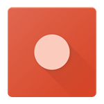
Another important point to consider is your icon's silhouette. Many custom icon packs replace all icons with a standard silhouette (squares, circles, and squircles are common) for the sake of easy visual consistency, but - in this writer's opinion - the variance in icon silhouettes in Android is something to be celebrated. Indeed, Google has long had an "anything goes" attitude toward the silhouettes of iconography, as long as the shapes are generally geometric and forward facing. For more on this, check out Google's old visual asset guidelines for web icons.
As long as those two basic principles of shape are met, your icon can probably be styled appropriately and look great lined up next to other updated icons.
Lighting and the Long Shadow
Like any physical object, you can light thick sheets of paper. From what we've seen so far, Google takes this approach with launcher icons. The icons are comprised of single or multiple elements stacked on top of each other, and follow a generally predictable lighting pattern - there's a subtle drop shadow directly underneath the top-most object, followed by a trailing hard shadow, preferably running at a 45-degree angle.
To visualize this as a lighting setup, look at the image above. This is a gross simplification of a real world lighting technique, but here we go. The black light is our key light, positioned low and close to the "subject" (the top-most element of the icon), while the gray light is our fill light - it's hard to see above but the fill light is positioned farther away and at a different angle. It washes the rest of the icon in a super subtle light that also creates the very light, soft shadow directly adjacent to the main element. The gentle washing effect of the fill light is another hard-to-notice element, but the Newsstand icon (again as an example) gradates very subtly from one shade to another as shown below, suggesting a gentle sweep of light. This may not be evident on smaller elements like the blades of the Photos pinwheel, but on large blocks like the Newsstand icon or Hangouts bubble it can be discerned.
When creating the long shadow in practice (in Photoshop, Illustrator, or whatever you use), create a gradient that goes from black to black. Set the second black to 0% opacity, and set the gradient's blend mode to "multiply." Then, adjust as you see fit and adjust the overall layer's opacity down to somewhere around 20-40% (this will vary based on what's underneath). The long shadow isn't an exact science but there are two critical pieces to understand.
First, as explained above, the long shadow gradates from translucent black to transparent, ideally at 45 degrees. It is not just a translucent gray block.
Second, the long shadow applies to the top-most element, and there should be only one long shadow where possible, unless you have multiple top-level elements that look better with their own shadows. If you have one complex top element, there should still just be one shadow that encompasses the entire shape. See the example below to get a clearer picture.
Left: Correct, unified shadow representing one object on the same plane. Right: Two hard shadows suggesting either another light source or a segmented object on different planes.
Keeping the very basic idea of realistic (ish) lighting in mind as you draw the icon helps keep shadows realistic and whole. Shadows that look too outlandish or unrealistic will end up looking off-putting or awkward.
All of that said, there are still instances where a long shadow just doesn't make sense. For an example, take a look at the Google Photos pinwheel icon. The icon's general premise is four blades of a pinwheel, each a folded piece of paper, all overlaid on one another. In this arrangment, there's little room for long shadows that wouldn't disrupt the shape or layout, so only the subtle drop shadow under each fold is retained.
Make it Tactile and Pressable
Another tenet of Google's new approach to icon design appears to be a focus on tactile design. The icons are made of paper that is cleanly cut at the edges, and folded where appropriate, lending them a tactile, touchable character that encourages users to press them. This is mostly a matter of taste - what looks inviting to one person may not look all that interesting to someone else, but if nothing else tactile qualities should be taken into account as you design an icon.
As I said earlier, folds are okay here. Looking at the Google Photos pinwheel icon and the Newsstand icon, we can see folded pieces of paper. The folds, done tastefully, add a subtle dimension to the icon that makes it look like something you'd want to touch. To get an idea of what I mean, take a look at the Newsstand icon purely flat, compared to its folded, properly illuminated counterpart.
Which would you rather touch?
Finishing Touches
Once you've come up with a great design, thought through its shape, its lighting, and its tactile qualities, there's still one more thing to do to fit in with Google's vision - a simple small drop shadow.
Google applies drop shadows to its own Android icons both to lift them slightly off the surface of the screen and to provide a bit of background protection for wallpapers that may cause visibility issues. The formula for these drop shadows is simple. Assuming you're working on a 512x512 artboard (the recommended size for Play Store icon artwork), aim for approximately 15px offset on the Y axis, 30% opacity, and blur subtly. The shadow's weight should primarily be at the bottom, with only very subtle visibility at the sides, like the above examples.
Final Thoughts
Google's new vision for icons is made of paper - it has depth, dimension, semi-realistic lighting, unique color and shape, and a subtle drop shadow. The question of whether your app's icon needs or warrants a redesign is a personal one that only you can answer for your product, but if you do decide your icon needs to fall in line with Google's new lineup, these basic ideas should hopefully give you some early guidance.