Back in KitKat, we were introduced to translucent system bars, which gave app developers the ability to make the navigation and status bars semi-transparent. Reclaiming as much of the screen as possible became an obsession for many fans as they demanded their favorite apps go "full bleed." With Android L, Google is treating us to even more flexibility by allowing developers to set their own color for the status bar, or even turning it completely transparent.
Fundamentally, the translucent status bar was nothing more than a very low opacity static gradient from black to fully transparent. This was added to protect the visibility of KitKat's all-white notification icons. Many developers and designers felt that this was still too limiting, as they were forced to choose between a default system status bar (which may vary by OEM) or a tinted gradient at the top edge of the screen.
Android L introduces a pair of new options. The first allows developers to apply a solid color to the status bar. This conforms to the Material Design ideology of providing system images and resources that can be easily branded with colors chosen by a designer or developer. There is no tint or special effect, and the color can be set to match an action bar, compliment a background color, or otherwise suit the brand.
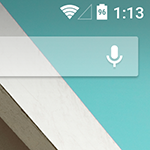
The other new option is full transparency. This is the alternative for developers and designers that are ready to throw caution to the wind and take full control of the experience. By setting the status bar to transparent, the only things actually drawn by the system in the status bar area are the icons and clock. This is basically the translucent option from KitKat without the gradient to protect the icons. Developers will have to be careful with this route, since a light or white background will make status icons invisible. The Google Now Launcher solves this issue by applying a long gradient, much longer in L than in previous versions of Android which limited the tint to just the status bar. It's also possible to keep the tinted status bar in apps.
Left: Google Now Launcher w/ all-white background, Center: all-white background w/o tint, Right: all-white background w/ tint
For the truly adventurous app creators, full transparency allows for some potentially amazing and beautiful interfaces without resorting to turning off the status bar entirely. With moderately dark or flat backgrounds, possibly even with animations, it's easy to keep the icons discernable and still add a lot of character to an interface. Here are a couple of quick screens I threw together to demonstrate some of the simple possibilities.
(Note: these are not mockups. They are screenshots from an app with custom backgrounds. The notifications are real and have not been edited into the pictures.)
Left: Includes Bird by IndigoCity, Right: Includes The Artist by TheEnderling
For developers interested in setting the status bar to their own color or full transparency, check out the documentation from the Material Design section. It's extremely easy, since it just requires setting the statusBarColor property through code or a theme. Regardless of how it's set, the app has to be using one of the Material themes as a base. And obviously, this will only work on API 20 or above. You can also catch a brief explanation in the session titled "What's new in Android" from Google I/O 2014.
[EMBED_YT]https://www.youtube.com/watch?v=3TtVsy98ces#t=989
[/EMBED_YT] It should be noted that the navigation bar at the bottom still cannot be set to fully transparent. It's not entirely clear from the talks or documentation, but it seems like that is probably intentional. However, there is a bug that prevents this area from taking on branding colors, which the documentation specifies is possible, so full transparency may still be an option once everything is working properly. It's still possible to use a colored background with a translucent navigation bar to achieve a similar effect.
Correction: The navigation bar can be modified with navigationBarColor. Thanks, Alan Viverette.
Sure, allowing apps to tweak the appearance of the status bar isn't a world-changing new feature; but little touches like this can elevate an app from a half-baked, incomplete interface to a truly elegant experience. We'll see apps like Evernote and Dropbox pushing their own brand colors into the status bar, and there will probably be a Twitter client or recipe database that pushes a mascot into the extra space, and there's (hopefully) nothing wrong with that. But this may also lead to unhindered use of art and motion. It's a small thing, but it just might be big for the right apps.