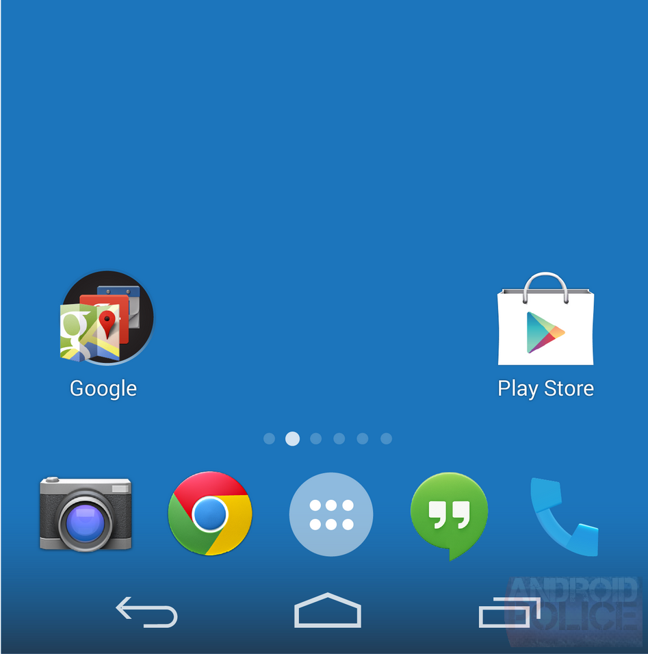
If you take a look at the mockup below (featured in this article), created by our very own Liam Spradlin, you'll see what we strongly believe the Android 4.4 homescreen is going to look like. New icons, transparent notification bar and nav buttons, and a stronger emphasis on white. Personally, I'm a big fan - Android 4.4 is cleaning up a lot of the messy, heavy-handed Tron-esque styling that hung on in the transition from Honeycomb to Ice Cream Sandwich.
Left: Android 4.4 [AP mockup], right: Android 4.3
A recent leak from TuttoAndroid basically lines up with what we're seeing here, and if Google is messing around with the look of the launcher, we can be reasonably certain the rest of the OS (and as time goes on, more of Google's own apps) will adopt a similar aesthetic. The blacks and gray gradients of Holo seem to be out, and softer edges and white / light gray seem to be in, a la Google Now.
So, do you like the new look? Hate it? Absolutely and utterly could not care less? Vote, and fight it out in the comments below.

