Announced at CES this year, the ASUS Cube has managed to get a decent amount of attention for a Google TV Box. Formerly known as the Qube, this angular, textured device came to market toward the end of last month, and I've been living with it ever since, trying to get a feel for the product and decide whether ASUS has something special on their hands.
In reviewing the Cube I wanted to answer two main questions that I think underlie every GTV device: Is the user experience a good one, and does the product successfully make Google TV something I actually want to use on a daily basis?
That having been said, let's dive in.
What it Looks Like
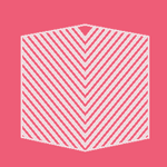
The CUBE is, as you are undoubtedly aware by now, a cube. The body is almost perfectly squared, only broken by diagonal stripes and beveled vertices. On the top, left, and right sides, there's nothing but stripes (save for a USB port on the right). The front has an IR receiver and a power indicator.
Around back, there are two HDMI ports – one in, one out. There's also a 3.5mm jack for a small, teardrop-shaped IR receiver, in case you need to position the CUBE such that the remote won't hit its main receiver. There's also a DC-in port, as well as one USB port and one Ethernet / LAN port. There's one more USB port inexplicably placed on the side of the device, too.
What strikes me immediately about the cube is how big it is. It's not bigger than a breadbox at ~4.9" high, wide, and deep, but given how light and airy it feels, I can't help thinking the body could be much, much smaller.
How it Works
The Interface
So, you know how the Cube is itself a cube? Well, so is the main user interface. The launcher is actually a rectangular prism, on which the long sides represent app/shortcut categories, and the short side is a quick selection of apps/shortcuts related to the category. ASUS' own video illustrates all you need to know about how the prism works.
[EMBED_YT]https://youtu.be/4f8fugsIn2w
[/EMBED_YT]
Of course, from the prism you can get to a full list of apps. Frankly, during my time with the Cube, I rarely did more than casually peruse the categories. The whole prism interface is awkward, unintuitive, and at least a little out of place. Do I know how to beautify Android 3.1 Honeycomb into a cohesive TV experience? No, but I can't help thinking there's a better way to do it than this. The prism would be substantially better if it managed to rotate with a higher frame rate, or switched the Cube branding from the long side to the short side, leaving more room for app shortcuts on its face.
One thing (perhaps the only thing, in my view) the prism has going for it is that it can be popped up over any app you're using, and popped back out of view if you change your mind, without ever exiting the app you were in previously.
Elsewhere in the Cube, you'll find things you'd expect to find in Android Honeycomb (ASUS hasn't yet announced plans to update the device to Jelly Bean, though LG has already stated it would give its devices the recent update).
If you stick with ASUS' launcher, the app drawer will probably be your best friend. It is still filled with a lot of categories like the Prism, but it is at least marginally easier to navigate.
Speed
Of course, the Cube's interface would be a lot better if it were actually very smooth. Scrolling through the prism is quick enough but fairly clunky, though the app drawer is just fine. Using the Chrome app, though functional, isn't a great browsing experience, but that opinion is likely a result of my distaste for the remote's keyboard, which we'll see later.
On the subject of speed, launching an app is generally no better than the launcher itself – particularly in the case of Netflix. I found myself waiting and waiting for things to actually launch in some instances, while some apps launched just as fast as I'd expect. Overall, the experience was not ideal. I felt like I was using a somewhat underpowered Honeycomb device.
Pre-Loaded Sundries
There are quite a few things pre-loaded on the Cube. Many of these are web bookmarks for the various categories you'll find in the app drawer and on the prism, few of which I actually found very useful. There are also ASUS-specific gallery apps, a music player, and various other augmentations.
Probably the pre-loaded feature with the most value is PrimeTime, which – if you've connected the Cube up with your cable box – will allow you to switch between "live" TV and on-demand content.
The Remote
The Cube's remote is pretty similar to most other Google TV remotes – one side is a full keyboard, and the other is closer to what you'd expect a remote to be – channel/volume controls, numbers, and media playback controls joined happily by back, voice, "Guide" and home buttons to help you navigate the Cube with ease. The Cube's touchpad is also used for clicking up, down, left, and right, but can also be used to control a mouse pointer. I point this out not because it's fantastic, but because it's a potentially good idea that's implemented in a way that leaves the experience wanting.
One thing that weakens the remote's experience for me is the textured directional cues. They're okay for clicking around, but you'll likely hit one of the directions if you haphazardly go for the center "ok" button. The position of the arrows indicates pretty much where the clicking area begins to trigger a directional movement. Bigger than that gripe, though, is that while using the pointer on screen, the textured cues totally disrupt the movement of your finger across the pad. I'm not sure for what purpose the red, green, yellow, and blue diagonal lines exist, but taking a similar low-profile approach to directional cues would have provided a much better pointer experience in my book.
The remote also has a special Netflix button, along with a couple of other buttons like mute, info, menu, and "LiveTV," along with one for a sort of window-in-window functionality.
Did I mention there are voice search and pointer buttons on the side of the remote? There are. And they're positioned in such a way as to cause my hand to graze them (thereby activating them) almost constantly.
All of that aside, I have to admit that no Google TV remote I've ever personally encountered has provided an excellent navigation experience. Yes, they all (for the most part) have utility, but there are just so. many. buttons. Thinking about it for a moment, I drew a quick comparison to Apple's remote. After all, the prospect of having just seven clickable things on a remote is lust-worthy compared to the idea of having eighty-five clickable things.
I realized, though, that Apple TV does things in a significantly different way from Google TV. Leaving aside for a moment the question of which is better, I think that perhaps the absolutely crazy remotes of most Google TV units are just a symptom of the platform – it's kind of clunky, hasn't found its killer application (yet?), and has a lot going on. Some people prefer that, but I'm not necessarily one of them.
Conclusion
At the beginning of my review I brought up two questions that I wanted to answer in living with the Cube for several weeks. The first of these asked whether the user experience was a good one. My answer to that is that ASUS has implemented an okay solution to the bad situation that is Google TV. Does the Cube successfully turn Google TV into an excellent experience that I personally would keep around for daily use? The answer to that one is "no."
While the Cube is a well-made (if hollow) device with a few solid ideas, it suffers from the pitfalls inherent in Google's neglected TV platform.There are too many things wrong with Google TV for a unique launcher and a mediocre remote to solve alone.
That said, if you're interested in buying the Cube, it's up for sale at Amazon for 9.99, and Newegg for 2.99.