A few weeks ago, we launched a little design contest with the main goal of getting some creative juices flowing ahead of firing up a full site redesign. We wanted to see some directions we can take the new AP logo and in exchange partnered with NVIDIA to reward the winner with a brand new Tegra 3-powered Iconia A510 (see our review).
As usual, there were a lot of creative submissions, and it was very hard to pick just one. But, in the end, there is only one prize, and we're going to award it to what I think was one of the more clever takes on the AP logo. Before I talk about the winner and the runners-up, I'd like to thank everyone - all 500+ of you who commented - for taking the time out of your busy schedules to contribute to Android Police. We love you all!
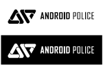
The Winner
Mark H. Evans' logo is clean, smart, geometrically interesting, and bears the right level of abstraction we were looking for. The A and the P (that's what those shapes are if you haven't picked it up right away) are brilliant. I personally think the monochrome version without the shadowing works best, but the one with colors is not too shabby either.
Congratulations, Mark. The Iconia A510 is rightfully yours!
Runners-Up
Since we had many outstanding entries, I felt that a number of contestants deserved special recognition as runners-up. Here they are:
Tom Kington
Jason Leslie Wright
Ryan Smith
KraYzeE
Joshua Richards
Michal Cabaj
Very clever - the ampersand is both an "and" and a "P"!
Krzysztof Stano
eM82 / Misi
Leigh Woods
Levon2
Joaquín Tuduri
Nick Hurlock
Graham Healy
Mark H. Delfs
Patrik Carlsson
Ha!
Martin Vasquez
For the lulz.