latest

Slack's revamped UI feels like a step in the wrong direction
Adding more clicks to do the same tasks is a great way to make people upset
Back in August, Slack announced it would introduce a new user interface to increase focus and productivity. Those changes started showing up earlier this month: buttons moved around, colors changed, and — perhaps most egregious of all — the workspaces consolidated into one icon. To say that some users are not happy about these changes would be a bit of an understatement.
Android 12L beta brings back Cast audio control, but not how you were hoping
This was entirely expected, by the way
Ever since it was revealed that the restriction on controlling the volume of Casted content with your device's volume keys was imposed for legal reasons, we've been waiting for a workaround to come into view. The Android 12L beta seems to have it (or at least the initial form of it).
Dark mode has been soaring in popularity as a design trend over the last several years, and for good reason — it minimizes eye strain when using computers over extended periods (Editor's note: It also looks slick AF). With major platforms like macOS, Windows, and Android offering darker shades, it became clear Chrome OS had to catch up with the pack. Dark mode is still in ongoing development despite work on it dating back almost a year now, and it looks unfinished — even today. But Google hasn't thrown in the towel here, and it's now adding another highly requested feature to make dark mode even better.
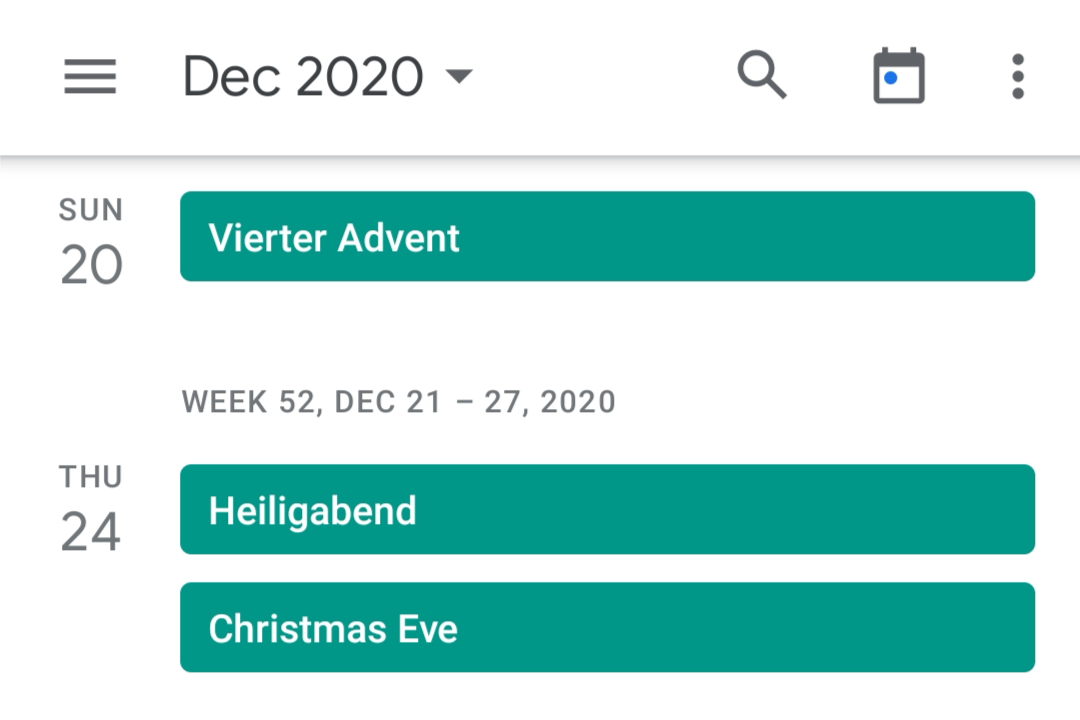
Google Calendar finally moved its search button to the top bar
It previously lived in the hamburger menu
Searching your events in Google Calendar can be a tedious experience, and many people might not even remember that's an option in the Android app at all. That's likely because the search button is hidden in the hamburger menu below the different view options. It looks like Google has recognized that this position doesn't make a lot of sense, as the company is rolling out a small UI tweak that moves the search button to the top app bar.
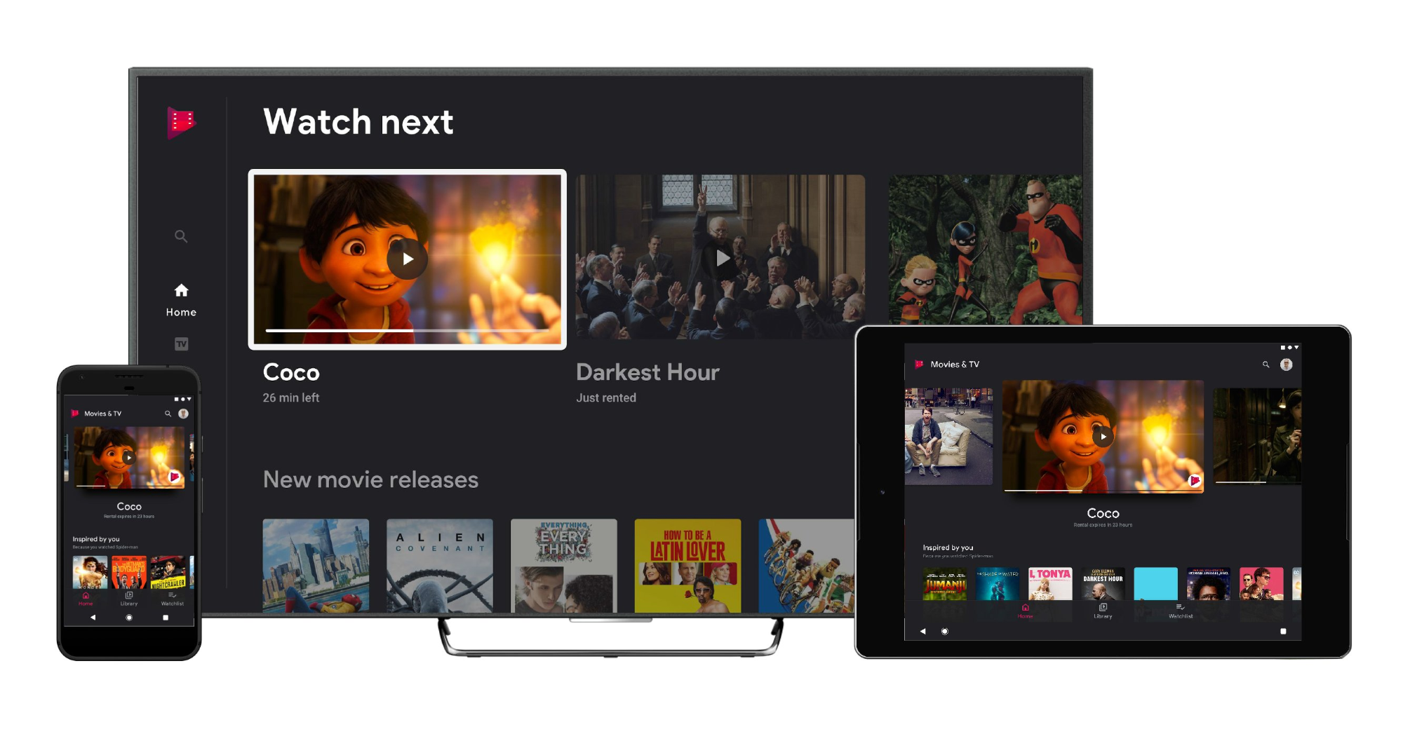
Google's Play Music & TV service has been long overdue for an update and revamp, especially on Android TV. The app has stagnated behind its counterparts, like the Play Store and YouTube, which got an interface uplift on Android TV in the past months, but it should be getting an overhaul according to new leaked screenshots.
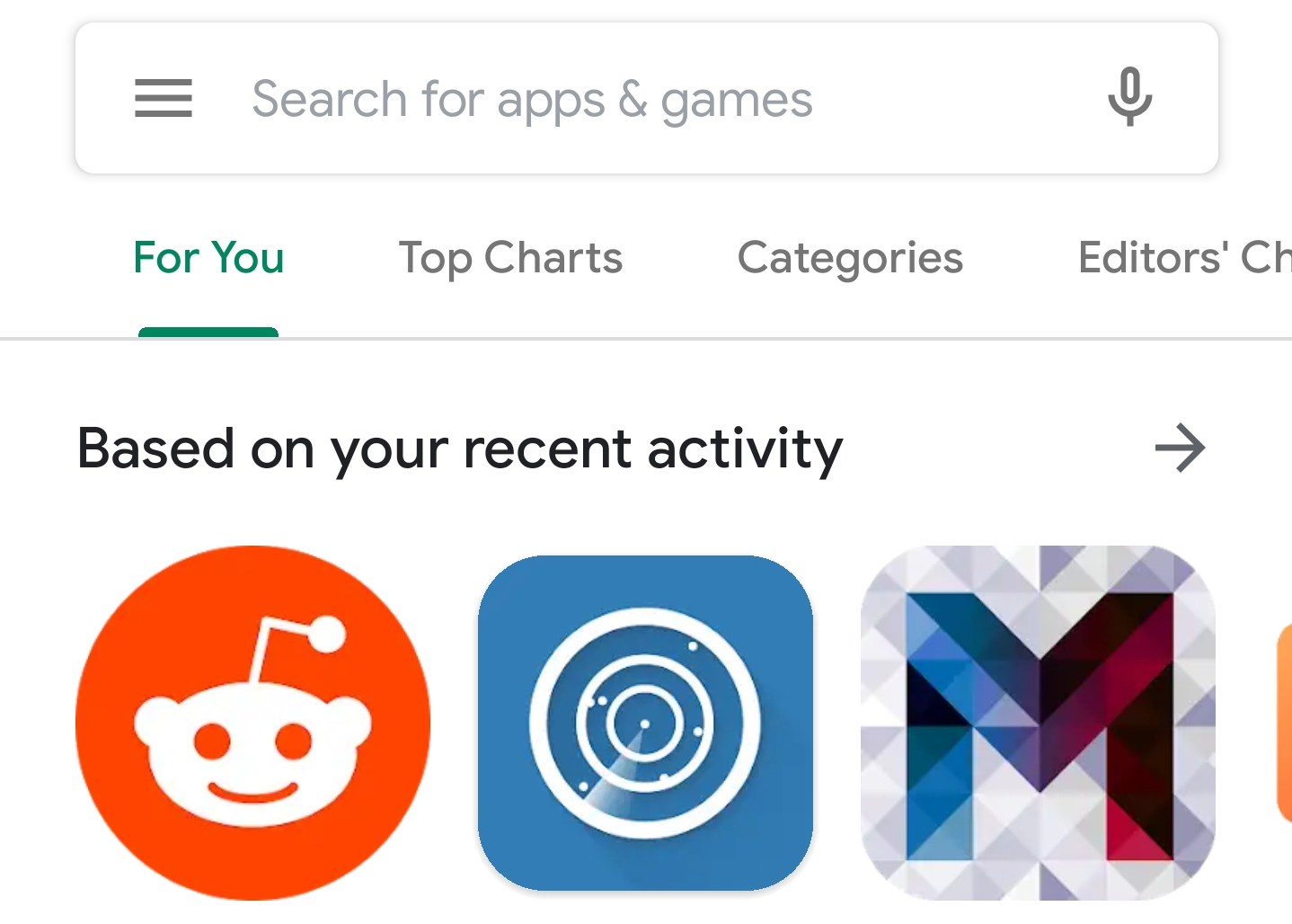
[Update: Now official] Google rolls out new Material Play Store interface with bottom navigation bar
Last month we reported the Play Store was about to get a design overhaul, including a new navigation bar that moved to the bottom of the screen. Although this could only be activated by fiddling with feature flags when we published our initial post, Google is now widely rolling out the new interface to users.
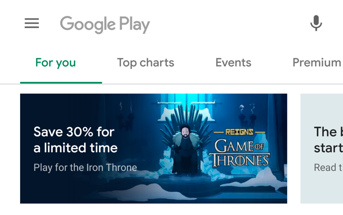
Read update
- Kieron Quinn has shared more screenshots of this new Play Store interface, including the search UI, and Music store.
Google has been busy refreshing the Material Design in its apps recently, and the Play Store seems to be among the next ones to get the treatment. Both 9to5Google and one of our tipsters has uncovered the new interface in the latest build by activating a feature flag, which hints the software is about to get a makeover.
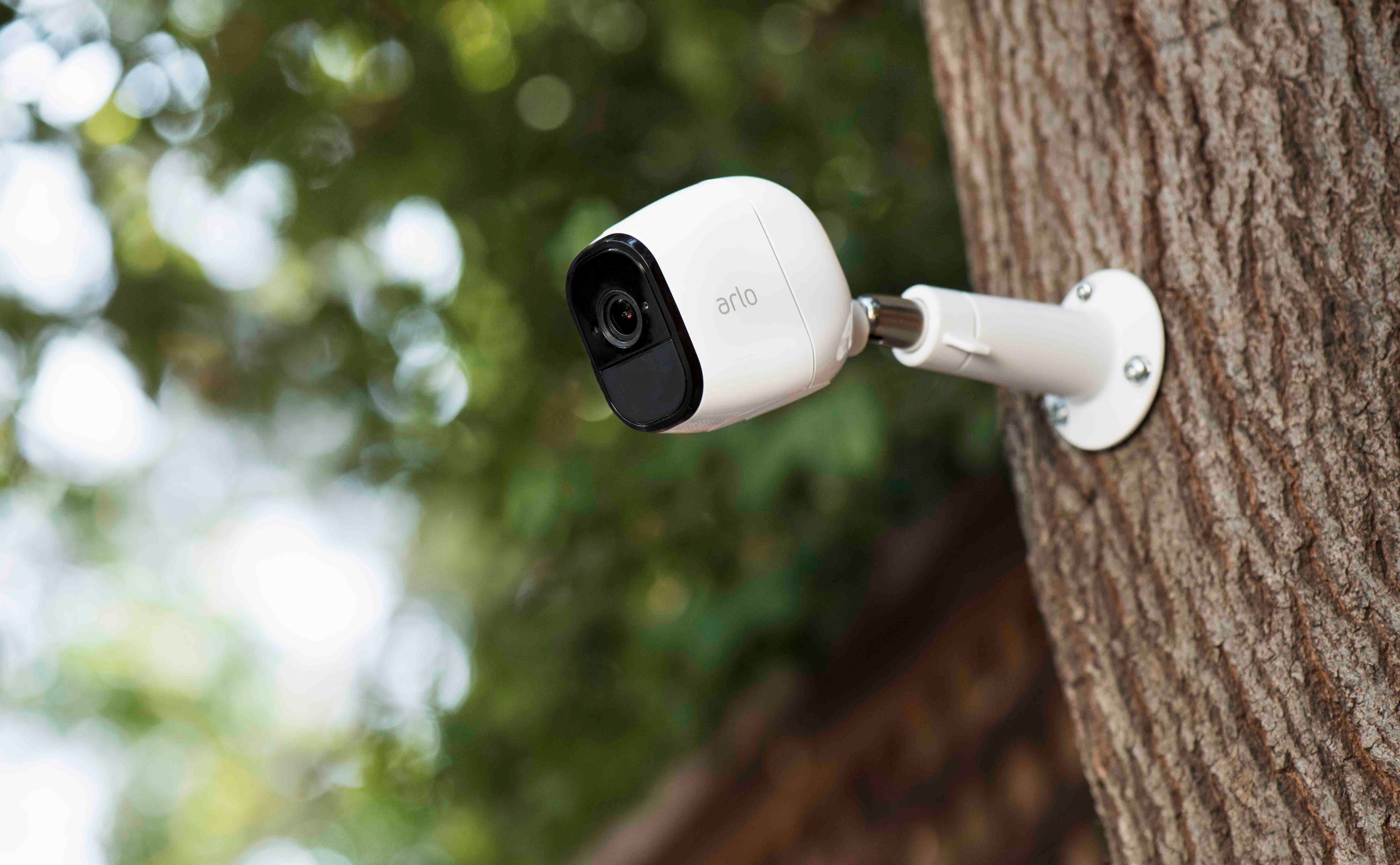
Connected security cameras from Arlo are some of the best on the market — Ryan called the Pro 2 the best wireless camera in his review, despite a couple of drawbacks. With Cyber Monday deals you can still get some substantial discounts on Arlo products (like at Amazon and Costco), and thanks to a tweet from the company's CEO, there will soon be even more features to make it worth your while.Only a few days ago, Arlo's latest update went live. It included animal, vehicle, and package detection to go along with the person detection features already available. According to CEO Matthew McRae, there's plenty more on the way, particularly when it comes to the UX of the service's apps.[EMBED_TWITTER]https://twitter.com/mbmcrae/status/1066481015655358464[/EMBED_TWITTER]2FA is something Arlo probably should have already, given that it's a security product, so that will be more than welcome. As will embedded time stamping and better notifications. Temporary notification muting also seems like a good idea, especially if you've got a party going on in the garden or there's a lot of expected activity. Then there's the good old widget, an all-time favorite feature of Android users — who doesn't love a homescreen widget.McRae went on to call these "long-standing requests" and said they would be prioritized for a Q1 rollout, with many more improvements also on the roadmap for the rest of 2019.Source: Matthew McRae on Twitter
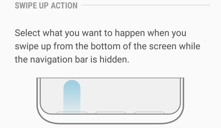
Gesture navigation is considered by some to be an important innovation in smartphone UX, not least because it removes the nav bar and allows for more content on the display. It's not easy to get it right, but Apple has done a pretty good job of it and Android OEMs like OnePlus have also had a good go (let's not waste our time discussing Google's Pixel abomination). Samsung's recently announced Galaxy A7 offers another new take on gesture nav, and it actually seems pretty good.
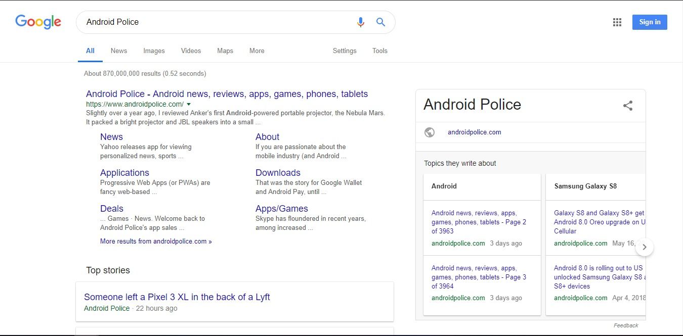
I've been noticing it pretty much since I arrived in Germany for IFA 2018, and now we've had a few tips from readers to confirm it. Google's desktop search UI is being updated to more closely follow the latest evolution of the company's Material Design guidelines — this means rounded corners everywhere, more white than a snowstorm, and a persistent search bar.
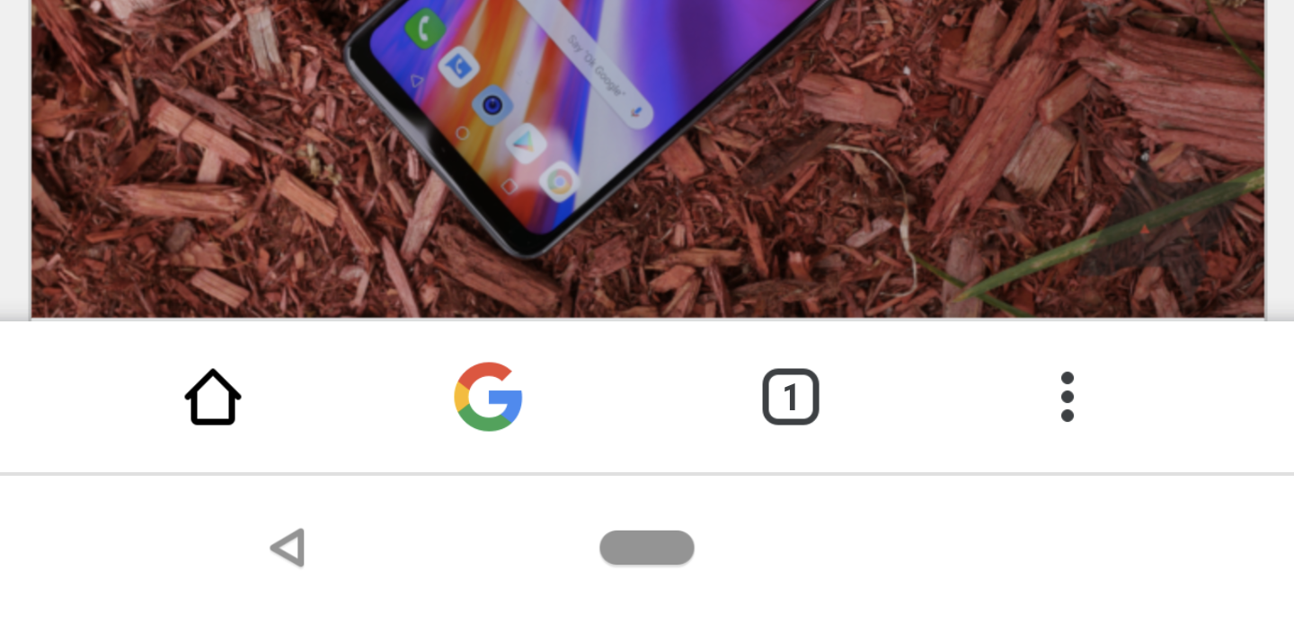
Google Chrome's Canary build offers "bleeding edge" features so they can be tested ahead of possible graduation to the more stable versions of the app. Recently, Google has been experimenting with the traditional top-positioned toolbar in response to ever taller Android handsets, first by moving the whole thing to the bottom (Chrome Home), and then by replacing that with a swiping up gesture to access the new tab page (Chrome Duplex).
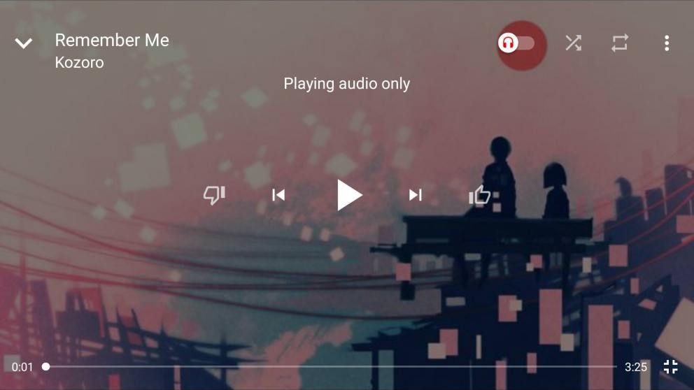
As Google prepares to sunset Play Music in favor of a new subscription model for YouTube Music, some changes to the app are being made to bring it in line with its competitors. A new fullscreen player UI is rolling out, along with a queue feature similar to Play Music that lets you line up subsequent songs and change the order at will.
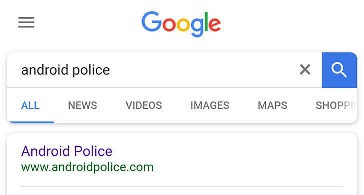
Google isn't one to rest on its laurels when it comes to the UX of its apps and sites. The company is continually testing different looks as it tries to keep up with the ever-changing design landscape and make its products as easy to use as possible. Search is still the company's bread and butter, and accordingly, it gets A/B tested more than most other properties. These latest changes have been tested to varying extents in recent months, and from the numerous tips we've had it seems they're being rolled out more-widely now. Let's take a look at what's new.

This is one of those minor UI changes we often see pop up in Google's apps, but we've been getting so many tips about it we thought we might as well let everyone else know about it. The Play Store, the portal to the Android app world, has been updated to include a slightly altered menu layout, and to be honest, it is an improvement.
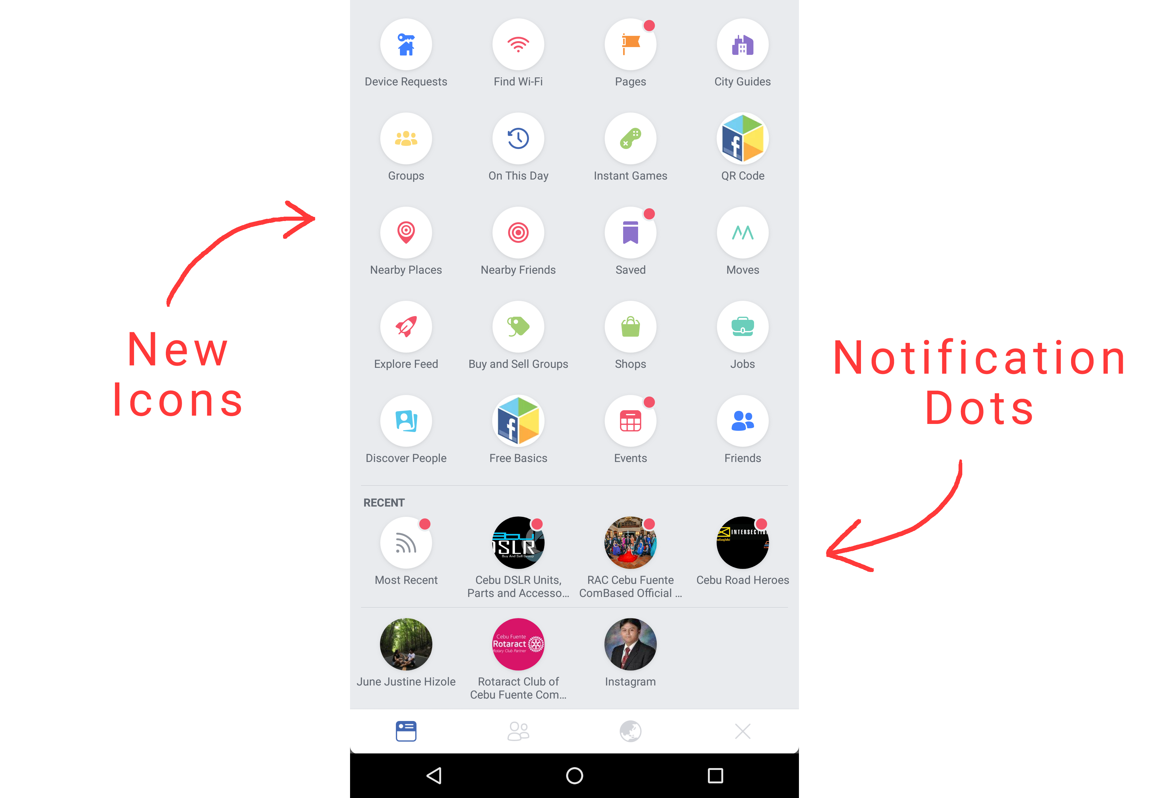
The devs in Menlo Park have been busy recently rolling out significant changes to the look of the Facebook app for Android, more about which you can read here. We've now received tips about a further change that's currently being tested which replaces the linear, swipe-left hamburger menu with a pull-down grid of options. The new layout even has notification dots, just like Android Oreo.
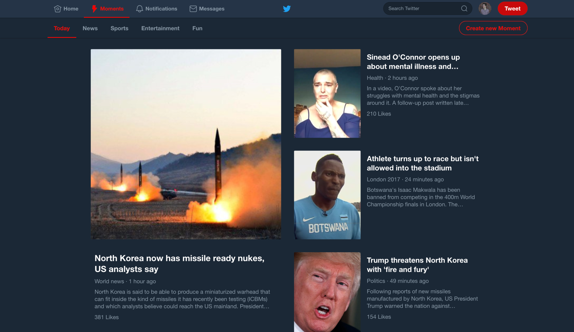
It's been roughly a year since Twitter made a ton of users very happy and fully introduced a night mode for its Android app. That was such a popular move with anyone who hadn't defected to a third party Twitter client that it seemed a dead cert it would eventually come to the desktop site. That time has now come.
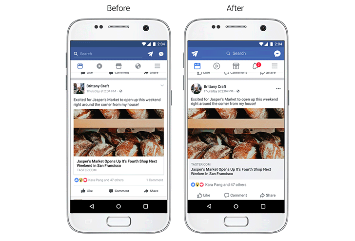
Although it might not always seem like it, UX is paramount to Facebook's devs. They want to make engagement with the app as easy as possible in order to persuade users to keep coming back for more. Every change they make is rigorously tested, a difficult task given UI preferences are highly subjective among the app's billions of users. For that reason, we don't see too many changes. Over the next few weeks, Facebook is going to roll out some of the biggest visual adjustments we'll have seen for quite some time.
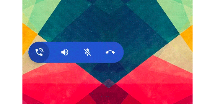
If there's one thing that's certain in life, it's that Google is always testing some sort of interesting UI change in one of its apps. Some of them end up on the scrapheap, but some of them end up being integral parts of the experience we all have when using our Android devices. The latest test to be discovered is a floating bubble UI in the Google Phone app.

Google recently made some significant changes to its Play Music app for Android, adding a search history and notification channels for use with the upcoming Android O release. That was followed up with the addition of New Release Radio, a personalized mix of recent releases similar to your own collection. Thanks to a couple of tips, we've also become aware that Google is testing a couple of small improvements to search in the app, namely a play button and album art for top results.
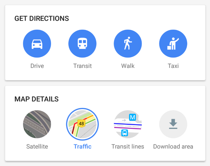
Google announced today on its India Blog that it's introducing a new home screen layout for Maps on Android. The new interface has been designed exclusively for users in India. In what looks like a streamlined version of the pull-up tab found in the US and European versions of the app, here we see cards that are optimized to be less data-hungry and load faster on poor connections across India.


