latest
Android 12 Beta 5 fixes the annoying square search bar
Back to rounded edges with the new universal search, which is also now live
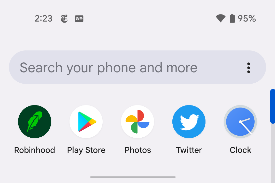
Among the more vexing changes in the Android 12 Betas to date has been the apparent bug that caused the search bar/widget built into the Pixel Launcher to lose its curves, not just appearing as a hard-edged square but with an off-center Google logo, to boot. As far as pedantically tiny frustrations go, it was maddening. Android 12 Beta 5 thankfully fixes that problem, and it looks like it won't be an issue when it hits stable.
The Google search bar is being a square in Android 12 Beta 3
A little bug in the app drawer breaks the rounded aesthetics
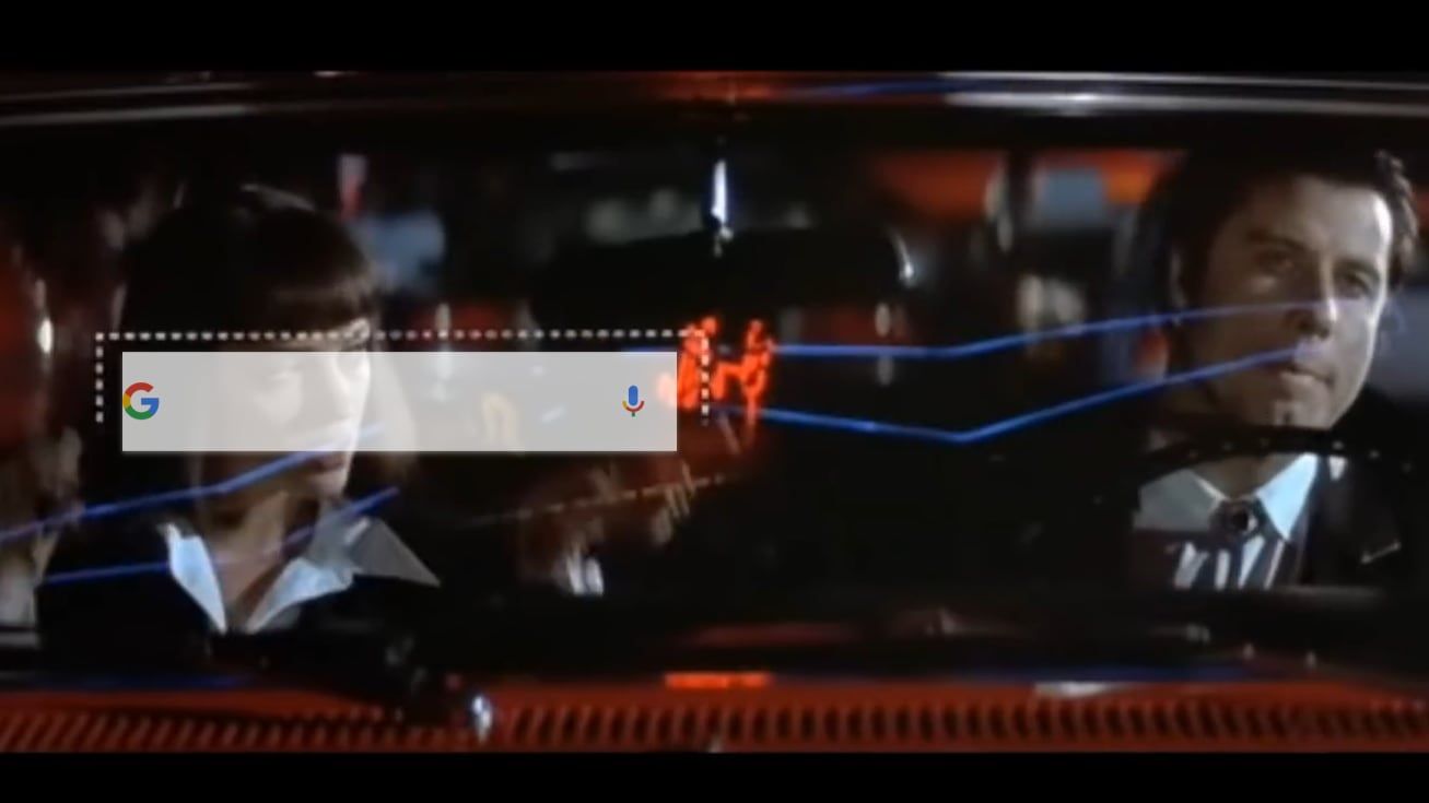
Android 12 Beta 3 is the last beta before the new OS reaches platform stability, but that doesn't mean that there aren't still bugs that need to be ironed out. Among them is one that's rather fun. No matter which icon shape you choose for your launcher, the search bar in the app drawer is always square with a rather misaligned Google icon.

Twitter for Android finally gets a search feature that should've arrived much sooner
It’s been live on the iOS app for two years
While direct messages are great for private conversations on Twitter, it gets increasingly challenging to locate that one thread you're looking for in the long list you’ve built up over the years. To make the process smoother, Twitter is finally adding a search bar in the DM section of its Android app — about two years after the iOS app got one.
There's nowhere Google Lens won't follow you — it's coming to the Pixel Launcher search bar next
Every move you make, every breath you take ...
Google Lens is an incredibly powerful tool that probably gets used way too little — you need to know how to access it in the first place, and even though Google isn't shy about adding it almost anywhere you could think of, it might still not be as discoverable as the company would like it to be. That's probably why it's experimenting with adding it to the homescreen search bar on Pixel phones.
Google wants you to use Lens so badly it might get tacked onto the Search widget
Lens creep has been happening for a while
Google Lens combines the power of live image processing vis a vis your phone's camera with artificial intelligence and the enormous reach of the company's search engine. Apparently not enough people know to use the app, though, so it has been working on making it more visible to users across Android.
Seven OxygenOS features we hope to see in stock Android someday
Good artists copy... you know the rest
Read update
Much more than hardware, OnePlus has matured on the software front in its relatively short existence in the smartphone space. In all these years, OxygenOS has embraced some neat little features that, in their own imperceptible ways, make our lives much easier. We’ve always liked how OnePlus handles customizations and its myriad of accessibility features. Now that some of these OxygenOS elements have lately been creeping into stock Android, we’re left wanting more.
YouTube has started testing two new so-called "experiments" across its various platforms: A new sign-in reminder prompt that may appear on the web and TV devices, and a new search bar on Android that replaces the old search icon. It still looks nothing like search bar Google uses for all its other apps, but YouTube's known for sticking with its own entirely different design choices for no good reason.
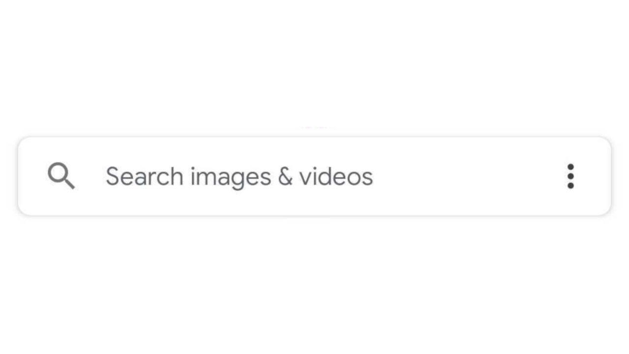
Google Messages is the main SMS client for Android, and while most of the app's recent development has been focused on improving RCS, the design team has also been hard at work. Now the app is receiving a top search bar, similar to what Gmail and other Google apps already have.
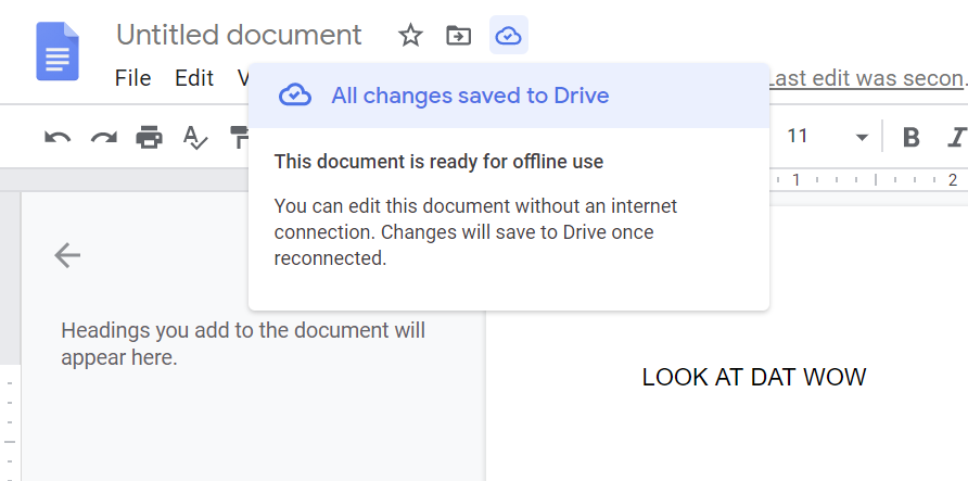
A handful of minor tweaks to G Suite's Android apps and Google Docs for the web have landed in recent days. None are game-changing improvements, but you can look forward to seeing a new document status indicator the next time you fire up Google Docs in your browser, and the Sheets, Docs, and Slides Android apps have picked up search bars and account switchers that match the redesigned look other Google apps have been getting recently.

The once-handy home screen Google search bar is acting up on Pixel devices. Many users, including some here at Android Police, are experiencing an annoying glitch that causes the bar to not show search history or suggestions of any kind.
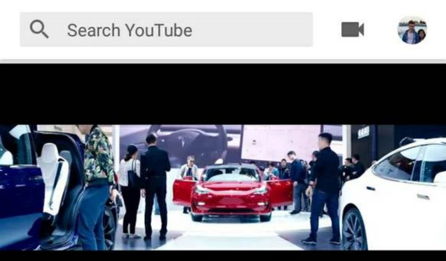
There's a good amount of Google apps that have top-mounted search bars, and it looks like the YouTube app may be about to join the club. This latest YouTube test we've caught gives the home screen a bit of a makeover, with the revised top bar and larger thumbnails.
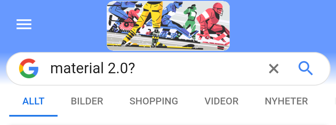
Google is well-known for constantly experimenting with new designs and UI changes, mostly via limited server-side tests. What we see here is no different; the company seems to be trying out a more rounded search bar, one that matches more closely with the one seen on the Pixel Launcher, on its mobile site.
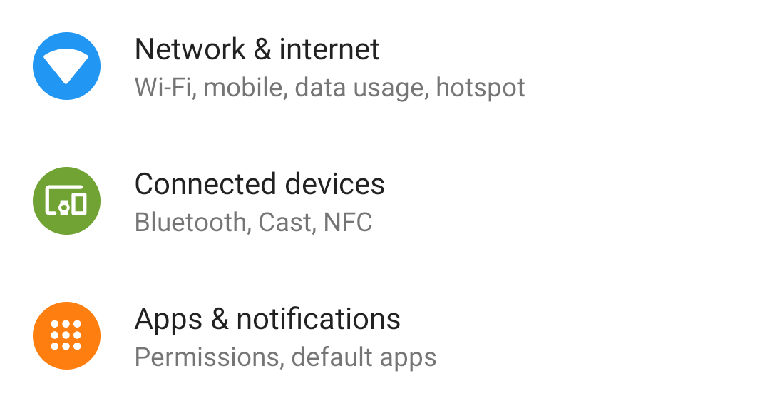
Were Android Oreo's settings just too boring for you? Did they look too black-and-white? Good news - Android P's settings menu has a lot of color, as well as a revised quick search bar. If anyone else is getting reminded of TouchWiz (back when it was still called TouchWiz) and ZenUI, you're not alone.
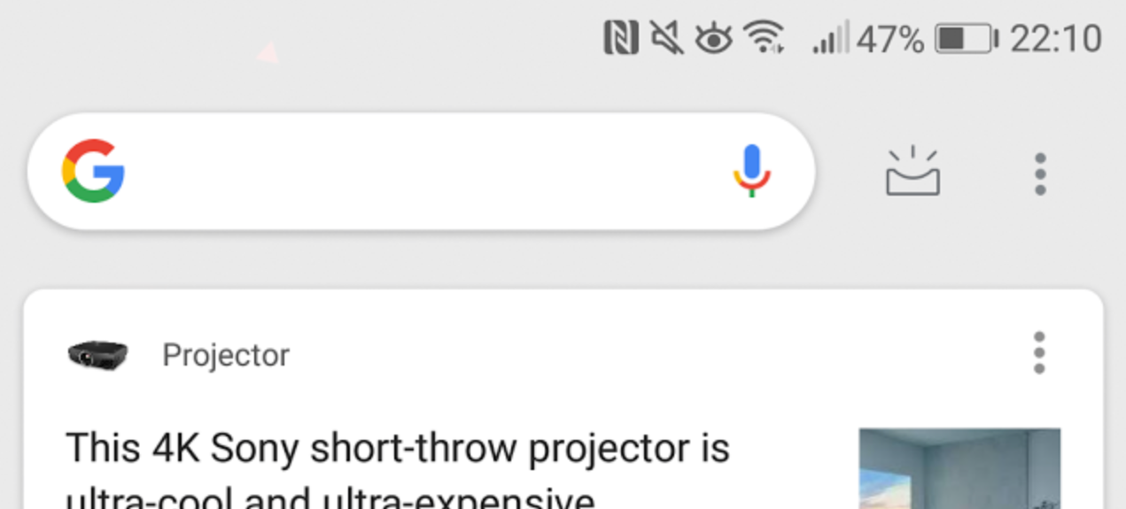
Over the years, the Google Now page has undergone more than a few changes, and it was even renamed a few months ago to 'feed.' Some users are reporting that they're seeing a new search bar design in their Google feed. Now that it's here (again), it's a bit confusing why it disappeared in the first place.
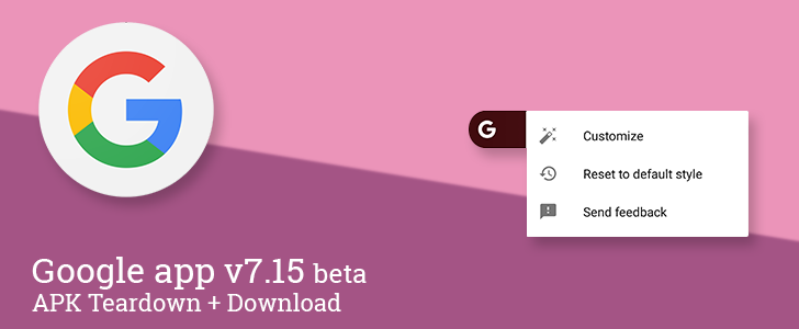
A new version of the Google app is making the rounds to users that have opted into the beta channel. This update is a bit tamer than some other recent version bumps. The only change popping up in the live interface at this point is a command to return the Google search widget to its original styling. However, there are quite a few small topics in the teardown, including the addition of Scenes to the upcoming support for Routines (a.k.a. multi-action shortcuts) and a couple more details about Quartz and devices that may be related to it.
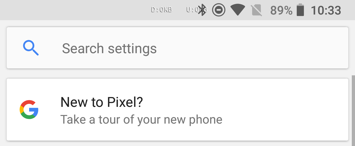
In the past couple of years, many apps have traded small search icons for full-width search bars. The Google Play Store is a prime example of this, and it makes hitting the search button much easier. To my eye, it improves the appearance of the app as well, but that's subjective. The Android 8.1 Oreo developer preview has brought the top-mounted search bar to all devices, marking another Pixel 2-exclusive lost.
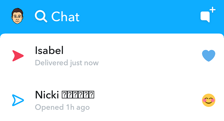
Snapchat is readying an update for its Android and iOS versions that brings a new interface with plenty of usability improvements and a few added features. The update is now rolling out to beta testers on Android so you can give it a go before it goes live for everyone — and thus feel cooler than the cool kids, I guess. Just don't use the word "thus" when you tell them that.

The Play Store, like many other Google apps, is no stranger to server-side UI updates; however, it's pretty rare for Google to be testing multiple changes at once. Currently, Google is not only testing a renamed Entertainment section, but also a different look for the carousel, the removal of the search bar, and a new Google Play Store banner.
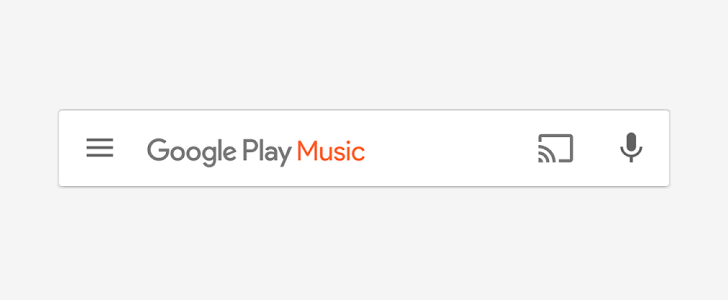
Google is on a crusade against search bars. Or so it seems to us at least. Late last year, the Play Store received an interface revamp that dumped the green search bar in favor of an overlaid grey bar with a hamburger menu, a voice search icon, and the words Google Play in grey that disappeared as soon as you started typing. Then a few days ago, it changed Play Books' search bar to a look that sits somewhere in the middle, with the blue bar switching into the grey one when you tapped to search.


