latest
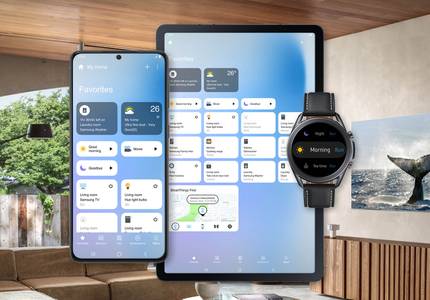
Samsung's SmartThings app is getting a new UI
The company also doubled down on its commitment to Matter

Building a smart home ecosystem can make the smallest elements of your life a whole lot easier, but even the best hardware around isn't any good without an excellent software experience backing it up. Today, Samsung is relaunching its SmartThings app with an all-new interface to help power every gadget in your home.

Inoreader v7 brings a more Material look to our favorite RSS reader (APK Download)
No new functionality, though

It's been eight years since Google killed Reader, its RSS service, and that wound has yet to heal in our hearts. Many alternative services sprung up afterwards, with Inoreader being one of the closest things to the original Google Reader, even down to the web app's keyboard shortcuts. Now, many years later, Inoreader is still going strong and has just began rolling out v7 beta with a more modern design.

Google Home app rolls out a better and cleaner UI for routines
It has the new sunrise and sunset routines
Google Home and Assistant routines have improved quite a bit since their launch in 2018. We started with six preset routines then got customization and scheduling, workday organization, home/away presence sensing, and just yesterday discovered sunrise and sunset routines. Turns out that functionality is part of a huge routines overhaul that brings the look of the feature more in line with Google's recent design language. Functionally, though, I'm sad to say not much has changed besides the new sunrise/sunset options.

Read update
Several months ago, Spotify began testing a new Now Playing interface that left us scratching our heads. It removed both the replay and queue buttons from the main UI and hid them under the secondary menu. Of course that was not a smart move, and Spotify is now rolling out (server-side) another take on that redesign, but with more sensible decisions. And I like it.

Google has toyed with Assistant's interface on Android countless times so far, adding a keyboard input method, Google Lens, then the Explore section, and finally the Now-like interface of upcoming cards (aka "visual snapshot"). But two things have puzzled me about it: one is that Explore and Visual Snapshot were almost invisible to people and I always had to explain where the icons were and what the did, and two is that getting to your Assistant's settings was an even more obscure process, and it was almost easier to just do it from the Google Home app than Assistant. Well, it seems that Google is working on solving at least the first of these problems.

Oh Spotify, oh Spotify, oh Spotify... Users ask you to improve your app's interface and you go ahead and try something that doesn't make sense. But such is life and, thankfully, this new interface is still a server-side change that we shall pray never comes to everyone.

We live in a perpetual server-side microscopic interface change whirlwind. One day you get used to a new interface, the next another one starts popping up, improving some things, worsening others, and generally making our lives a little miserable in the process. But I can't complain, it's part of the reason I have a job, isn't it? The latest new UI we've spotted affects YouTube on Android TV, and it's not all good news.


Netflix has announced that a new interface for its TV experience is rolling out starting today. The updated layout, seen above, includes separate tabs for movies and TV series, among others. It's not clear which specific apps are getting the new look and when — Netflix only said that the update "will begin rolling out to members all over the world today."

Google Assistant (Express) shopping list adopts a new interface with images and better swipe actions
Google Assistant's shopping list is probably one of the most loathed features of the service. Google didn't do it any favors when it forced users to adopt the new web-based Express interface instead of having the list in Keep, and the hatred has kept spewing since then. I'm sure some of you like it, some are indifferent to it, others use it because they have to, and others wouldn't touch it with a ten-foot pole. Today's news won't convince the latter to give it a go, but if you belong to the first three categories, there's a new interface to feast your eyes and fingers on.

Google Keep for Android Wear has made a significant jump from version 2.0.08 to 4.1.091. Along with this jump comes a new design that makes note actions easier to get to, though it does remove one neat feature that I often used.
There are many ways you can get a translation on your Android phone like searching for "translate x to Spanish" or going to the Google Translate website. But if you're travelling or your work requires constant access to translation, the Google Translate app is essential and thanks to its latest changes, it's even a little easier to use.

YouTube is one of Google's most server-side test prone apps. Every couple of weeks, sometimes even days, we spot a new layout somewhere that brings a little change to the table. The latest is a renamed 4th bottom tab to Activity.

Google is gearing up for tomorrow's Pixel event and one of the first hints of everything we've got coming our way is a redesign of the Google Home app that seems to be rolling with the new version 1.25.81.13. We're seeing it on all of our devices so this doesn't seem to be a sever-side test.

Remember the new Play Store "My Apps" screen layout that we spotted in testing in a dogfood version in February? Well, that appears to be rolling out more widely now, possibly even to everyone. You may need to clear the Play Store's app data and restart it to see the change (which might revert you back to the old lime green color for a bit before it switches back to the new darker green, thought I'd warn you), but it should be working for everyone now based on the number of tips we've received and on testing with our own devices.

Google started testing a Preview redesign of Google Contacts' web interface back in March of 2015. At the time, you could access it by going to contacts.google.com/preview and it looked nicer than the old Gmail-like Contacts page. As time passed, Material Design evolved even further and that redesign itself was getting stale. A slightly updated version was rolled out to G Suite users in March of 2016, but the biggest redesign is happening now and it's affecting everyone.

Snapchat is readying an update for its Android and iOS versions that brings a new interface with plenty of usability improvements and a few added features. The update is now rolling out to beta testers on Android so you can give it a go before it goes live for everyone — and thus feel cooler than the cool kids, I guess. Just don't use the word "thus" when you tell them that.