latest
Chrome Home's bottom address bar: Ahead of its time and intentionally left behind
Ex-Google original designer recounts the history of his project now that bottom address bars are hot again
Plenty of folks, including us, found a few of Apple's changes to Safari in iOS 15 to be familiar, resembling a redesign Google spent years testing for Google Chrome. While that UI, originally called Chrome Home, was ultimately abandoned after years of testing on users, a former Googler and designer intimately involved with the changes recently published a short but fascinating account of the time that pulls aside the curtain on the rise and fall of Chrome's now-defunct bottom navigation bar.


Google has been working on some variation of a bottom bar in Android's Chrome browser for nearly four years. It started as 'Chrome Home,' which moved the entire address bar to the bottom of the screen, but it was later revamped into 'Duplex,' later renamed to 'Duet' to avoid confusion with the Google Assistant feature of the same name. Now it appears the long-running interface experiment is gone for good.


Google Chrome's Canary build offers "bleeding edge" features so they can be tested ahead of possible graduation to the more stable versions of the app. Recently, Google has been experimenting with the traditional top-positioned toolbar in response to ever taller Android handsets, first by moving the whole thing to the bottom (Chrome Home), and then by replacing that with a swiping up gesture to access the new tab page (Chrome Duplex).

For over a year now, Google has been working on an overhaul of Chrome's interface on Android, called 'Chrome Home.' It moved the address bar to the bottom of the screen, and pulling up on the address bar would reveal an updated New Tab Page. Despite it being mostly ready for release, Google canned it earlier this month for reasons unknown.

Read update
- XDA Developers discovered a commit in the Chromium gerrit, describing what is probably the successor to Chrome Home. The code snippet describes 'Chrome Duplex,' a split toolbar mode of Chrome Home. On the latest build of Canary, the #enable-chrome-home flag has been renamed to #enable-chrome-duplex, but turning it on does nothing at the moment.
For over a year, Google has been testing an experimental interface in Chrome for Android, nicknamed 'Chrome Home.' It first appeared in October, and at that point, the only change was the address bar being at the bottom of the screen (instead of at the top). Then the New Tab Page was revamped with a bottom tab bar, and in August of last year, the UI was changed again.
It's that time of the month again - Google has released a brand new version of Chrome for Android. We're now up to version 63, which brings a few useful improvements and further changes to the in-development 'Chrome Home' interface.
Chrome 62 was released a week ago, and as always, that means the next release has moved to beta. Chrome Beta 63 includes a massive number of changes, including the finishing touches for Chrome Home, a brand new flags page, new options for web apps, and more.

It has been about a month and a half since the last Chrome release, but good things come to those who wait, right? Chrome 62 includes yet another redesign hidden behind a flag, some new APIs developers can use, and several smaller tweaks. So without further ado, let's get into it.

Chrome 61 was a huge update. Not only did the long-awaited Chrome Home UI (the bottom URL bar layout) finally start rolling out, but it also improved the Google Translate bar and file picker. Chrome 62 isn't quite the overhaul that 61 was, but it already has improvements to the round Chrome Home UI and enables several new APIs and features.

The past few Chrome releases have only had one or two user-visible changes, with most of the work going into new features that websites can use. But Chrome 61 has plenty of both, most notably the new Chrome Home UI that is finally rolling out. Let's dive right in, shall we?

Google's experimental 'Chrome Home' interface first appeared nearly a year ago, but at the time, the feature only moved Chrome's address bar to the bottom of the screen. It became a full revamp of Chrome's UI in March, by changing the New Tab Page and adding a bottom navigation bar. Earlier this month, the 'Modern layout for Chrome Home' flag showed up, which made the Chrome Home interface more round.

The 'Chrome Home' interface, which only moved Chrome's address bar to the bottom of the screen, first appeared back in October. Since then, it has turned into a complete overhaul of the app's interface, with a revamped New Tab Page being added into the mix. Now it's showing up in Chrome Beta by default for some users.
The experimental 'Chrome Home' interface first appeared in October of last year, and at the time, only moved Chrome's address bar to the bottom of the screen. Google has continued to work on it since then, like adding a revamped New Tab page with a bottom tab bar. A new flag has appeared in Chrome Canary, that further changes the Chrome Home interface by making everything round. In other words, there's a new experiment for the experimental UI.
We first spotted the 'Chrome Home' flag back in October, which moved Chrome's address bar to the bottom of the screen. Since then, Google has continued to refine it, but it still remained hidden behind a flag. Starting with the latest build of Chrome Dev 61, it appears to be turned on by default for most users.

Back in Chrome 54, Google replaced Chrome for Android's New Tab page with a new design that prominently featured suggested content - much like Google Now's feed. To quote Douglas Adams, "This has made a lot of people very angry and been widely regarded as a bad move." Switching to the old design was possible by disabling a few Chrome flags, but the recent Chrome 58 update removes this ability.

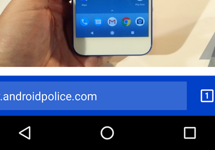
As you may know, Google often tests new Chrome features in 'flags' - hidden settings that can be enabled or disabled. We first spotted "Chrome Home" in October, which moves Chrome's address bar to the bottom of the screen. This is especially handy for larger screens, but it looks like more changes are coming.
In a world of large phones, it makes sense to move commonly-used actions to the bottom of the screen. A new flag in Chrome Dev and Canary, only described as 'Chrome Home,' moves Chrome's address bar to the bottom of the screen when enabled.