latest

Google Chrome is testing a way to jump straight to the juicy bits about a business
Waste fewer taps trying to look up restaurant reviews
Ever since this year’s annual I/O developer conference made Google’s focus on AI more apparent than ever, we have been seeing AI-related features make their way into everything from Search to Workspace. However, Google Chrome continues marching onwards with a steady influx of new features on desktop and mobile. We just caught a glimpse of a particularly handy way to look up businesses quickly in Chrome.
Chrome is getting a fresh Material makeover for its system pages
Settings, bookmarks, history, extensions, and downloads ditch the blue for an all-white aesthetic
It's been a few years now since Google gave Chrome one of its biggest makeovers to date — a perfect treat (for most) to celebrate the browser's first decade. Its Material makeover ditched the trapezoidal shapes and drab gray for a modern, rounded look that's more in line with Google's updated design system. However, the lack of theming in Chrome's system pages (settings and bookmarks, for example) is a testament to the absence of consistency in Google's implementation of Material Design. But with an upcoming change, it seems like the company finally wants to apply its attractive design language to Chrome in a consistent manner.
Upcoming Chrome test releases will have easy access to an Experiments menu
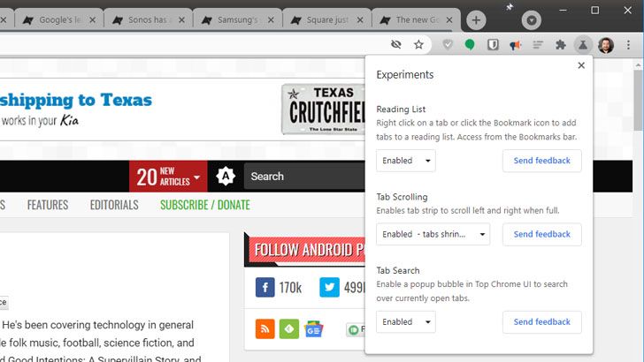
The feature was previously called Labs; tab scrolling, tab search, and a reading list are the first features highlighted in the menu
Google tries out a lot of tweaks on its early Chrome browser and Chrome OS builds, though most of it isn't immediately user-facing. In the Chrome 91 build some of those changes will be more obvious thanks to the Experiments menu, previously called Labs. You can find it by clicking the beaker icon that's now next to your user icon in the menu bar, and it's now enabled by default on Canary.
Google is adding tutorial videos to Chrome for Android
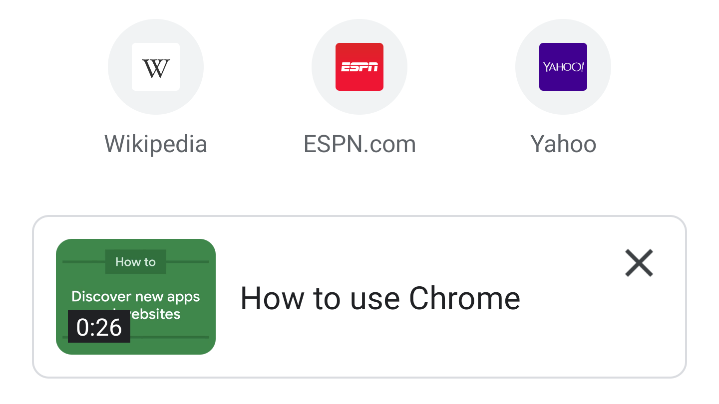
The videos will cover web searches, offline support, and more
Google Chrome is already (mostly) simple to use, but there is plenty of functionality that isn't well-documented or easily discoverable. That could be why Google wants to add video tutorials to the browser, which are now being tested in the Chrome Dev and Canary channels.
Chrome's crowded grid tab switcher gets trending search suggestion chips
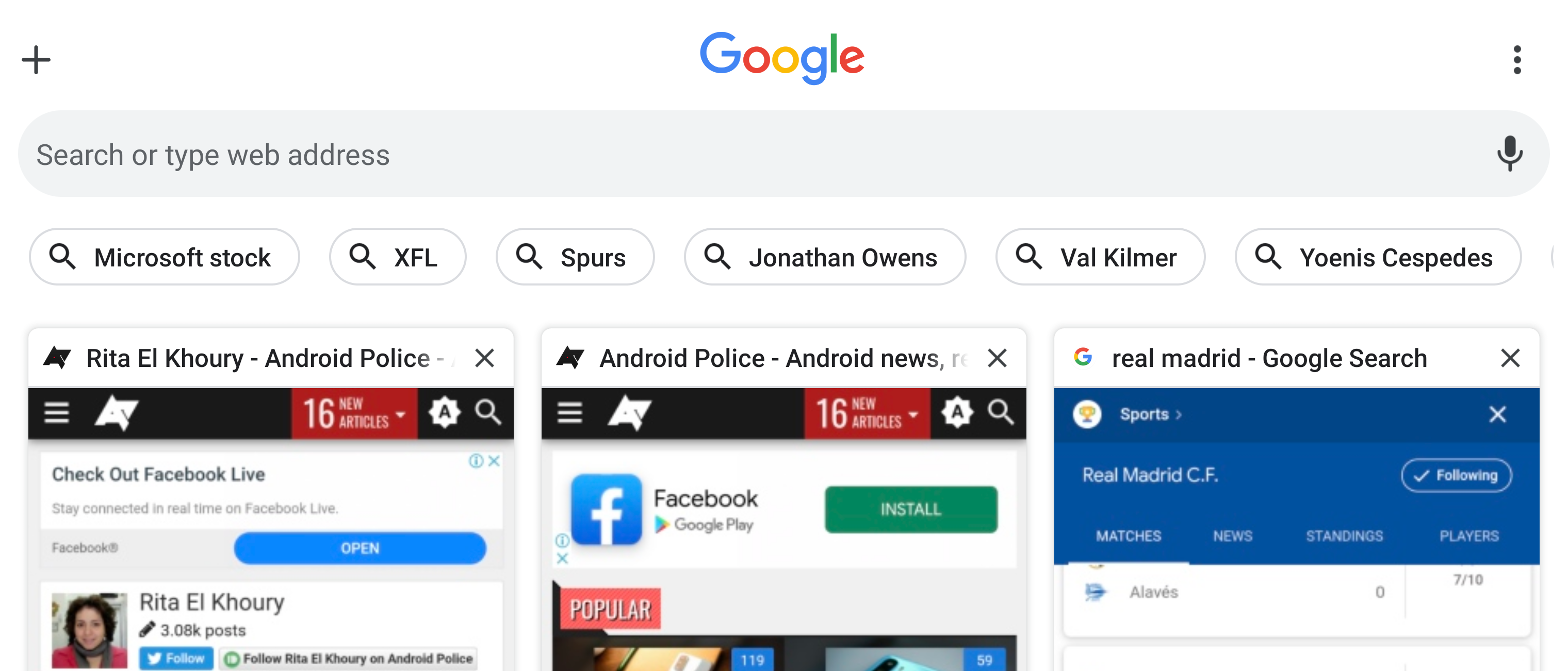
Another way for Google to suck you into its Search product
Late last year, Chrome began testing a very busy tab switcher interface with a grid layout, incognito toggle, Google search bar, and site shortcuts. A few reiterations later, we're now looking at a slightly newer approach which keeps everything nearly the same, but puts trending search terms at the forefront instead of site shortcuts.
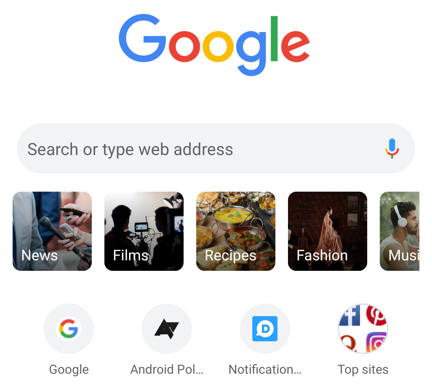
Chrome is testing 'Query tiles' to help you start a quick search from any tab
They're like search shortcuts with images
Chrome's team is always experimenting with new ways to surface content for your or speed up your search when you open a new tab page. Over the years, we've seen bookmarks, downloads, Discover content, games, top sites, and more, show up on this previously empty page, and now we've spotted another experiment called "query tiles."
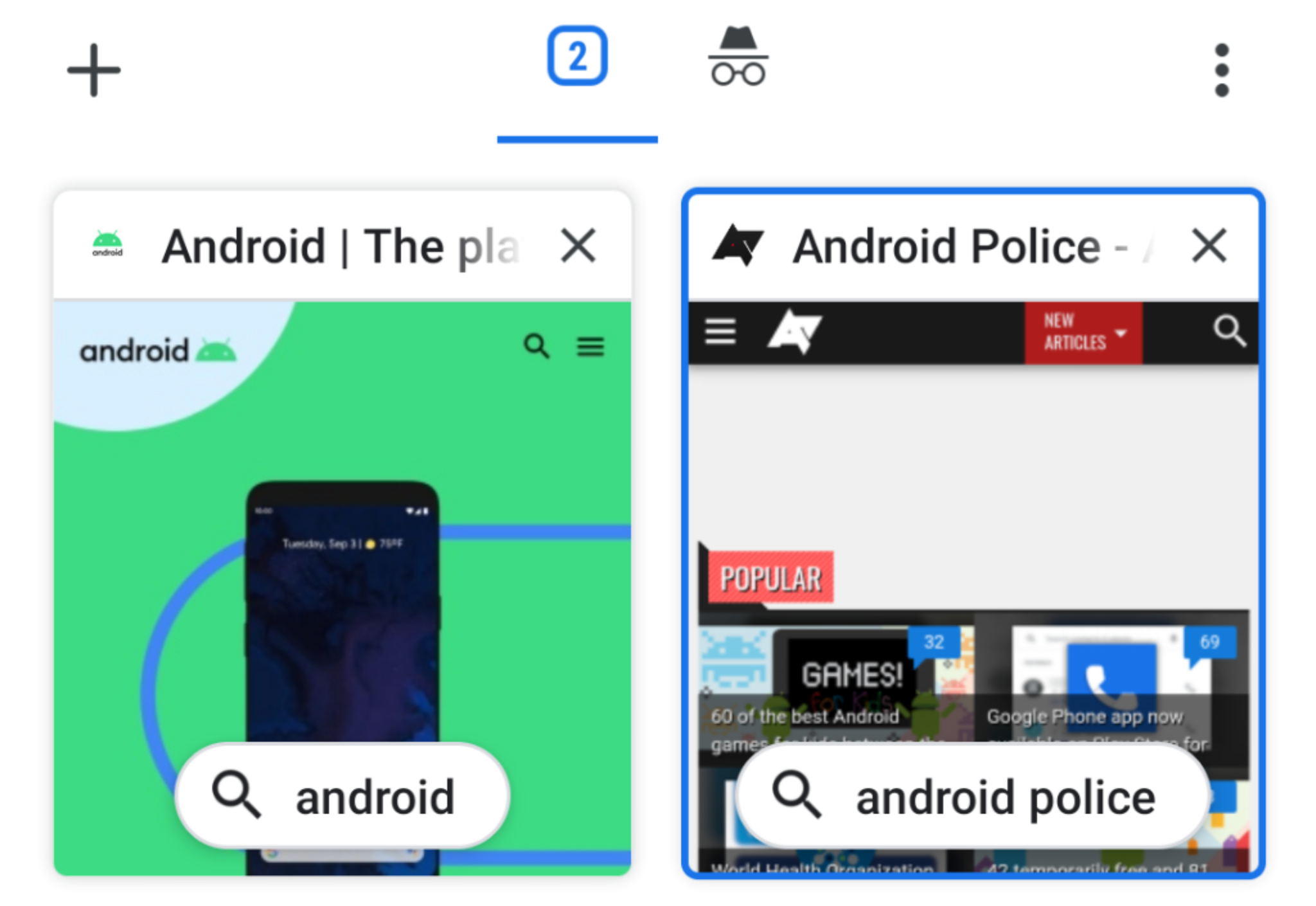
Chrome flag shows search term chips in the tab overview
Helping you piece together what you were searching for
A while back, Chrome got a completely rethought tab switcher that's already standard for many using the stable version of the browser. A flag allows you to further improve that overview by adding a small search chip to tabs, helping you quickly find what term you were searching for without having to navigate back to Google.
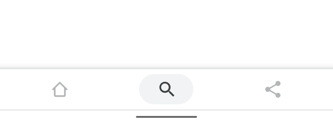
Google has been working on a bottom bar interface for Chrome for what feels like forever and keeps changing the layout. Initially, the browser had its complete app bar moved to the bottom, while recent implementation left the bare address bar up top and put all buttons (new tab/tab switcher, home, share, overflow menu) in the new location. The latest iteration of the design, accessible on Chrome Beta and Dev, reduces the number of shortcuts on the bottom from five to three, and people aren't happy about it.
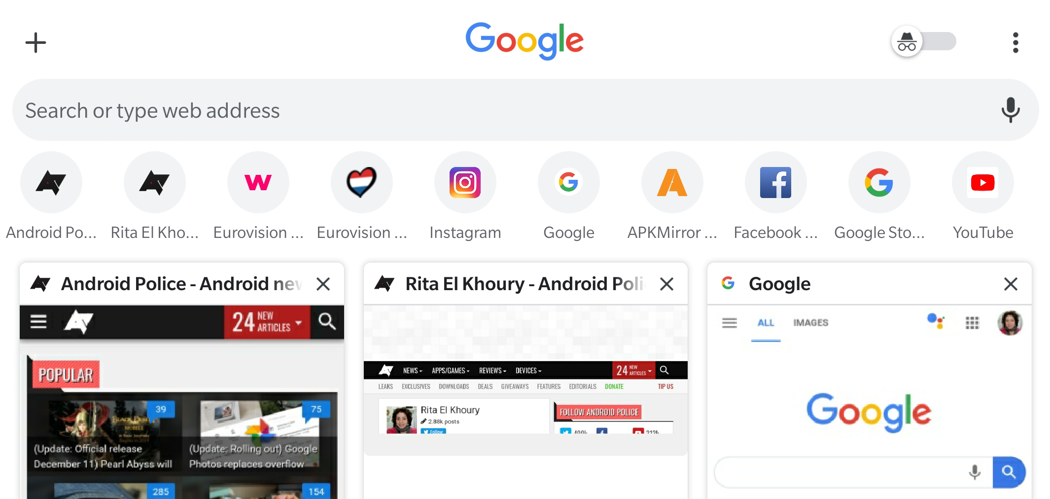
Chrome is in a perpetual interface test. Every few weeks, we discover a new flag that turns things around like putting the URL bar at the bottom or eschewing the large tab cards for a smaller grid tab switcher. Google seems ready to settle on the latter as the latest Chrome Dev and Canary use this as the default layout but with a busier look that mashes elements from the new tab page into the tab switcher, with lots of icons, bars, and toggles.
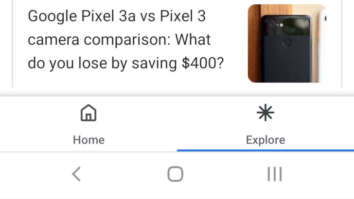
[Update: New combined Single Surface UI] Chrome tab switcher gets 'Explore' tab in new UI experiment
Google's recommended articles already exist in the Google app, the far left page of most app launchers, the New Tab page in Chrome for Android, and on the mobile google.com homepage. In case you need yet another place to find your favorite clickbait articles or mildly-relevant news, you might soon see them in Chrome for Android's tab switcher.
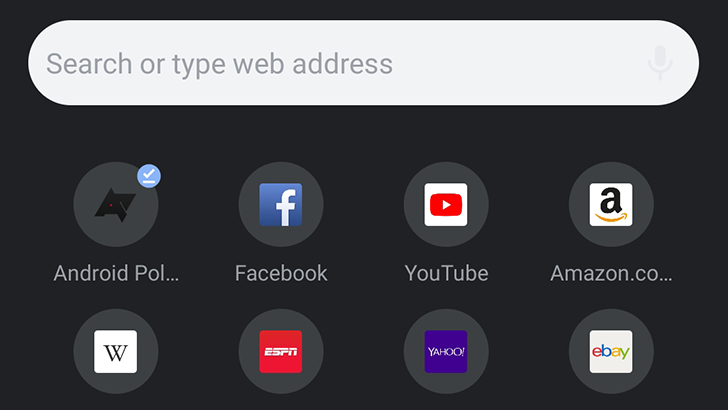
Read update
- The dark mode flag is now on Chrome Dev, and seems to be enabled by default for some people. It also no longer requires the Chrome Duet UI, so if you don't like the bottom toolbar, it's not needed for dark mode to work.
Google is still in the process of adding a dark mode to all of its applications, in preparation for Android Q's system-wide dark mode toggle. Chrome is one of the few remaining holdouts, but not for much longer. A dark mode toggle has been added to the experimental Canary branch of Chrome, though it's a bit buggy right now.

Another day, another Chrome flag. The browser is starting to let users swipe to go back to the previous page they had open, or come forward again. Even though we knew this behavior would be coming, we'd never seen it live before. A dip into the browsers' flags revealed one that triggers it.
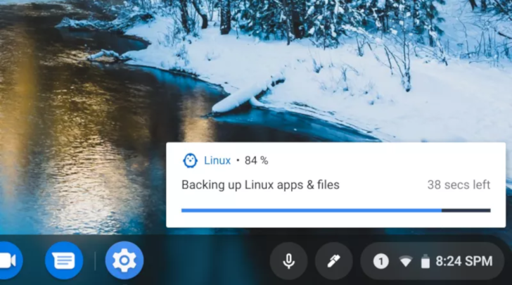
The recent addition of Linux app support to Chromebooks has made the laptops much more useful, especially in the eyes of developers. However, if you needed to wipe or upgrade your Chromebook, there wasn't an easy way to keep your Linux data. Previous code commits hinted at the ability to back up and restore the Linux container, and now that functionality has arrived in the Dev Channel.
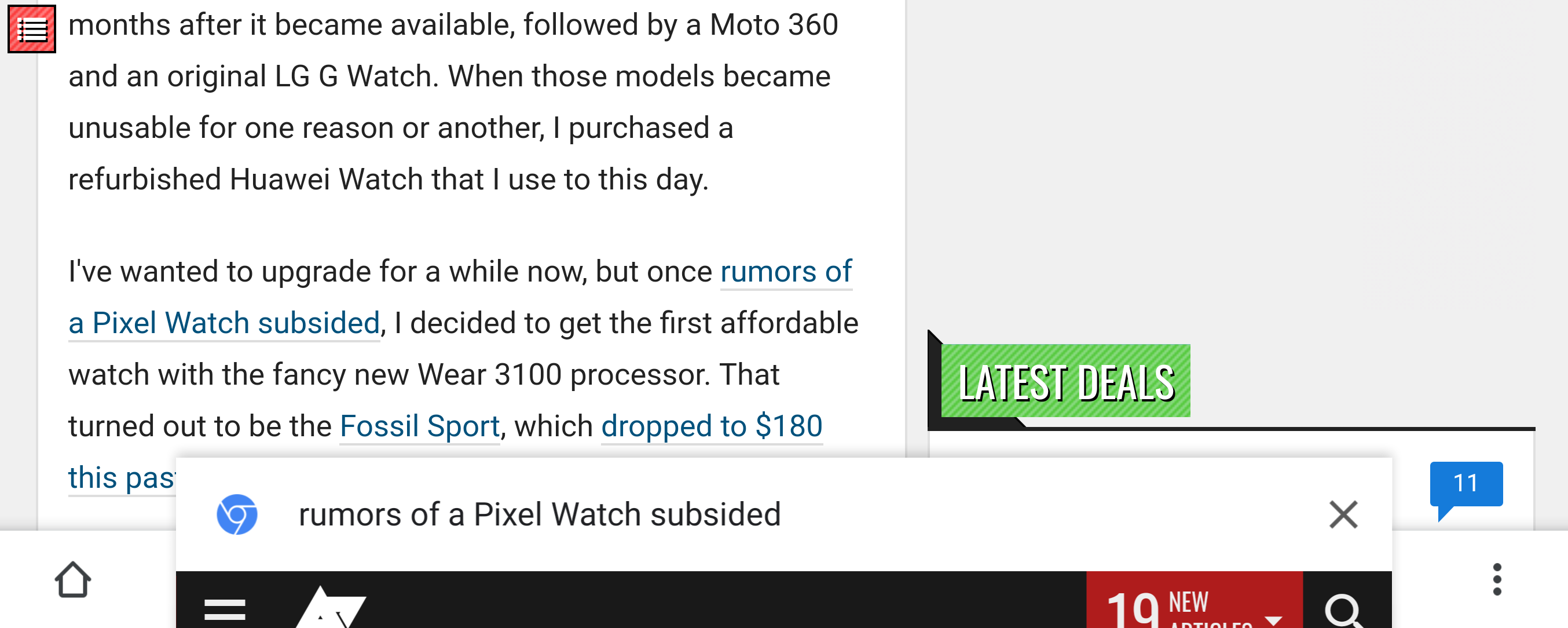
When I'm reading an article or checking a page and notice a link that seems interesting, my default behavior is to tap and hold to open it in a new tab. I'm likely not yet done with the page I'm still on, and I don't know if the upcoming content will be worth leaving it for, so the separate tab solves that issue. A new behavior in Chrome might be more interesting though, as the browser is testing a "Sneak peek" feature that lets you load a link in an overlay without leaving the current tab.
Chrome for Android has had a home button since its inception, but only on certain devices. Google started experimenting with allowing all devices to have a home button in April, but the feature is still opt-in. Now it appears Google is experimenting with the button's design.
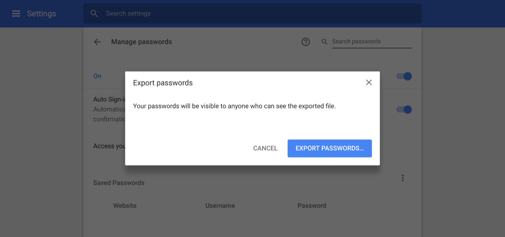
Whether on desktop or mobile, Chrome always offers to save your logins and passwords so it can easily autofill your details the next time you need to log in. In a way, if you accept that pop-up, Chrome (and thus Google) become your password manager. However, what happens if you want to use another password manager app? Migration can be a bit tough and not-so-straightforward and that's why Chrome is now offering an export function.
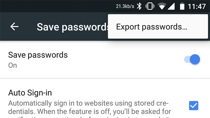
Exporting your saved passwords from desktop Chrome has been possible in one way or another for years. However, the feature has always been missing from the Android browser - until now. Google is now testing the ability to import and export passwords straight from Chrome on Android, but only the latter function seems to be working right now.
Read update
- The bug report has been updated with screenshots of what the new flags page looks like.
Ever since the first release, Chrome has had a hidden settings page, found at chrome://flags. There, you'll find toggles and switches for hundreds of features in Chrome, ranging from in-progress experiments to completed functionality. But all that time, the page has stayed pretty much the same, progressively becoming harder to use as the number of flags continues to climb.
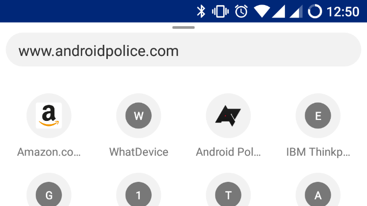
Google's experimental 'Chrome Home' interface first appeared nearly a year ago, but at the time, the feature only moved Chrome's address bar to the bottom of the screen. It became a full revamp of Chrome's UI in March, by changing the New Tab Page and adding a bottom navigation bar. Earlier this month, the 'Modern layout for Chrome Home' flag showed up, which made the Chrome Home interface more round.
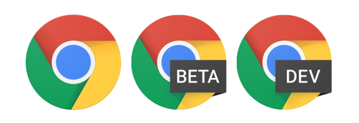
Although on Android it's been possible to install different releases of Chrome simultaneously to compare versions and test things out on t, the same thing hasn't been true on Windows and Mac. Once you installed Chrome, it defaulted to the stable channel and you could go into settings to switch to the Beta or Dev channel, but you couldn't have both or all 3 side-by-side. That made it difficult for devs to test their sites or web apps on new versions of Chrome while still being able to monitor their status on the current stable release. (I haven't looked into it, there might have been workarounds, but there was no official solution). But that's changing now.


