latest
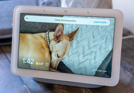
Google seems to finally be getting serious about Nest Hub apps
A video showing off an app tray surfaced on Reddit

At their core, Google's smart displays are permanently-docked tablets designed to stay in a single location in your home. Despite featuring screen sizes large enough to run full-blown Android, they're using special software perfect for glanceable information like cards and slideshows. However, a new video showing a fresh app UI for the Nest Hub series could be a preview of more functionality coming soon.
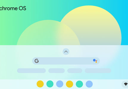
It's about damn time: Your Chromebook will finally let you sort your apps in the launcher
After ignoring user feedback for years

It's no secret that your Chromebook's app launcher could use a serious user experience overhaul. As it is today, Chrome OS is devoid of any method of sorting your apps, meaning all rearrangement of your apps has to be done by hand, and it creates new pages in the launcher seemingly at random. The end result is an unusable mess, making it frustrating to find your important apps unless you use the search bar. After years of neglecting user feedback, it seems Google is finally doing something about it.
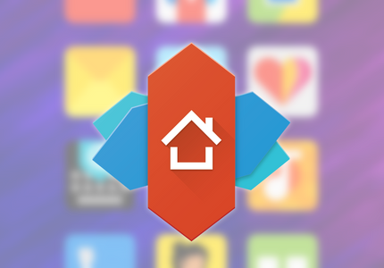
Nova Launcher gets new features and animations in latest beta (APK Download)
Your favorite launcher is getting better

Nova Launcher has long been a reliable option for anyone looking to rejig their home screen and app drawer. Known for offering a straightforward yet customizable experience, the launcher has been among the most popular ones out there. Now we're checking out some of its latest visual tweaks and new features, with the release of the 7.0 beta.
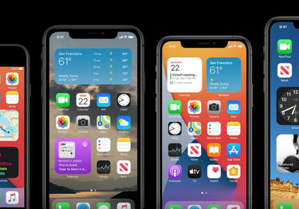
16 major iOS 14 features Apple 'borrowed' from Android and Google
Plus one bonus feature for Apple's HomePod
Unless you've been forcibly avoiding the news, you know iOS 14 is now a thing. But if you don't use an iPhone (or maybe even if you do), you might not have bothered checking out what was new in Apple's latest mobile operating system. But as fail to be basically every year we watch the WWDC keynote, no one on the Android Police was surprised to have one recurring thought: "hey, that feature looks familiar." Apple apparently felt very inspired by Android in the last year, and iOS 14 has a whole bunch of "world-first" innovations to show you that—very coincidentally!—also happen to be on Android. Here are 16 such features.


Android Q's new gesture navigation is a vast improvement over the two-button nav bar introduced in Pie, but it still has quirks that need to be worked out. Particularly, the back gesture interferes with the swipe-to-open option for side menus. Google promised a fix in the form of a peek gesture, but that still feels very unfinished as of Beta 5. However, this release adds a two-finger swipe from the side of the display to open those slide-out navigation menus, and it's as awkward to use as it sounds.

Read update
- While the previous version didn't support gestures, the latest alpha build (v4.10.6.1038-06251834) lets users swipe up anywhere on the home screen to bring up the app drawer, as shown in the video below. Even though this confirms the company's commitment to offering an app drawer, it's still an early version, as the menu options to activate the feature aren't translated yet.
One of the many reasons I don't like iOS is its lack of an app drawer. Indeed, I want things to be very organized, and dumping all icons on my homescreen just doesn't work for me. Xiaomi, however, preferred to mimic Apple and decided to go against Android standards by removing the app drawer in its MIUI launcher, which essentially meant all icons had to be on the home screen. However, the company appears to be opening up by letting users enable the drawer in MIUI.


With the Pixel 2, Google introduced automatic dark/light themes dependent on your wallpaper. It was a short-lived exclusive, making its way to Android 8.1 just days later. It hasn't even been a year since then, but Google is already changing the themes' behavior slightly — for the better, in my opinion.

Animations have been a big focus in Android P, so it was a bit surprising when the new Recents menu landed without one for invoking it. In earlier versions of Android P it just sort of plopped up without any fanfare. But now in DP3/Beta 2, Google has introduced a new rubbery bounce complete with corresponding haptic feedback, as well as a new semi-transparent rounded background for the app tray. The mild translucency in the full app list also appears to be mostly gone (thankfully).


LG has been criticized for its decision to remove the app drawer on the G5, but its UX 5.0 demo video a while back said the app drawer option was returning. The best it could do in the short term was publish the old UX 4.0 home screen in SmartWorld, but now an updated home interface for the G5 is rolling out that adds the app drawer option.

LG took a lot of heat (deservedly) for its decision to remove the app drawer from its stock launcher on the G5. It eventually showed off a different version of the home screen in its recent UX 5.0 video. That one had an optional app drawer, and now that version (named Home 4.0) is available for download.


One of our readers spotted this neat trick in the latest update to the Google Now Launcher (which is part of the primary Google app). A single tap on the app drawer icon will open the app drawer as usual, but a long-press will open it and immediately highlight the app search field. It will also automatically open your default virtual keyboard, quickly and easily allowing you to type and search for apps.

Google continues to tweak Android 6.0's visual interface with the latest Developer Preview, in ways both big and small. The default Google launcher has been seeing subtle changes since the M Preview was introduced, and the latest one is... interesting. The Preview 3 version of the app drawer includes a little "pop" effect when scrolling, highlighting the first app that begins with each successive letter in the alphabet. It's a little hard to describe verbally - check out the video below from YouTube user Zaid Salem.

Nova Launcher is easily the top pick for conventional Android home screen replacements, and a "daily driver" for a good chunk of Android Police's staff. The latest update added a Material Design user interface, but there are other goodies hiding just below the surface. For example, version 4.0 includes a simple app search function hidden in the app drawer. It's especially handy if you've got hundreds of installed apps (like Artem) or just don't like organizing your apps into folders (like everyone else).

One of the things I love about Android is the way it allows fantastic customization of its user interface, even without root or other major modifications. Take App Swap for example: this handy little app drawer replacement can launch either from a standard shortcut on your launcher (or alternative methods like SwipePad) or it can replace the default Google Now swipe-up-from-the-home-button gesture.


I've never been to Vietnam, but (after seeing the earlier hands-on photos and now this video here) I'm tempted to check out airplane ticket prices for the country. I hear they have gorgeous landscapes, an interesting culture, and a bunch of geeks loose with Nexus 9s. One of them is parading in a coffee shop with a chocolate drink, a couple of books, and our coveted tablet. But I might be mistaken.

Themer wowed us with its introduction a few months back, and today's update to the powerful homescreen replacement and customization app is the largest yet. The biggest change is a redesigned app drawer, which allows for both the standard scrolling view and a new Categories screen. Categories are basically folders, but they're displayed like Google Now cards, and automatically populated with apps. You can manually tweak them if you want.


App drawers suck. Okay, that may not be universally true, but for the sake of this hands-on, lets all agree on this premise. Once we install apps from the Play Store, it takes way too long to find them, and once we're done, it can be bothersome trying to remember which app we installed before that one. After a couple of months, that clean app drawer can grow to become six, seven, and even eight pages long. Most launchers now come with the ability to organize these apps into folders, but coming up with a manageable system of organization can be quite the pain. That's why Wyze Launcher promises not only to clean up your app drawer, but to take care of the organization for you. Does it work? Almost.

Are you ready for some hot app drawer action?