latest
YouTube video thumbnails may have found a way to be even more clickable
A/B testing will let creators find the best pics for getting you to watch
Ever been frustrated by the noticeably clickbait nature of some YouTube video thumbnails? They're an essential part of a creator's toolkit, helping to grab potential viewers' attention while they scroll through the multitude of content on the platform. YouTube is now on the verge of intensifying this strategy with a potentially game-changing feature that will let creators A/B test multiple thumbnails to find the most effective one.
Read update
Google Assistant isn't only good at answering your questions and orders. It also proactively sends you notifications on flights, public transport updates, packages, upcoming events, and more. To personalize which of these you receive, you usually have to head to the Google app's App info -> Notifications section. That's not very intuitive, and the amount of Assistant options there is limited. In a change that's already rolling out to first people, Google has moved the notification controls to a more prominent place right inside the Assistant's settings and has added many more granular toggles.
Read update
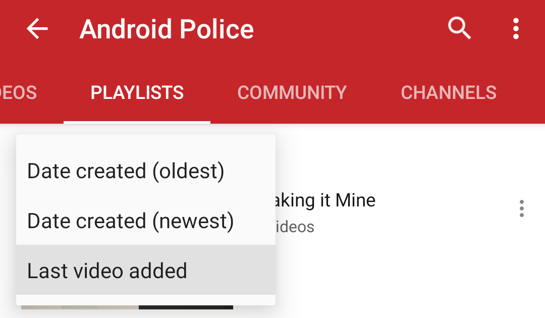
The YouTube app is only two years younger than Android itself, but it has always lacked some features compared to the service's website. Among them is the ability to sort a channel's videos and playlists, which you could historically only view by date added. A new A/B test finally gives the app the same sorting options that have been available on the website for a long time.
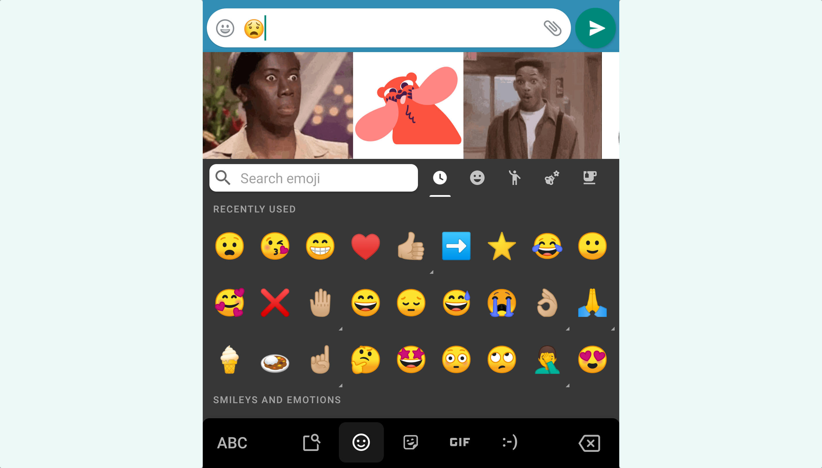
It's incredible how feature-packed Gboard has become over the years with integrated stickers, GIFs, Google Search, clipboard management, and much more, so Google is trying to make some options more accessible. At the moment, the company is testing a function that gives people GIF and sticker suggestions when they add emoji through the keyboard.
The YouTube app is constantly under construction with Google changing up little things here and there all the time. The comment section in particular has come under scrutiny this year, with Google even hiding it behind a button during a test this June. The latest experiment in turn makes comments more visible. YouTube is putting the section right below the video description for some as part of an A/B test.
Google is constantly working on little usability improvements across all of its apps, and that's no different for Calendar. Code sleuth Jane Manchun Wong peeked into the application and managed to activate vertical scrolling in the month view, replacing the horizontal navigation that's been with us for years.
Streaming music apps have been looking at ways to add value to the in-app experience for both users and artists alike. Spotify, being the biggest fish in the pond, has pulled off the most of these experiments, but upstart (in a very loosely relative sense) YouTube Music has had its innovations with video and art integrations, too. But today, it's gone to the core of its music serving experience with a new top releases playlist and some design changes in testing that could grab more plays for publlishers.
Read update
- In an earlier version of this article, we stated that this new pop-up was created with App Slices. These are completely unrelated, however, as they are UI templates that show up within the Google Search app and Assistant, pulling content like Maps address information and Uber price estimates from the respective apps. We updated this post to reflect that.
With the introduction of Android Q, Google started putting common system settings such as WiFi, Bluetooth, and others in convenient cards that slide up when needed. The company seems to take a liking of this approach, as it just started rolling out a similar feature for Google Contacts that pops up when you add a new contact via another app.
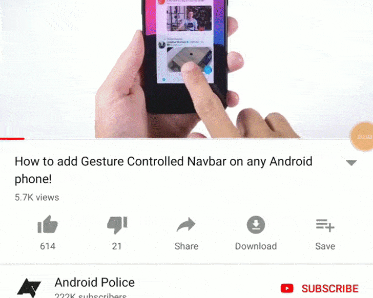
Navigating between videos in the YouTube app could be getting a whole lot easier in the future. According to one of our eagle-eyed tipsters, a subtly different interface might be coming that supports swiping between videos. With the slide of a finger, you could navigate between videos in your queue—though you'll still never find something to watch.
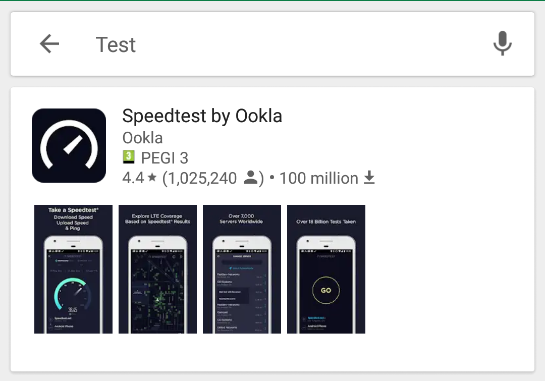
The Play Store seems to be testing a new layout for search results. We've received a tip that the normal app list has been replaced by a card-like interface for some, with app listings now including screenshot thumbnails. The change brings Play Store search results more in line with the visual style of the mobile web search results layout, which also shows results on cards.
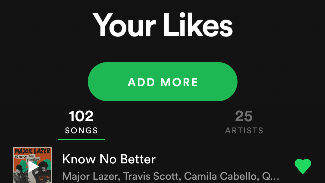
Spotify's been doing incremental tweaks to its Android UI for a long time. Since I've been working here at AP, it seems like we get at least a tip or two a month related to one minor change or another. That means the company's server-side A/B changes are pretty well known to us as a result of our position in the grapevine. Recently we've been getting reports of a UI test that includes a new consolidated three-tab navigation, simpler list views, larger interface elements, and the return of an old UI test.
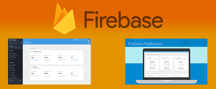
Google's Firebase team has been hard at work lately. Earlier this month, Firebase added a whole new storage product called Cloud Firestore, but that was just the beginning. Several major additions and improvements were just announced during the keynote at the second annual Firebase Dev Summit taking place in Amsterdam.
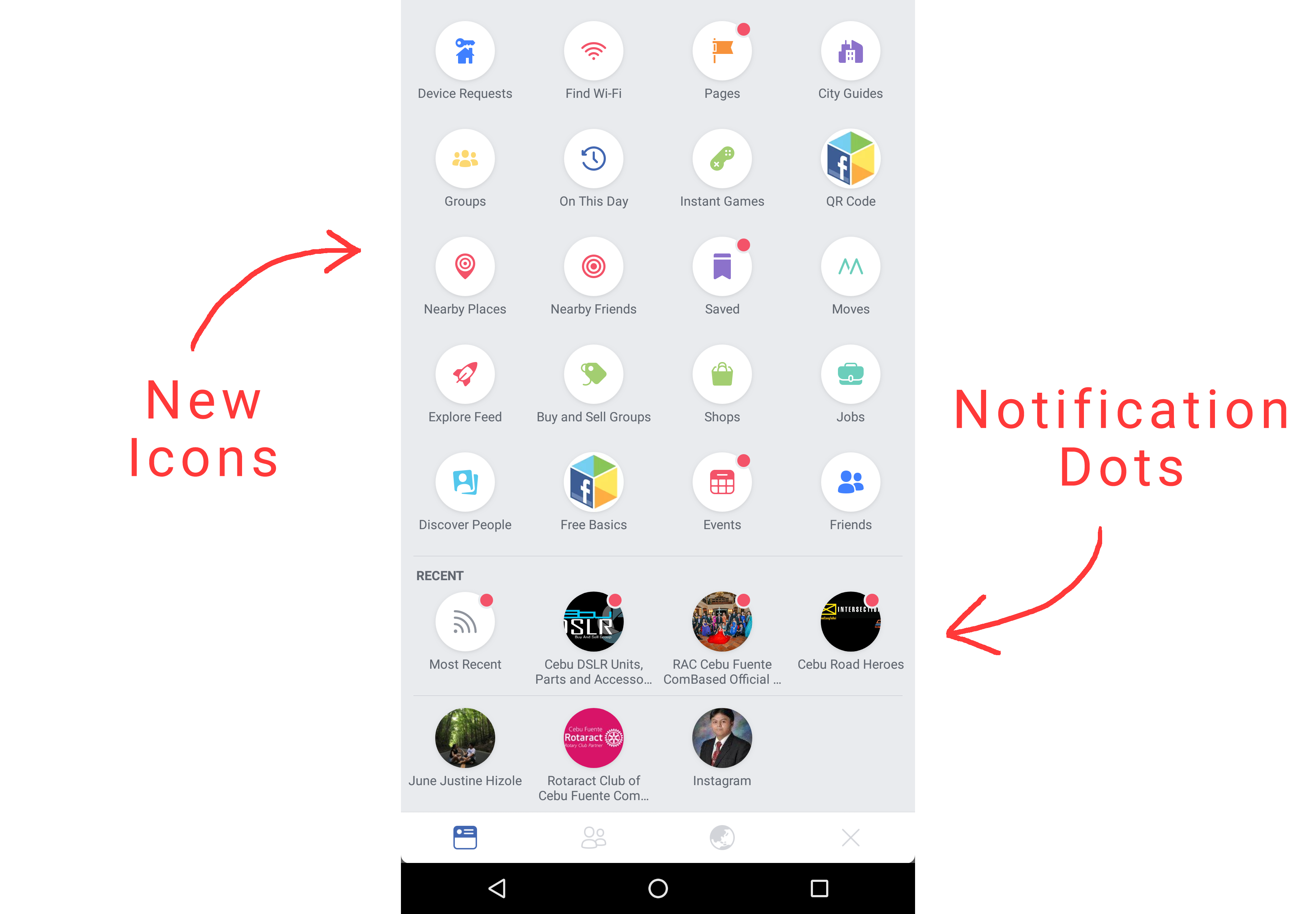
The devs in Menlo Park have been busy recently rolling out significant changes to the look of the Facebook app for Android, more about which you can read here. We've now received tips about a further change that's currently being tested which replaces the linear, swipe-left hamburger menu with a pull-down grid of options. The new layout even has notification dots, just like Android Oreo.
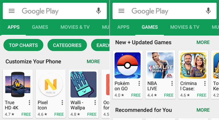
At this point, I'm convinced everyone has a unique Play Store app layout. Several UI changes are in various stages of testing - including expanded cards on search, a new My Apps screen, a 'Top Features' list, and several others. There's yet another UI change in testing, this time expanding the Play Store categories.
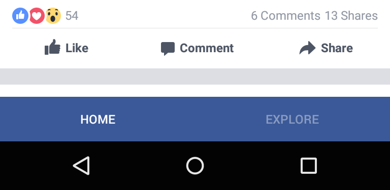
Facebook is well known for being a rather liberal user of A/B testing, having seemingly hundreds of tests going on at any one time across its increasingly diversified product line. We've come across a new one, courtesy of Google+ user Fedor von Bock, which sees Facebook testing out a navigation bar at the bottom.
Back in June, Facebook released a new feature to the iOS app, Slideshow, which takes photos uploaded to the service and turns them into videos, much like in Google Photos. We've received a tip that says this is now being tested in the Facebook app on Android, although it's hard to say how widely.

The Spotify app isn't bad, per se, but it could probably be better (similar to certain other music apps). It's good, then, that the company is testing a new material-esque now playing screen, which looks much improved compared to the old one.
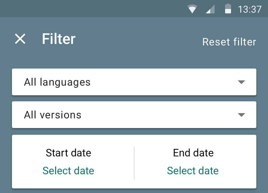
The Google Play Developer Console app isn't a piece of software most of us will use. It's aimed at the folks who make the apps the rest of us download, not the other way around. But more than a few of you are developers, so you might want to check out the latest version of the app. The update brings new ways for you to find what the rest of us feel about the stuff you make.
Much like Google, Facebook runs a lot of tests on its products, trying to gauge whether new things are a good idea. It tested a material update to Messenger, the Reactions button and Messenger SMS (which is still ongoing), multiple Messenger accounts, and probably more besides. Now it's got a new one for Messenger as well: a call tab.


