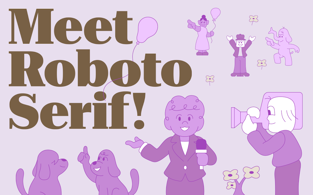
The World Wide Web first started out with a measly collection of just 11 core fonts meant to make things as legible as possible on those low-res screens of yesteryears, but these days, virtually all websites and brands can choose whatever font they want to and that they feel is the best for both legibility and identity, with some even creating new typefaces of their own. As such, Google has just introduced a brand-new font to its family — meet Roboto Serif (via 9to5Google).
Roboto Serif joins the other four fonts in the company’s growing lineup, Roboto Sans, Mono, Slab, and Condensed. It’s Google’s first serif font — one of those with those little lines and strokes attached to letters or symbols, like you know from good old Times New Roman. In contrast to classic serif fonts, Google wants things to be minimalistic, though, “with just a ‘whisper’ of a serif,” playing right into the company’s heritage as an internet-first business.
“We wanted it to feel comfortable next to a sans-serif, and not to feel cluttered. It doesn't need to have serifs everywhere to drive home the point that, ‘I am a serif and have serifs in all the places serifs go,” said Rob Giampietro, formerly of Google Fonts, now a UX manager at Google.

Roboto Serif is also an incredibly flexible font. It comes with four variable axes, allowing designers to fit it to their needs. Weight, width, size, and grade are all adjustable, and you can pick between nine ready-made versions, ranging from thin over regular and bold all the way to black. The goal is that the font can be used across digital products and print, providing an easily legible experience anywhere you need it.

Google commissioned the font from Commercial Type, a company that created custom typefaces for publications like The Guardian and Vanity Fair, and made it available for free via the Google Fonts catalog. If you’re interested in checking out the font some more, you can also look at Google’s beautifully designed PDF handbook.
Now, excuse me while I go bugging my editor-in-chief for a custom Android Police font created by Commercial Type, with maybe just a hint of Gilroy in it, our current typeset. It can’t be that expensive, right? Right?!