The Netflix app on Android has looked the same for a long time, but the company is apparently trying something new. One Reddit user has shared the updated UI that popped up on his phone, which includes a bottom navigation bar. There are some other changes as well, but all the same functionality should be included. If you're looking for an APK download, sorry. This looks like a server-side switch.
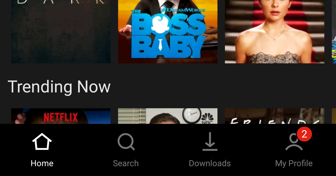
Currently, the Netflix app has a slide-out nav menu. It's not a standard material design menu, and the assortment of notifications, categories, and settings is pretty messy. That menu is gone in the updated UI. In its place is a bar at the bottom of the screen with links to Home, Search, Downloads, and My Profile.
The categories from the old nav menu have been integrated with the search page. Likewise, notifications have been merged with the profile interface. The more prominent placement of downloads will be nice for those who need to use Netflix offline on a regular basis. In general, the bottom bar UI looks much cleaner and easier to use. That's not always the case when apps move to the bottom bar, but Netflix definitely needs some tidying up.
Left: Current UI, Right: New UI
It's unclear when (or even if) this interface will roll out. The OP on Reddit says this UI appeared in the stable version of the app, so it's not a beta-specific feature. You'll get the bottom bar when Netflix decides you should get it.
Source: Reddit