Google has just announced its 2017 #madebygoogle hardware line up, including the new Pixel 2 and Pixel 2 XL phones. There are lots of interesting new software features to talk about, including a new always-on ambient display that tells you what song is playing in the background without you even asking, but the first thing anyone notices when they unlock their phone is the launcher. Sabrina Ellis, director of product management, took to the stage to talk about the new Pixel Launcher home screen, among other things. It is getting a considerable makeover, and it's bound to be controversial.
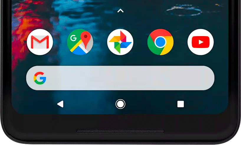
"Why has Google put the search box at the bottom?" That's the question on most people's lips. It's a fair question, and it's certainly going to be a divisive decision. The official line is that it's easier to reach. Of course, Google also really wants you to use search, from which it generates a lot of revenue. As phones get thinner and taller with the trendy new 18:9 screen ratio, the G pill was only going to get further away, so it makes sense from Google's perspective to put it nearer the bottom where your thumb can get to it easily. As with the dock apps, the new rounded search box will also be present on every home screen, unlike the current pill which sticks to only the first screen.
Some might view the decision to move search to the bottom as user-hostile, particularly those who don't currently use the search pill that often. Some might also think it detracts from the Assistant, which can now be activated by squeezing as well as long-pressing the home button. I would argue that generally search and Assistant serve different purposes, depending on how you want to interact with the information your query will present. At least, they do for me. And as someone who uses search a lot, I think I'll actually be pretty happy with the change.
Also new is the "at a glance" section at the top of the screen, in place of the search pill and weather/date widget from before. The weather is still present, albeit much smaller than before, but the main calling of this space is to show upcoming events from your Google Calendar, as well as traffic updates and flight statuses, with more promised to come somewhere down the line. The comical example used at the event showed a "Pixel Ultra Meeting in 5 min," which everyone seemed to enjoy. This section could be rather useful, depending on how much you use your calendar. It's unclear what will show up there if you don't use your calendar at all, however.
Other than those two most notable changes, Ellis also talked about a new range of live wallpapers called "Living Universe," with the waves splashing against the beach in the live example. How search functions was also touched upon. When you search for apps you can now drop their icons directly onto the home screen, which is pretty neat. You can still also bring up web results and contact entries, just as before. It's rumored that a Google Lens button will also be added to the search box, just like it is when you open up the Google app on the new Pixels. It may be optional (along with other customizations options), but there's no official word on that yet.
Hopefully, those of us with first generation Pixels will also get the new home screen design, but that's not a given. All in all, the changes are sure to disappoint some people while pleasing others. Thankfully, there are plenty of other launchers out there for those who don't like what Google does with the Pixel Launcher – nobody is forced to use it.