We heard of Google Finance's complete overhaul a few days ago, but it seems that hints of the new design could be hiding in Google's latest stocks card interface. If you search for any stock value on Google, it provides you with a card that details its price history, performance, and provides comparison against other stocks and news.
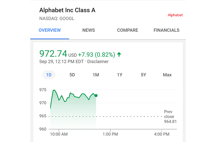
Now that interface has changed. Instead of one long page where you scroll down to each separate section you have 4 tabs for Overview, News, Compare, and Financials. The blue line in the graph has also been replaced by a filled green one, and the different history periods are now tappable buttons instead of tabs. All the fonts look darker too, which is better for readability.
Old above. New below.
Below the graph, you'll find smaller cards for quick stock comparisons, and you can always switch to the 3 other tabs for news and more comparisons and financial details.
We first received a tip about this new card layout around mid-September, but it seems to be more widespread now with several of our devices showing it. My phone is still giving me the old card design though, so this doesn't appear to be ubiquitous just yet.
Thanks: +Henny Roggy, David