G+ may be going through some stuff right now, but that isn't stopping Google making little changes here and there to improve the experience for anyone still using it. The Android app is updated fairly frequently, and now the desktop site is getting some attention, too. I'm not sure how many people this tweak will make a difference for, but I'm sure someone, somewhere will be pleased about it.
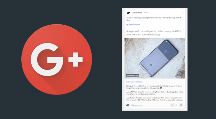
The change in question relates to the comments section underneath posts. For posts in feeds, the behavior up to now, at least since the Material redesign, has been to show just a single comment at a time below each post. If there were more than one comment, it would cycle through them and only show more if you clicked to expand. At this point, the box would enlarge and you could scroll through all the comments on the post.
Old: Cycling through one at a time. New: Three on view at a time.
Artem has noticed that there's now a new way of doing things, suggesting a wider rollout may be underway. The new UI shows up to three comments below each post, with a button above them allowing expansion to show more. There's also an ever-present 'Add a comment...' box, and the '+1'button has moved to the right side, next to the share button.
For single posts, things have also been tweaked. Multiple comments show by default, as before, but in the new version, more prominent 'Reply' and '+1' buttons are on display below each comment. Before you would have to hover over each comment to see the '+1' button and click to get a reply option, so threaded conversations should now be easier to start.
Old: No 'Reply' button. New: With more prominent 'Reply' and '+1' buttons.
Perhaps Google wants us to be more active on G+ as this UI tweak seems to encourage conversation by bringing more comments to the forefront and making it easier to add a comment of your own. I suppose that's one way of fostering more engagement and getting people back onto the platform. Who knows if it will make any meaningful difference.
Thanks: Artem