Read update
- Love them or hate them, the tabs are here now. We've been seeing them roll out slowly to users over the past months, but based on how many tips we've received about them over the last couple of days and our own devices starting to show them, we're thinking they're now officially rolling out to everyone. It's a server-side update though, so you'll probably get them on older versions and newer versions of the Play Store alike.
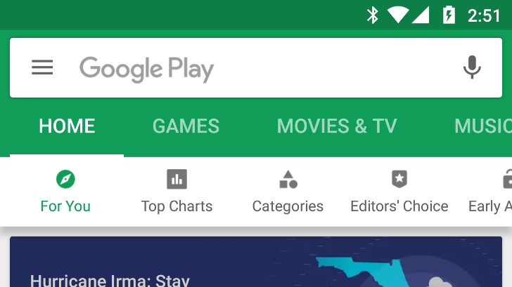
Google is starting to adopt bottom navigation bars across its products, with the recent YouTube update and new Chrome interface. But if there's one thing about Google that's consistent, it's the company's inconsistency. A tweaked design for the Play Store app is rolling out to users worldwide, with a new navigation bar below the existing tabs.
Left: Old design; Right: New design
The new bar doesn't function like a bottom navigation bar (despite looking like one), instead serving as a sub-menu for whatever section you're viewing. It replaces a series of buttons with the same labels. Both the old buttons and new bar overflow to the right of the screen, requiring horizontal scrolling to see all the options on phone screens.
While perhaps not part of this exact test, there is also a notable change rolling out to the side menu:

Left: Old design; Right: New design
The 'My Apps and games' menu option is now placed at the very top. In my case, the tab for 'Movies, Music, and Books' is also gone, but that tab may have already been gone from your devices. It's hard to keep track of all the Play Store's small UI changes.
UPDATE: 2018/03/10 3:27am PST BY
Love them or hate them, the tabs are here now. We've been seeing them roll out slowly to users over the past months, but based on how many tips we've received about them over the last couple of days and our own devices starting to show them, we're thinking they're now officially rolling out to everyone. It's a server-side update though, so you'll probably get them on older versions and newer versions of the Play Store alike.
Along with this new UI server-side update, we're seeing the changes in the left menu mentioned above as well as the new Notifications tab and My subscriptions tab that were being tested recently.
Thanks: Everyone who sent this in