In the last two weeks, Google has been revealing a ton of new features for Chromebooks. The latest reveal is the biggest change in recent memory, though. Google is working on a new launcher for Chrome OS that is built for touch. With Chromebooks providing most of the same utility that Android tablets do now, these further optimizations for a finger-pokin' interface are more than welcome.
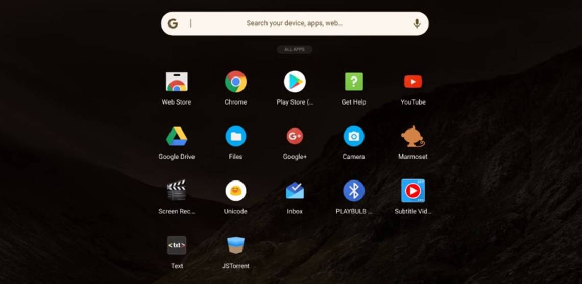
Today's reveal, much like the last two, comes courtesy of François Beaufort, Google's Chromium evangelist. The post is a bit light on details, so we don't know if this new interface will only appear when in tablet mode, but I honestly wouldn't object if it were to replace the current launcher. It's quite slick and minimal. Even with the non-transparent background, not blocking the center of the screen when invoked is also a nice move.
The black background might not be a popular choice, but the design might be a bit too busy otherwise. It also provides a great sense of focus, there's no distraction from text or images behind the interactive elements. With all the focus that Material Design places on animations, I hope that those implemented in the new launcher can be refined a bit more, though.
The feature is live but currently only present in the Canary channel. Assuming all goes well (and that the new feature follows the standard progression from Canary -> Dev -> Beta -> Stable) we should see the feature hit Stable in 3-4 months.
Source: Google+, Chromium Code Review