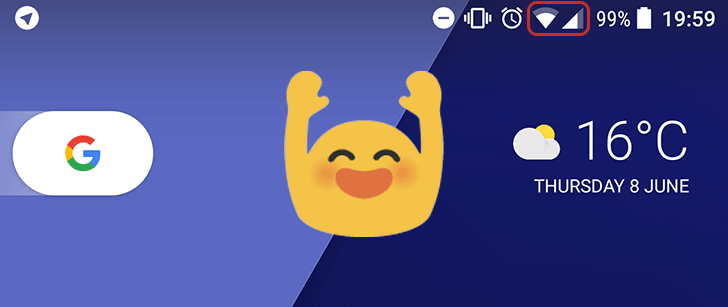
Sometimes it's the little things in life that bring the most joy. Google often uses Android developer previews to test small changes and gauge public opinion on them ahead of a final release. This may or may not be one such example. Dev Preview 3 has reversed a tiny change that was made in the last version, namely changing the order of the WiFi and cellular icons on the status bar.
Granted, this seems like a really insignificant alteration. But clearly there were plenty of users annoyed by the change, and this forced Google into reverting to the previous state. If nothing else it just looks weird when cellular comes first. The angles of the two icons fit nicely together when WiFi leads. If you don't believe me, take a look:
Above: The right way round, Dev Preview 3. Below: The wrong way round, Dev Preview 2.
So there you have it. A tiny change, but one that will likely please a good number of Android fans. Cheers, Google.
Thanks: Zachary “Wiki” Kew-Denniss

