Google has been a bit slow to adopt Material Design in Chrome. The browser got a Material makeover in Chrome 52 for Mac and 53 for Windows, but the Settings page has remained relatively unchanged since Chrome's introduction. Chrome 59, which was released today on the desktop, includes a new Material settings area.
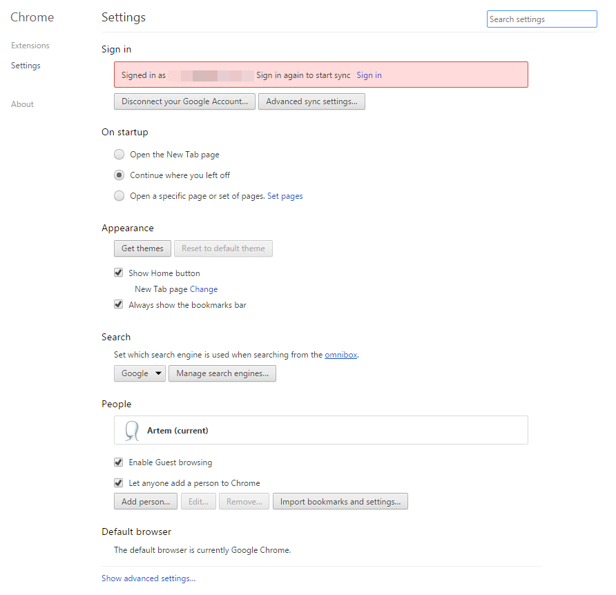
I'm sure most of you have seen the browser's old settings menu before, but just for reference, here it is:

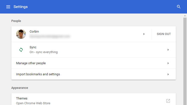
And here is Chrome 59's settings page (click on the images for a larger preview):


The new design has been in testing for a while, accessible through a Chrome flag, but now it's visible by default. You still have all of the basic settings, like appearance and search engine options, at the top with a link at the bottom to show advanced settings. The hamburger menu doesn't change pages, only skips to the selected section on the main settings page.
While this is definitely an improvement, I do think it could still be a bit better. Just like Android's stock settings app, everything is in one column (in this case, with a maximum width of 680px), so there is a lot of wasted space on widescreen monitors. Google could at least have the hamburger menu pinned to the side for wide displays. Also, the extensions page is still using the old design.
You can manually update Chrome by clicking the menu icon, navigating to Help > About Chrome, and waiting for the new version to download. We'll have a more complete post about Chrome 59 once it is released for Android.
Source: Chrome Releases blog