After some time spent testing out different bottom navigation styles, the latest incarnation in the Android YouTube app is something very similar to what you'll find in the iOS version. It's still being a/b tested as far as we know, so some users will see it and others won't. It now appears that the YouTube Music app is following suit with a bottom navigation UI of its own.
Slide-out menus and top-level tabs were preferred previously, but Google added bottom navigation to its Material Guidelines in the last major refresh. It's likely that Google tried to avoid it in order to differentiate Android apps from their iOS counterparts but eventually conceded that it's a useful navigation mechanism and added it in. Since then, YouTube has been playing with different implementations so including it in YouTube Music is a logical next step.
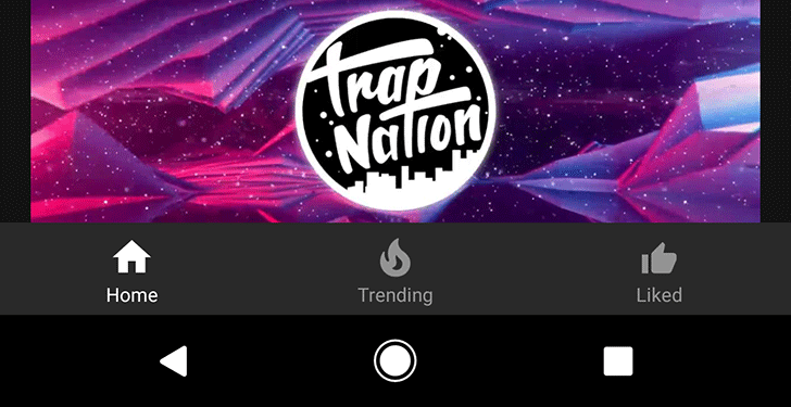
Left: The new bottom navigation. Right: The old tabs.
As well as moving the tabs to the bottom navigation, the hamburger menu has also been removed. The option to stream music via a Chromecast and the account settings have been moved to the top right in the header bar. Where the hamburger icon once was, we now see YouTube Music branding. While this approach certainly simplifies the UI and avoids hiding options behind a slide-out menu, the header does suffer for being more cluttered. The lack of empty space won't be to everyone's taste.
We're not sure at this point how widespread the testing is, or whether it will end up being the final version. This is probably a server-side change kicked out to a handful of users, so don't panic if you don't see this new UI on your device. We'll let you know about any further changes as we discover them.
https://play.google.com/store/apps/details?id=com.google.android.apps.youtube.music
Thanks: Ramit Suri