The Mozilla Foundation is most well known for Firefox, the popular web browser, but it makes many other products too: Thunderbird, SeaMonkey, BugZilla, and a programming language, Rust, among lots of other things. After seven months of public consultations and submissions, the non-profit organization has launched a new brand identity, named 'the Protocol', to push forward in the heavily congested market that is apps and services, and signalling the renewed focus on the internet.
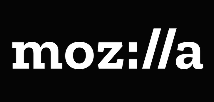
The new brand image is mainly a wordmark in a slab-serif typeface, Zilla, which is free to download (see the source link for more info). It uses the :// prefix of http:// in place of the 'ill' in Mozilla, creating 'Moz://a.' This isn't difficult to read though, and it's not like people will type 'Moz://a' when referring to the company in text. The mark works well in pretty much all colors, and could even be inverted if needed. Under Consideration's Brand New notes how the black box behind the letters is symbolic of an address bar, which I find very appropriate for an organization as internet-focused as Mozilla is. For its part, the company says, "Our logo with its nod to URL language reinforces that the Internet is at the heart of Mozilla. We are committed to the original intent of the link as the beginning of an unfiltered, unmediated experience into the rich content of the Internet."
Above: variants on the white-on-black wordmark.
Check out the YouTube video to see how the branding works in motion.The main reason I like this is because it signals a renewed focus on the internet and the open ethos that Mozilla was founded under. And that's good, because while most won't see this in their day-to-day lives, since the majority of users see the Firefox logo, it's good to know Mozilla is still focused on outputting quality products that are used by millions around the world.