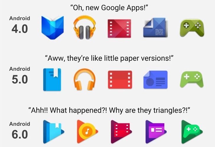
An infographic posted on Google+ yesterday really has managed to capture the emotional roller coaster of Google's app icon evolution on Android over the past four years. Using the icons for Play Books, Music, Movies, Newstand, and Games, we can watch as Android goes from toy-like skeuomorphism, to paper cutouts, to triangles (!?), to triangles in circles (disgruntled face here) in Nougat.
I have to say, I think we really hit Peak Icon in Android Lollipop. Those were some damn good icons. The triangles in 6.0 were on-brand with the Play Store icon, but they really were sort of bizarre. And then placing those triangles inside... circles? Google, what are you doing. The imagined Android 8.0 icons really do illustrate the absurdity of the direction we're going.
One can only hope Google's triangle-in-circle icons are just a phase, to be replaced by something a bit less ridiculous down the road. I mean, what is this - iOS?
Source: Google+

