The Android Pay landing site (android.com/pay) has just been revamped with some more eye-catching elements. I haven't heard anybody complain that Android Pay's landing site is too drab, but this new site definitely looks quite a bit nicer. (You can check out the old one here.)
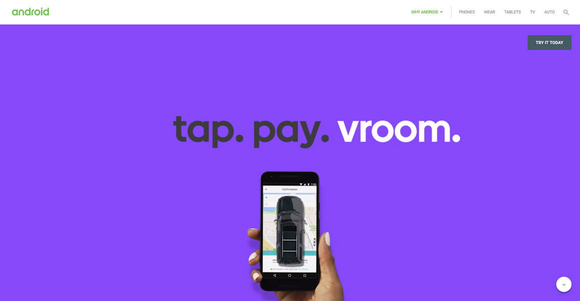
When you get to the site, you're hit with a splash of color, some "tap. pay. xxxxx." text, and a Nexus 6P or 5X demonstrating these actions (oddly, they didn't go with the Pixel or Pixel XL for this). Some of the 5Xes have curiously small bottom bezels.
Note the awkward 5X in the third picture.
As you scroll down the site, a Nexus 6P doing various Android Pay things follows you with pretty animations, exhibiting how easy Pay is to use. The lists of vendors and banks that support Android Pay are still there, but they're a lot easier to parse and just look better.
Overall, the redesign definitely makes the site easier on the eyes, even if it wasn't all that necessary. I can't find anything I really hate other than their spelling of "yum." Seriously, who spells it "yumm?"
Source: Google