Google is always trying something new with its different apps. Our personal nightmare is YouTube — ask Cody, trying to monitor the dozens of tips we get each week about a new YouTube UI are his personal nightmare. But Google Now might be an exception. The app's stream of cards has looked the same for a while and it's rather consistent between users. Not anymore.
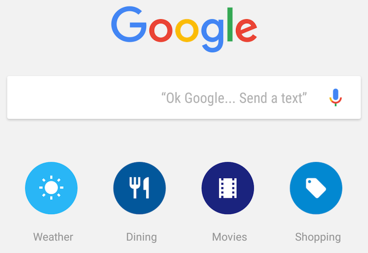
The server-side switch plague has claimed another victim. Some users are seeing a series of blue circle icons on top of their Google Now stream for weather, dining, movies, and shopping. Others, like me, are not.
The icons don't do anything beside launch a search — and thus trigger smart cards and results — for their respective purposes. They're basically glorified search shortcuts, or maybe big hints for those who don't know what exactly you can search for on Google Now. If you think back to Google Now's mantra of surfacing results to you before you even search for them, these essentially contradict it by asking you to search for things.
Philosophical and existential purposes aside, we don't think the circles are very new. Cody spotted them a while ago, but they now seem to be showing up for more (but still limited) users. Users are seeing them in both the beta and stable Google app, so they don't appear to be limited to one version.
Thanks: Joseph Antonetti, Ramit Suri