According to multiple reliable sources, we believe that Google plans to debut a brand-new launcher for Nexus devices some time in the near future, likely on its 2016 Nexus (if they are Nexuses) smartphones Marlin and Sailfish.
We do not have possession of any APKs we can distribute or unreleased devices, so please don't ask for them.
Confidence level
We give this rumor a confidence level of 9 out of 10. We have very substantial visual evidence we can share with you today, and the quality of that information is exceptional. As such, we are subtracting a point only for the fact that we do not know to a certainty the following:
- If this launcher represents the final design choices Google will implement (it may very well change)
- If the launcher will be a Nexus exclusive (though we believe it will be at this time)
- How much the experience will change when Google Assistant / Now On Tap / Search etc. are updated for the experience (the version you see here likely doesn't represent the new Google Search app)
But overall, we are extremely confident that Google is actively working on this new launcher design, and we're sharing with you their progress today. I use "progress" for a reason, because Google is notorious for changing or axing software designs and features up until the final days and weeks before a product is scheduled to launch. Some of these things may never see the light of day. But with all that in mind, let's proceed.
The evidence
We have a number of animated GIFs and still images to share, as well as some descriptive information we can give you to make sense of the changes.
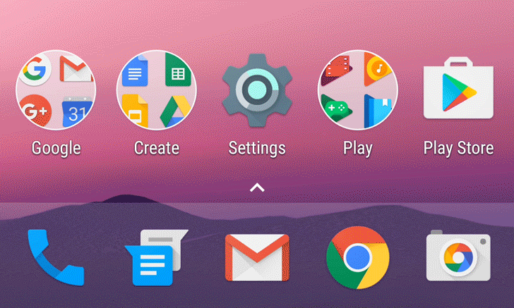
First off, this new launcher does away with the app drawer icon. The drawer itself remains, but it now hides under a "frosted glass" section along the static set of icons on the bottom of the homescreen, which have been increased in capacity to five as a result. To access the app drawer, you have two options. First, you can slide up anywhere in the "frosted" zone, including on the small arrow above the zone. Alternatively, you can just tap the arrow itself, which will instantly reveal the drawer. To close the drawer, you can swipe down from anywhere (except the notification and nav bars) or hit the back button. The new drawer has a large restyled search bar up top, but otherwise isn't especially different from the current Now launcher's.
Moving to the homescreen, we see that the standard Google Search widget has been removed. In its place is a calendar widget (this cannot be moved or removed), opposite of which you see what looks like a "G" pull-tab. Tapping the G launches search on the version of the launcher our sources showed us (this launcher is not running on final Nougat), but pulling it does nothing.
We suspect the behavior and animations around the "G" button may change substantially when using a newer version of the Search APK in tandem with the Nexus launcher, but our sources were unable to provide a demonstration of this. It is our belief that more of the Google "Assistant" functionality will be built into this launcher, and given what we've heard about the new nav buttons, we expect Assistant to play a key role in this launcher when it arrives on the new Nexus phones later this year. The calendar and "G" widgets, by the way, are only on the primary homescreen. There is also a settings toggle to turn off the Google Now pane, interestingly.
Settings and customization are, for now, pretty much what you'd expect based on the current GNL: meager.
For clarity's sake: at this time, we still expect the new nav buttons to launch, including some form of the "flower" home button. It's quite possible - likely, even - that Google is deprecating the very big and obvious search widget for something smaller in favor of pushing users to the home button long press for helpful Assistant functions, highlighting Google's belief that things like Now and Assistant will be more helpful in many situations. How will this work? Remember that Google Now On Tap redesign that never really rolled out? We strongly expect it to make a return with Assistant (in fact, that new UI may even have been part of Assistant).
Remember these new On Tap shortcuts? I suspect we'll see them again soon, possibly with Assistant branding.
Finally, the pane switch animation now uses a horizontally-scrolling line to show which homescreen you're on, instead of the dots you see on the current version of Now launcher.
Final thoughts
Without the newer search app and Google Assistant on display, we may not have the full view of what the "Nexus launcher" will look and feel like when it launches just yet. But this is a tantalizing leak nonetheless. I have to admit: it was really weird to see a "Google" launcher without the Google search bar sitting up top at first. And the loss of the app drawer icon makes me a bit nervous.
What do you think? Love the new look and features? Not a fan? Let's discuss.