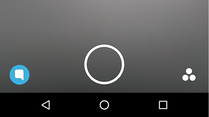
Snapchat is often bemoaned as one of the worst of the major social apps for Android, but a new update today at least makes a few modernizing UI changes in areas that looked, well, kind of bad. The state of the Snapchat pre-update you can see below, in the three areas where major changes have occurred: the navigation bar, stories, and discover.
The new UIs for each of these are below, starting with navigation. You now have proper icons for chat and stories (you can still swipe left or right to get to either), and the navigation bar is responsive to which one you are currently in, which provides users a bit more visual context in the, frankly, confusing as hell app that is Snapchat.
Here's the Play Store changelog:
* Stories and Discover have a new look. See what’s inside before you tap!
* When you finish an edition in Discover, swipe up to Subscribe so you never miss an update! Subscriptions appear below your friends’ Stories.
* Tap the navigation buttons at the bottom to jump between screens.
The Discover tab has received the largest overhaul, now directly displaying stories in the tab instead of various sources in a scrollable list of basically space-wasting circles. These changes bring some significant visual updating and, hopefully, slightly more intuitiveness to an app that has been notorious for its confusing and convoluted interface. I mean, it still seems confusing to me, but it's at least slightly less confusing now. Maybe. Kind of.
[EMBED_APP]https://play.google.com/store/apps/details?id=com.snapchat.android[/EMBED_APP]