Google may design most of the Android Wear experience, but the company doesn't control everything. One poorly designed app is all it takes to sour someone's impression of a platform. And with Android Wear getting a major update, that would be a shame. So to provide users with the best experience and increase chances that they will keep an app around, Google has released design guidelines for the latest version of its smart watch platform.
The information gives developers and users alike an idea of what to expect from their watches. Apps should display one or two options on-screen at a time, not require squinting, and ultimately make information easy to process and respond to at a glance. Buttons should be easy to press with a finger.
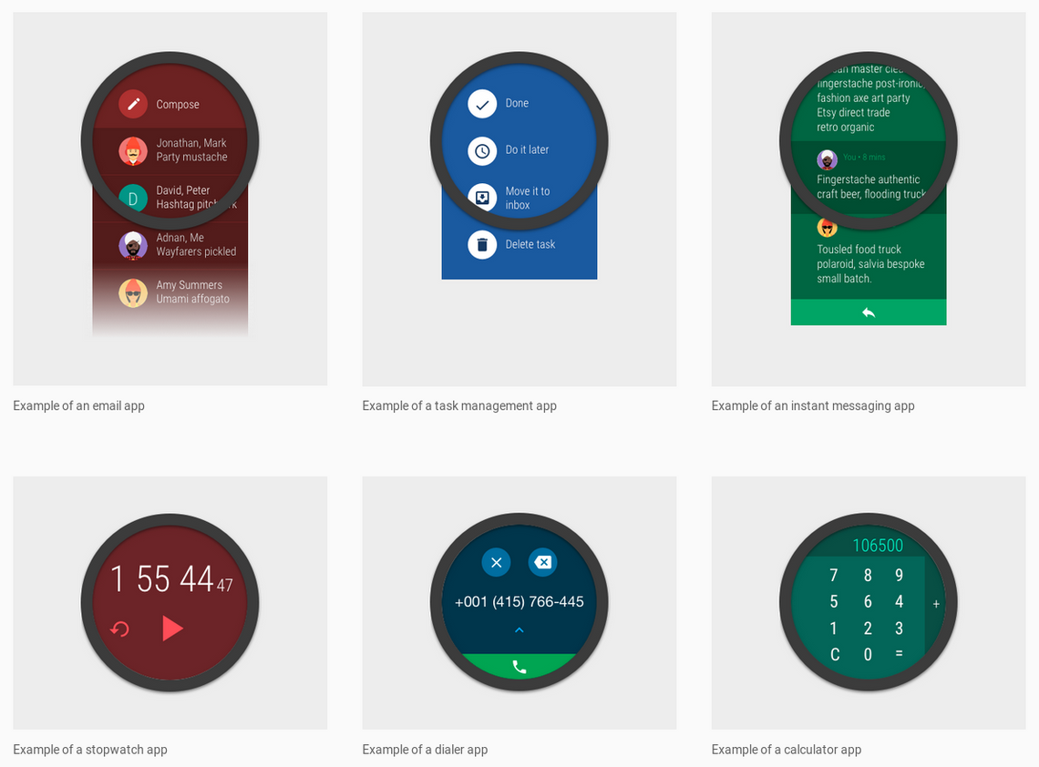
The site includes examples of what to do and what not to do. Images show how email clients, to-do lists, and instant messaging can look on Android Wear.
Google encourages developers to create apps with tasks that are easy to accomplish from a watch. An example includes showing how many steps the wearer has taken. Something the company doesn't want to see are apps that display entire spreadsheets or calendars. Though that won't stop anyone from making them.
The guidelines instruct developers to design apps for round displays, since most Android Wear devices have circular screens. Square interfaces can leave information cut off at the corners on models like the Moto 360, LG Watch Urbane, and Huawei Watch.
The guidelines cover specifics, such as how to display progress indicators, show notifications, and request permissions. Hit up the link below for the full rundown.
Source: Material Design for Wearables