When eBay released its version 4.0 interface revamp back in September of last year, I was slightly disappointed. The app looked like a mishmash of design styles and ideas that didn't really belong on any platform but that were trying too hard to not offend anyone either on Android or iOS. It lacked life and felt clinical, with so much grey and white and nary another color. It also removed access to your personal lists, an omission that I still despise because I am very picky about organizing my items in differentiated and clear lists.
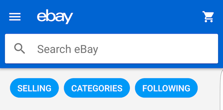
But now eBay is rethinking its mobile design altogether, introducing a new look with more colors, clearer layouts, and a lot of Material Design. I love it. The entire app has been overhauled from the main screen to the navigation drawer, including the different icons, side menus for filtering and sorting, and item pages.
Most notably, Watching, Purchases, and Bids & offers, have been separated into three different sections instead of being lumped into one, and Search not only loads your previous history but also lets you quickly jump to your followed searches.
At the bottom of each item, you'll also see a More like this section with related items that you might want to check out, à la Amazon. This was a bit of a hit and miss with previous eBay versions, but it seems to show up more consistently in this new version.
Overall, I'm a fan of this new design, even if there's still no way to add an item to a specific list or collection from the mobile app and there's also no way to browse your lists and collections. Why, eBay, why?!
The update is rolling out gradually to everyone on the Play Store, but if you don't have it yet, you know that APK Mirror's got your back with the manual download.
Source: ebay