Google is on a crusade against search bars. Or so it seems to us at least. Late last year, the Play Store received an interface revamp that dumped the green search bar in favor of an overlaid grey bar with a hamburger menu, a voice search icon, and the words Google Play in grey that disappeared as soon as you started typing. Then a few days ago, it changed Play Books' search bar to a look that sits somewhere in the middle, with the blue bar switching into the grey one when you tapped to search.
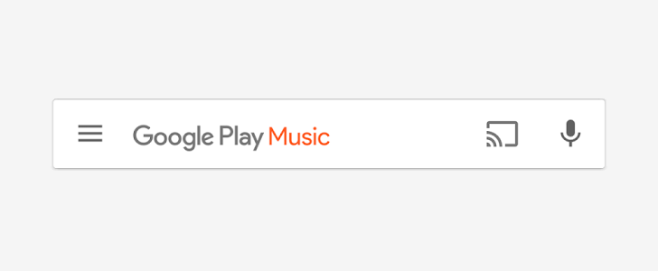
Now it's Play Music's turn. Well, in testing at least. A reader is seeing a new design for the Play Music's search bar that looks very similar to the Play Store's, except with Music added in orange and a Chromecast icon. Neither Artem nor Phil nor I are seeing it though on Play Music 6.7.2712Z, so it might be a very limited server-side test.
Current Play Music search bar (left) and what could be the next one (right)
I'm not sure what I think of the new look. I like the super bright colors of the old search bars, they were cheerful and added a nice touch to the rest of the interface. The new look is more tame and seems a bit odd with the colored status bar. Oh well, we better be ready for it when it comes crashing on our devices.
Thanks: Connor Kirkby