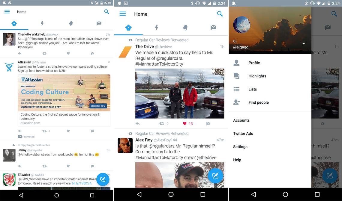
The Twitter app has gone through many, many incarnations. Not only have there been plenty of official redesigns, Twitter often tests UI tweaks using server-side switches. That's the case now as a new, more material interface appears to be rolling out to users (see above). It has tabs, a proper nav menu, and even a floating action button (FAB).
There are a few screens of the current app down at the bottom of the post, and as you can see, it barely even looks like an Android app. The redesigned version people are starting to see has tabs across the top for the timeline, notifications, messages, and moments. The navigation menu slides out, and actually looks like a standard Android UI element. It provides quick access to your profile, highlights, lists, and so on. It basically takes the place of the weird overflow button in the current app.
Twitter actually tested a FAB in a server-side push last year, but that didn't make it into the main app. Now it's back in this version, and takes the place of the bottom bar. The app used to have tabs too, but that was in the distant past. We don't know if this UI is going to become official or not. Because it's server-side (we've tested the latest beta and alpha to make sure) there's no way to get this interface manually. You'll just have to keep an eye out.
The current app
Thanks: James Brown and AJ