Read update
- New logo now live
Asterisks are serious business. It appears that LastPass was hit with a trademark lawsuit about its logo last year (personal theory: maybe from Asterisk.org?), forcing it to change its brand's identity. The asterisk had to go so the company looked at the visual interface of password fields and saw that dots were now the norm for hiding passwords, not asterisks.
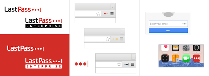
That's where the new logo was born from. The signature red color remains, the black/red logo is also alive, and the font appears to be unchanged. The only difference is that the 4 asterisks have switched to three dots and one vertical bar — the latter isn't explained by LastPass. I see it as both a cursor and the end of your password woes, because LastPass, geddit?
It's not the full logo that's confusing though, it's the small one that will appear on the browser extension and different apps. Say goodbye to the big white asterisk inside the red box and hello to the dots and bar, alone. That's sure to be redundant inside any password text entry box you'll run across. Not to mention that it won't be easy to spot or find in a hurry. But hey, it's a new logo!
LastPass's Android app hasn't been updated with the new logo yet and LastPass says that it might take a couple of months for all of its software solutions to see the change. That'll give you enough time to be ready.
UPDATE: 2016/03/03 4:56am PST BY
New logo now live
LastPass just got updated in the Play Store with the new logo and brand identity. Here's the changelog and the link to download the app.
WHAT'S NEW
Questions about the app permissions? Please see our FAQ here: https://helpdesk.lastpass.com/lastpass-mobile/lastpass-for-android/#h13
- LastPass has a new icon and logo! Head to https://blog.lastpass.com/2016/02/meet-the-new-lastpass-logo.html/ for more details.
- This release also includes minor app fill improvements, bug fixes and stability improvements.
Thanks everyone for your feedback!
Source: LastPass

