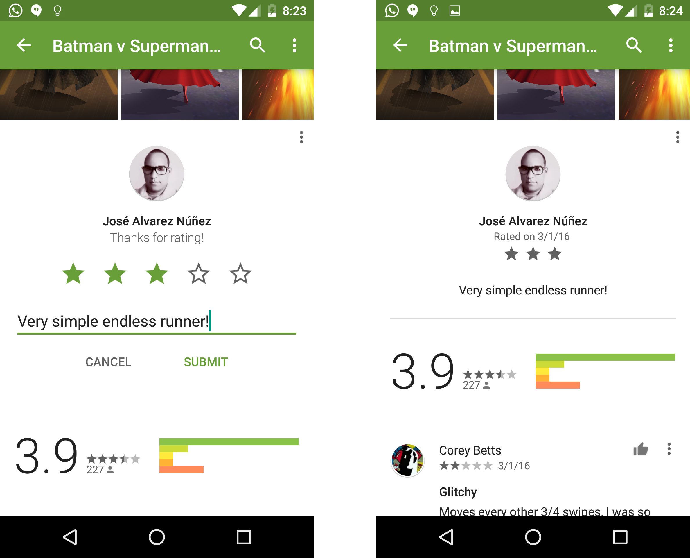
Google is constantly making changes to the Play Store layout, and these tweaks are often server-side. A new line here, a different dialog box there, and the experience changes. This time, Google appears to be testing a layout for reviews that takes away a dialog box when you leave a review. Instead, the review dialog is embedded in the page.
You can see the current style below for comparison. Basically, it looks like Google is toying with getting rid of the pop up for leaving reviews. The layout of that box was just tweaked last year, in fact. The new screens above do look much cleaner and more consistent with where Google is going these days. You may also notice there's just a single text field for the content of the review with no "title" space.
Current UI
No one on the team is seeing this UI right now, so we can't tell if there's anything else different. There's probably no way to force this UI to show up, so you'll just have to wait for Google to roll it out to everyone, if indeed that happens.
Thanks: José Alvarez Núñez

