Many a double-take were... taken? when the brand new Google+ redesign was unveiled. Not because the design didn't look great, or didn't perform well (as we know, the website is highly responsive and super speedy), but because of an interface element that appeared on the new Android app - the bottom tab bar.
Not since the days of holo have we seen the split action bar in Google's apps (unless you count the bar in Keep), so it seemed odd to find a bottom tab bar so prominently featured on almost every screen of Google+ in 2015. But there's more to the tab bar than just its unfamiliarity on the platform. It's one instance of many where the new stars of Google+ - communities and collections - are wedged into the interface in a somewhat questionable way.
I've delayed diving into the interface of the new Google+ for a few weeks, because in general I think gut reactions to big interface shifts are risky things. I wanted to live with the interface and see if my instinct - that the new Google+ sacrifices some UX in favor of a product focus - was at least justified.
To suss that out, let's get started by taking a look at the new navigation model(s) in Google+ for Android.
Navigation everywhere
Probably the most notable change to the Google+ app is the navigation model (or models). In its previous iteration, the G+ app dumped almost everything into a dropdown bar on the main screen, which had the effect of essentially deemphasizing all the features right off the canvas and into an unfamiliar new navigation element. Within that dropdown was a secondary hierarchy of big or small, full-row or half-row or third-row actions, etc. Not many people were a fan of the dropdown (though I think in theory it could work in very specific contexts).
So in the new update, Google+ takes an approach that is both more contextual and more holistic by essentially stirring up three navigation models and sprinkling them across the app. Of course there's a "hamburger" menu accessible from the main screen, which contains entries for Profile, People, Locations, Events, and Settings. Inside collections and communities there are swipe-able tabs at the top to filter down to what collections or communities you actually want to see. And then we have the elephant in the room - the bottom tab bar.
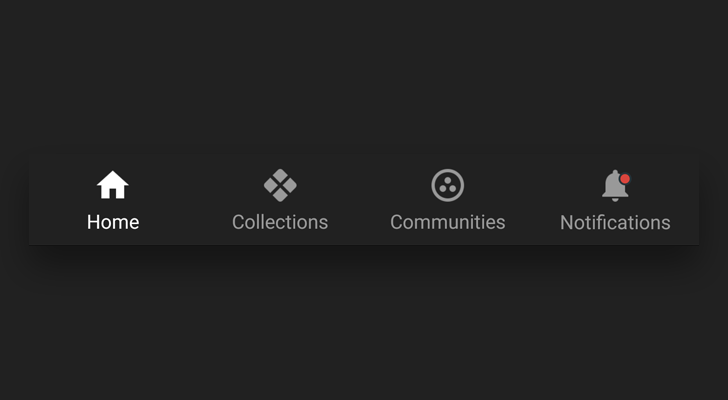
The bottom tab bar
The bottom tab bar feels like it exists solely to promote collections and communities to the very very front of the app. The bar exists in this weird space that's persistent across almost everything, superseding the canvas, the content, the toolbar, and even the FAB but not the drawer. Yet at the same time it's also more important than the drawer, whose contents are a mix of primary and secondary destinations like your profile, locations, and events. With the bar and the drawer fighting for a claim to the primary navigation of the app, it feels like Google+ has a conflict of too many layers that are able to affect what you see on screen in too many ways.
But let's assume that the bottom tab bar's cause is just and that - though limited to four slots - it can adequately serve as primary nav for the app. Assuming this is the case it's odd that the bar doesn't appear inside individual communities or collections or profiles deferring to "up" navigation to climb back up to the home stream. The fact that it's possible to escape the bottom tab bar kind of undermines the idea of getting home (or to your notifications or wherever) from anywhere right?
Also worth noting is that - after subtracting pixels for the nav bar, status bar, and top toolbar - the bottom tab bar takes up about 9% of the remaining screen space on my Nexus 6P. Is the constant ability to access collections and communities more important than 9% of the stream content? That's impossible to answer definitively but ideally the answer should be an absolute and enthusiastic "yes!" if we're going to have the bar.
Is this about the product?
It's possible that Google has data saying that users love communities and collections enough to promote them to almost every single screen in the app, or it's possible that the bar is one symptom of a product objective steamrolling UX. Whatever the case, we can't really say one way or the other if the decisions discussed in this post are "right" or "wrong" without inside context. What we can do is observe the highly special treatment these two aforementioned features get, and how they impact the rest of the interface for better or worse.
Besides the home stream, one area where the impact of collections and communities can be seen is search.
Search
Here's a diagram of (my personal) expected search behavior, compared to the flow in G+.
Collections and Communities are given almost the entire fold space when you land on the search screen (why again is this a separate screen?), when you focus the search box, when you're typing, and even after you've performed the search. Even when you've typed something unmistakeable like a person's name directly from your circles. On the web app, search will at least give you quick recommendations, but on Android the space we'd normally fill with recommendations is reserved for C&C.
Search, at this point, will show you communities or collections managed by this person, but if we were truly filtering for relevance, the People results would bubble to the top, right? Instead we have collections and communities first, with people drifting quietly right off the edge of the canvas.
The profile page
One other area where C&C have made themselves more prominent is the individual profile page. Community posts are still blended into the stream, but collections take precedent over the user's posts (which are also contained in and linked to the collections, obviously). Interestingly, even the names of collections are pushed off the canvas. Assuming all other elements stay the same, even removing collections wouldn't let more than a peek of a post be seen, but right now there's a decent amount of scrolling between the user and even seeing a glimpse of the first post in a user's profile stream. On the web, the story is much the same, except collections tiles fit neatly above the fold.
Final thoughts
Before we close this post, I should note that I'm writing this because I want to see Google+ get better. Hopefully the remarks above come across as helpful criticism, not just sour grapes. The website has already enjoyed some pretty fast iteration, but both the site and the Android app still seem to have some hangups that may or may not be the result of giving communities and collections a full and total spotlight throughout the interface, and hopefully these can be resolved. Karthik Nagaraj, Engineer on the Google+ team, already acknowledged feedback on my prior G+ post, and it seems clear the team is listening, which is great.
Overall I would say search and the bottom tab bar are the biggest offenders when it comes to spotlighting a specific feature in a way that makes other experiences more difficult, but in an ideal world, the goal of promoting engagement with and focus on these two features could be fulfilled without actively disturbing other, more fundamental features.