Read update
- Here's the full changelog, courtesy of +Luke Wroblewski:
Google is on an update spree for most of its apps, probably getting everything as ready as it could before the end of the year holidays. An update to Google+ rolled out yesterday, bringing the app up to version 6.9 and updating the look of the Notifications tab.
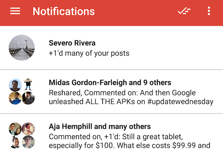
Previously, this tab was a slide-out from the right side of the screen, and it only covered about three quarters letting other content show beneath it. But when version 6.8 of the app was released with a new interface and notifications were moved to the bottom tab bar, it made little sense that they would keep their truncated look. With version 6.9, notifications get the full tab treatment that they deserve with a bright red primary toolbar, an updated mark all icon, and a wider column to read the notification's content.
Left: Before. Right: Now.
That's the only visual change we can spot right now. We're still looking through the new app and will let you know if we find something else. If the update isn't live for you in the Play Store you can grab the installation file from the source below and manually run it to check it out.
UPDATE: 2015/12/10 4:18pm PST BY
Here's the full changelog, courtesy of +Luke Wroblewski:
* 45 bugs fixed
* 12 accessibility issues addressed
* Notifications are now full screen
* Following screen now visually separates "following" from "your circles"
Source: APK Mirror