LinkedIn's main app rarely gets significantly updated. It has added a few new features here and there over the past years, but it has looked the same since time immemorial. Very Holo, very grey, very Ice Cream Sandwich. You can finally bid adieu to that old design though, since version 4.0 is ready to coat your smartphone's screen with fresh animations, a cleaner design, more white, better use of space, and some nicer transitions and animations.
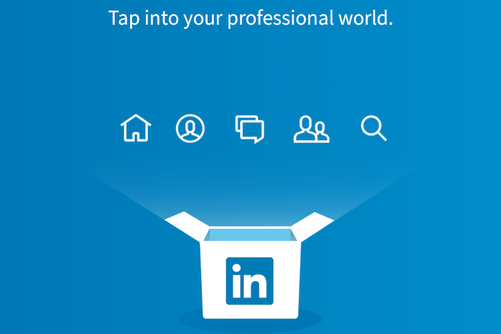
LinkedIn's design reshuffled and reorganized the app too. Gone is the side drawer, replaced by a blue bar at the top with icons for each tab. Swipe left and right to switch between your feed, profile, messages, connections, and search. The last icon only gives you links to grab LinkedIn's other apps. If you're wondering where the settings have gone, they're now accessible from the profile tab and let you tweak a lot of your LinkedIn profile options, not just the Android app's.
For comparison's sake, here are the same screens taken from the old LinkedIn 3.5.4 app.
From where I stand, the only area where there appears to be a step back is in uploading images to new posts. The old version had quick access to your latest images' thumbnails, whereas the new one requires you to tap a couple of times to get to your photos.
The 4.0 update seems to be on a staged rollout on the Play Store, so you can try your luck there or go grab the file directly from APK Mirror.