Did you visit Google Fit's website back when the service first launched? It was a bare bones affair. The screen was mostly gray, and you were presented with the same information you saw inside the app, only tucked away on the left side of the screen. There really wasn't much reason to pay it any attention, so we didn't.
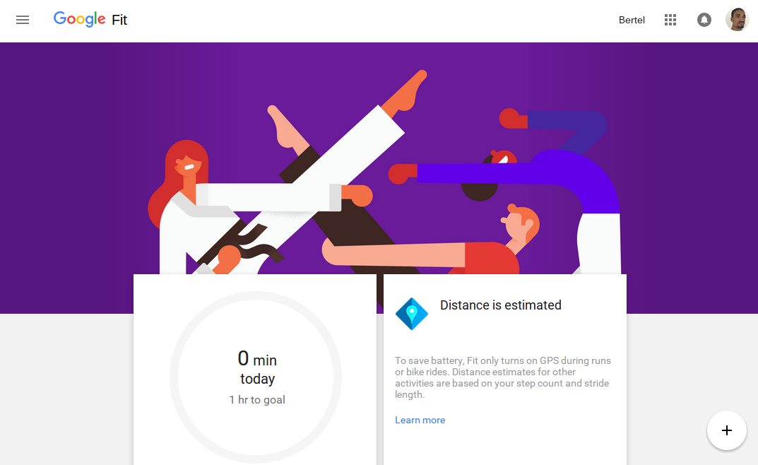
But now the website has received an update that makes it worth a visit. The most noticeable distinction is the inclusion of numerous Material Design elements, such as the Floating Action button in the corner, a side menu that slides out on top of other on-screen elements, and information dense cards that slide up over a stylized background.
All of this is well and good, but it's what's on those cards that will have users come back for a second look. This single screen shows how many steps you've taken, how far you've gone, the calories you've burned, and your recent activities. Some of this information shows up in different formats across the page. As for that FAB in the corner, it lets you add a new activity or log your weight.
Major visual changes aside, don't expect much of a leap forward in functionality. The changes are live, so feel free to check things out for yourself.
Source: Google Fit
Thanks: Elliot, David Poole,Lukas Hadrava