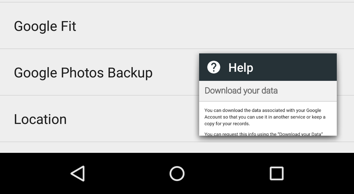
Filed in the category of "things we just noticed" is a pretty strange interface element discovered in the "help" interface of Google Settings. When opening an article, users can tap a "full screen exit" icon in the toolbar to trigger the little floating window seen above.
The window is reminiscent of the one found in YouTube, where users can collapse a video and keep browsing, but this window can be moved up to the top of the screen as well. Sliding it to either side will dismiss the mini-window. Here's a quick video demo:
There's no doubt this element seems a little out of place in Google Settings, but my first guess is that, functionally, it would serve a similar purpose to YouTube's mini player - if a user is following step-by-step instructions in a help article, they may want a fast way to switch between the steps and the app that they're dealing with.
But this line of reasoning reveals another potential flaw - articles specific to the Google Settings app are under "browse all articles," while the popular or recommended articles point out toward Google websites for their steps, obviating the need for a fast switcher.
Once a user is in a relevant article, though, there's an assumption that they'll be either familiar or adventurous enough to get along with the floating mini-window, but since the element only appears in one other app (with slightly different behavior) I think that's a pretty big assumption.
Whatever the case, it's an interesting decision and one worth talking about. What's your take on the mini-window?
Thanks Brandon!