In a rather exciting post to its Google Design Google+ page today, Google announced a big set of improvements to the material design guidelines. The design spec, which - since this summer - has been a "preview," has been updated with links to relevant Android developer documentation, a new section called "What is Material?" a "What's new" section (to stay up to date on any changes), and a couple of other exciting changes.
First among those is clarity on more design patterns, including scrolling, swipe to refresh, time and date formats, errors, and navigation drawers. Readers may remember my recent post about the many faces of Google's nav drawers. After counting up so many different variations, it's refreshing to see Google providing some clearer guidance on the topic, with new information that went unstated in the previous documentation.
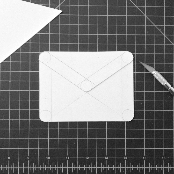
Another bit of clarity that I've personally been waiting on is guidance for product icons (launcher icons on Android). This is another subject I've discussed here at AP before. Until today, there was no real guidance for how to pull your launcher icons into line with Google's new design vision so I pieced together what we could observe from Google's existing guidelines and existing material icons to form some recommendations I thought may be helpful. It turns out those observations weren't too far from the truth. In Google's new guidelines, the lighting, layering, and folding of "paper" are all covered, along with general guidance on color and a new set of grids.
This is by far the most guidance Google has given developers and designers on launcher icons in the history of Android.
Overall it's great to see the design team encouraging everyone to gain inspiration from the new guidelines and adding significant clarity to make the changes as painless as possible. For Google's own overview, hit the source link below.
Source: Google Design Spec, Google Developers Blog, via Ian Lake (Google+)